At what price?
Three words. Every pricing project I have worked on started with some version of them.
Sometimes they arrive in a meeting room, from a brand lead who has just been told the launch date. Sometimes they come in an email from a market access director, with a forecast deadline attached. Sometimes they are not even said out loud. They sit underneath a request that sounds like something else: "Can we test the product profile with doctors?" or "What do payers think of our data?"
But underneath, the question is the same. At what price?
In most industries, that question matters. In healthcare, it matters in a particular way. The price of a medicine decides how much revenue a company earns from years, often more than a decade, of research. That revenue funds the next round of research and clinical trials, and pays the people who run them. It also decides whether the medicine reaches the patients it was made for. A price that payers will not accept, or that patients cannot afford, means a product that sits on the shelf.
So when a client asks "at what price?", they are asking one of the most consequential questions in the business. Getting the answer right, or at least getting the research behind it right, is one of the most important things a market researcher, analyst or consultant is trusted to do.
This post is about the step that comes before the answer: choosing how to find it.
Too high, too low
It helps to be honest about what is at stake on each side.
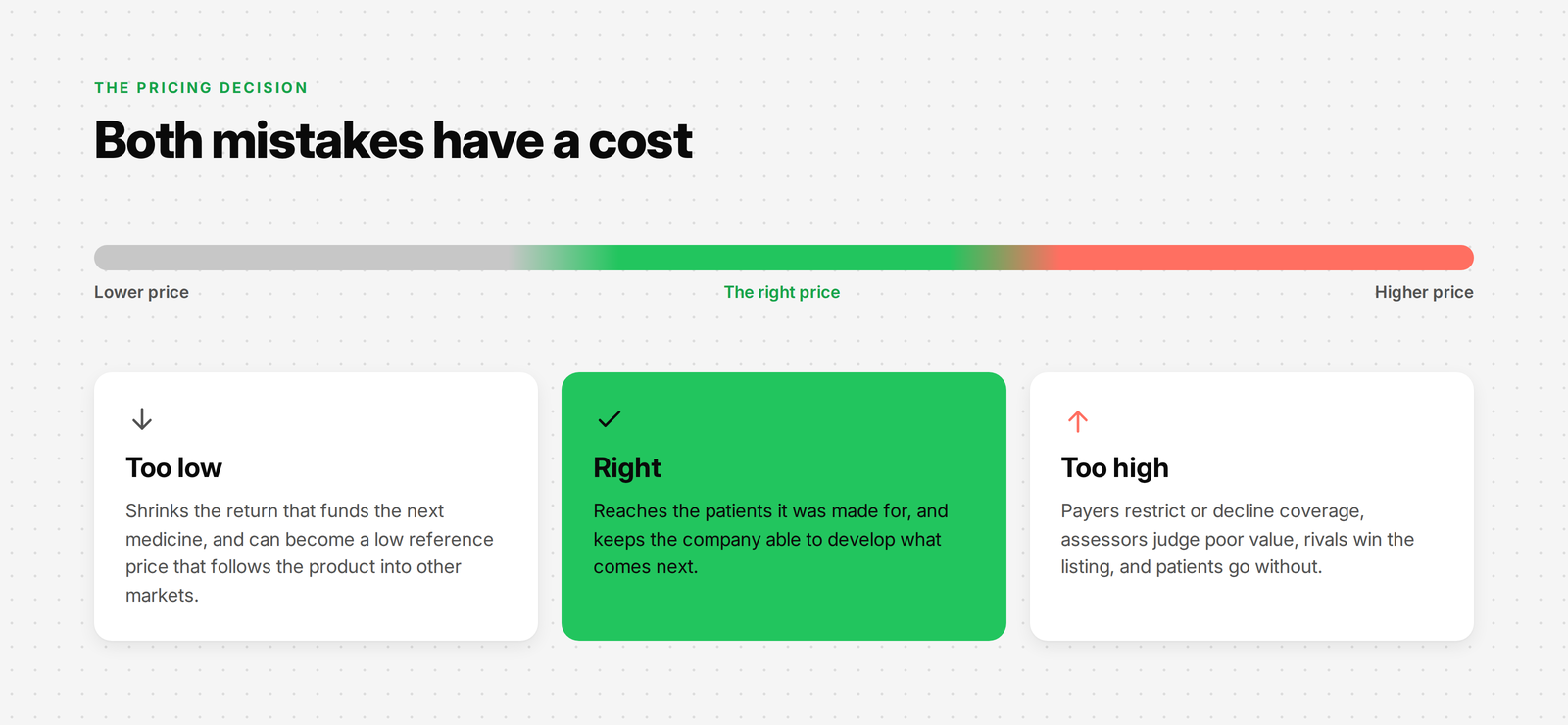
Price a medicine too high and the consequences show up quickly. Payers restrict access or decline to cover it. Health technology assessment bodies judge it poor value. Competitors with a similar product and a lower price win the formulary position. Doctors who want to prescribe it find they cannot, because the patient's plan will not pay. The product does not reach the patients it could have helped, and the launch underperforms.
Price it too low and the consequences are slower but just as real. The revenue a product earns over its life is what pays back the cost of developing it and funds what comes next. A price set well below the value the medicine delivers weakens that cycle. It can also lock the company into a low reference point that follows the product into every other market that looks at its price. In many countries, a price agreed in one market becomes the benchmark for the next.
Neither mistake serves patients or the business. The goal of pricing research is not to find the highest price someone will tolerate. It is to find a price that lets the medicine reach the people who need it, while keeping the company able to develop the next one. Good research gives the people making that decision evidence instead of instinct.
Which brings us to the part most people find hardest.
The wall of methods
If you have worked in healthcare market research for a while, you know the names. Van Westendorp. Gabor-Granger. Conjoint analysis. Brand-Price Trade-Off. Monadic testing. Payer interviews. HTA modelling. Reference pricing. Tender benchmarking.
Each of them is a real, well-established method. Each has textbooks, vendor white papers and conference talks behind it. And each, in the right situation, is exactly the right tool.
The problem is the phrase "in the right situation". When the question lands on your desk, you do not get a label telling you which situation you are in. You get a product, a market, a deadline and a budget. The methods are all there in front of you, like a wall. Which one fits?
In my experience, this is where a lot of pricing research quietly goes wrong. Not in the execution. Most teams can run a survey or build a model competently. It goes wrong in the choice. A team runs a consumer-style price survey with doctors who never see the price of what they prescribe. A team builds a detailed conjoint simulator for a market where a tender committee, not individual prescribers, decides what gets used. A team designs an elegant study for one country without noticing that the price agreed there will be referenced by six others.
None of these studies are badly run. They are just answering a question nobody needed answered.
Over more than a decade of working on healthcare research, I have seen this pattern often enough that I started to think about why it happens. The answer, I think, is simple. We start at the wrong end.
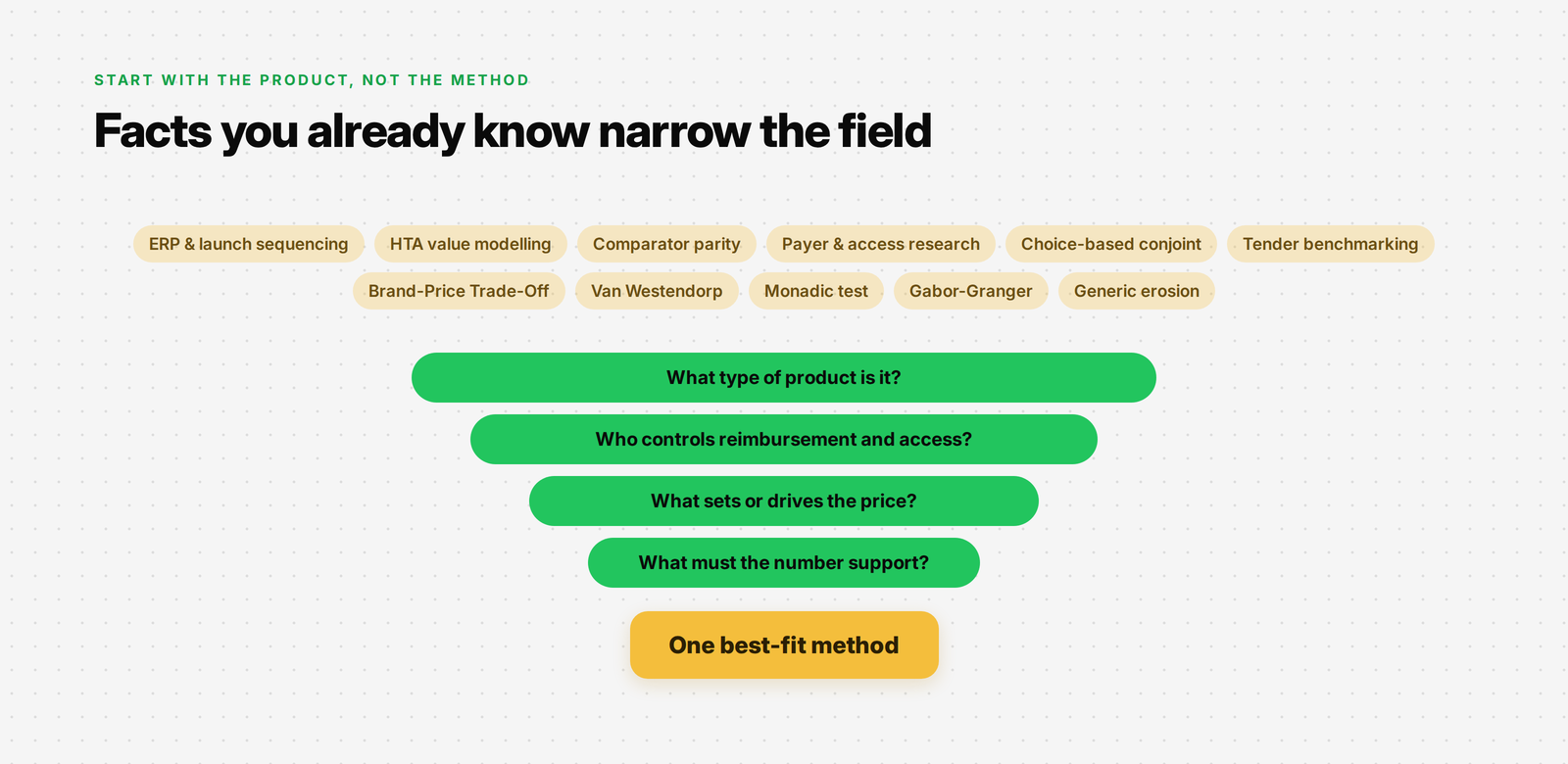
Start with the product, not the method
When that question lands, the instinct is to reach for the method you know best and hope it fits. If you have run a lot of Van Westendorp studies, Van Westendorp starts to look like the answer. If your team has a conjoint licence, conjoint starts to look like the answer.
But the method is not where you start. It is where you arrive.
What you need first is not a technique. It is a way to narrow the field. And here is the turn that makes the whole thing manageable: choosing the method is not really about the methods at all. It is about the product and the market it is going into.
What kind of product is it? Who decides whether it gets paid for? Is there a rival, and does anyone actually compare the two on price? Who chooses whether it gets used: a doctor, a patient, a payer or a procurement committee?
You already know most of these answers, or you can find them before the next meeting. They are facts, not opinions. And each one quietly rules some methods out, until only the ones that fit are left.
So instead of memorising every technique and its pros and cons, you can answer a few straightforward questions about your own product and let them lead you to the method that fits.
That is exactly what the map below does.
The map
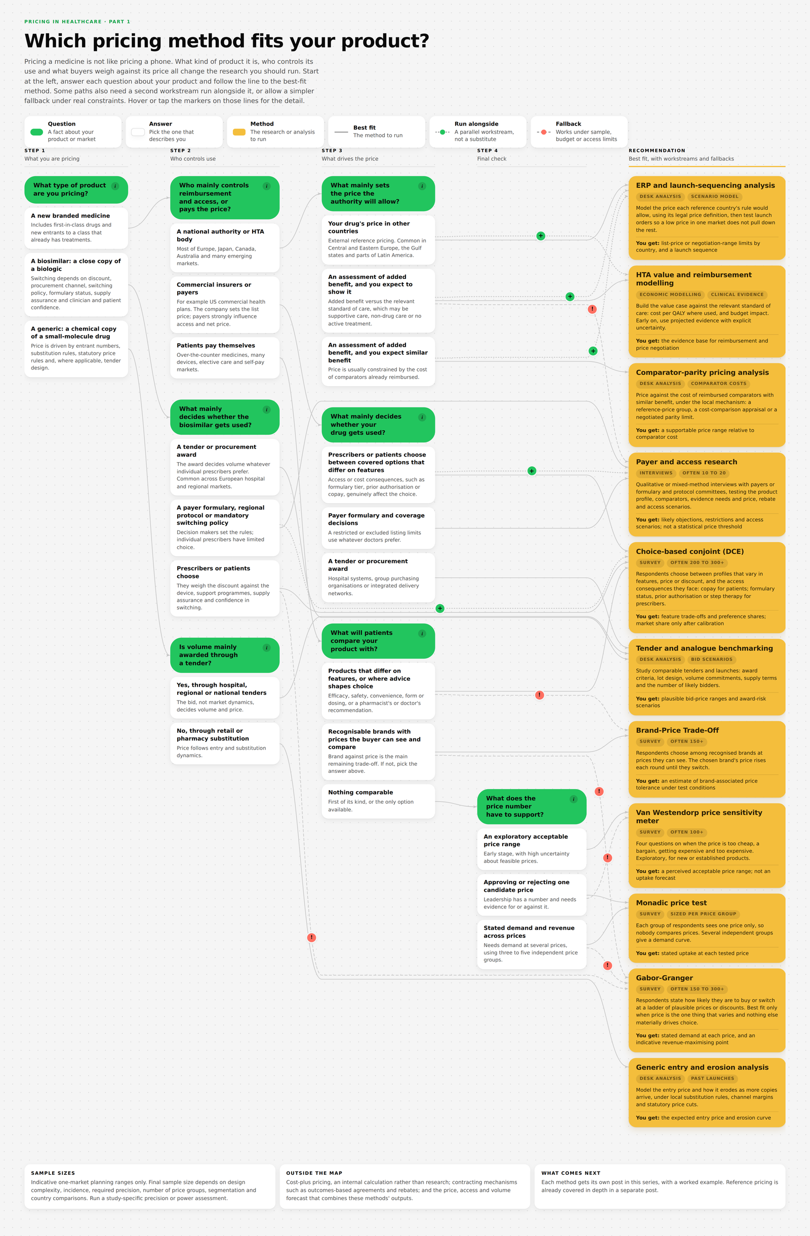
Here is how to read it.
Start at the left with Step 1 and pick the answer that describes your product. Follow the line to the next question, and keep going. Depending on your product, you will answer between two and four questions before you reach a recommendation on the right.
Green pills are questions. White cards are answers. Yellow cards are the methods. If you are not sure what a question is getting at, the small "i" inside each green pill explains why it matters.
You will notice three kinds of line:
A solid line leads to the best-fit method: the one to run if you can.
A dotted line with a green + leads to a second piece of work that should run alongside it. It is not an alternative; it covers something the main method cannot.
A dashed line with a coral ! leads to a fallback: a simpler or cheaper method that still does a reasonable job when sample size, budget or access rule out the best fit.
Hover over, or tap, any green or coral marker to see when that line applies and what you gain or give up.
Tap any card to light up every path that passes through it. Tap a method on the right, for example, and you will see every situation that leads there. And if the map feels too small or too large on your screen, the zoom control in the bottom-right corner lets you fit it to your screen or zoom in.
The best way to use it is with a real product in mind. Pick something you are working on now, or a launch you remember, and follow it through as you read the rest of this post.
Walking through the questions
The map gives each question a short help note. That is enough to use it, but some of the questions have a trap in them: an answer that looks right and isn't. If you pick the wrong answer, the map will still give you a confident recommendation. It will just be the wrong one.
So this section spends its time where the traps are. The easy questions get a sentence. The tricky ones get a closer look.
Step 1: What type of product are you pricing?
This one is usually easy. A new branded medicine, a biosimilar or a generic.
The reason it comes first is that copies and new medicines are priced through completely different channels. A new medicine has to establish its value. A copy is priced as a discount off something that already exists, and the size of that discount depends heavily on how the copy is bought. So the map splits here and never brings the paths back together.
One note: "new branded medicine" includes first-in-class drugs and new entrants to a class that already has treatments. Whether rivals exist matters a great deal, but it matters later, at the point where it changes the method.
For generics: is volume mainly awarded through a tender?
Ask yourself: when a hospital or health system buys this product, does it run a formal tender and award the volume to one or a few suppliers? Or does the product reach patients through retail pharmacies, where the pharmacist can swap one generic for another?
These are different worlds. In a tender market, your price is a bid. What matters is how many others will bid, what the award criteria are, how the lots are designed and what volume or supply commitments come with winning. In a retail market, price follows entry: how many competitors arrive, how quickly, what the substitution rules allow and which statutory price cuts apply.
The map sends tender markets to tender and analogue benchmarking, and retail markets to generic entry and erosion analysis.
For biosimilars: what mainly decides whether it gets used?
This is the first question with a real trap in it.
The natural assumption is that doctors decide. A biosimilar is a copy of a biologic; if it is cheaper and clinically equivalent, doctors will switch their patients. So you study doctors.
Sometimes that is true. But often it is not, and the tell is simple. Ask yourself: if a doctor preferred the original product, could they keep prescribing it without friction?
If the answer is no because a tender has awarded the volume to one supplier, then the tender committee decides, not the doctor. If the answer is no because a regional protocol, a payer formulary or a mandatory switching policy says patients move to the biosimilar, then those decision makers set the rules and the doctor follows them. Only when doctors or patients genuinely choose does a study of their preferences tell you what will happen.
There is a second, subtler point. When doctors do choose, they rarely choose on discount alone. They weigh the device (is the auto-injector as easy to use?), the support programme that comes with it, confidence in supply, and their own and their patients' comfort with switching. That is why the map recommends a choice study that varies all of these together, rather than a simple ladder of discounts.
Step 2: Who mainly controls reimbursement and access, or pays the price?
For new medicines, this is the question that shapes everything after it.
The three answers are a national authority or HTA body, commercial insurers or payers, and patients paying themselves. Most readers know which world they are in. The trap is in mixing up two different things: who sets the list price and who decides access.
In the US commercial market, for example, the manufacturer sets the list price. It can look as if the company is in control. But payers decide whether the drug is covered, at what tier, with what restrictions, and at what net price after rebates. In practice, they control access. So the answer is "commercial insurers or payers", even though nobody from a health plan ever signs off the list price.
The test I use: ask who could stop this medicine reaching patients, and who would have to agree before it does. That is the group whose decision your research has to model.
For regulated markets: what mainly sets the price the authority will allow?
There are three answers here, and the honest difficulty is that real markets often use more than one mechanism at once.
The first answer is external reference pricing: the authority looks at the price of your drug in a basket of other countries and allows a price based on those, often an average or the lowest. This is common across Central and Eastern Europe, the Gulf states and parts of Latin America.
The second and third answers both involve a health technology assessment: a body such as NICE in England, G-BA in Germany or HAS in France judges how much better your medicine is than current care, and what that improvement is worth. The difference between the two answers is what you expect the assessment to find.
If you expect to show clear added benefit, the work is value and reimbursement modelling: building the case that the extra health gain justifies the price.
If you expect similar benefit to existing options, the work is different. Price will usually be constrained by the cost of comparators already reimbursed. NICE, for example, runs a cost-comparison route for treatments that offer similar or greater health benefits at a similar or lower cost than the comparator. Other countries use reference-price groups or negotiated parity.
The trap here is optimism. It is tempting to pick "added benefit" because the clinical team believes in the product. Ask instead: compared with the treatment assessors will actually use as the comparator, which might be supportive care rather than another drug, will the evidence convince a sceptical reviewer? If the honest answer is "probably not by much", plan for parity. You can always be pleasantly surprised.
Because reference pricing and HTA so often operate together, the map asks you to pick the one that sets the first limit, then shows the other as a workstream to run alongside. That second workstream is not optional. A price agreed after an HTA in one country can drag down prices in every country that references it, so if your launch market uses reference pricing, or its price will be referenced elsewhere, the launch-sequencing analysis needs to run in parallel.
For insured markets: what mainly decides whether your drug gets used?
This question has the most important trap in the whole map.
Here is the tell. Ask yourself: if the doctor wants to prescribe it, but the insurer will not cover it, who wins?
In most commercial insurance markets, the insurer wins. A restricted listing, a prior authorisation requirement or a step-therapy rule limits use whatever the doctor prefers. If that is your situation, your research needs to understand payers, so the map sends you to payer and access research.
Only when coverage is broadly available, and doctors or patients genuinely choose between covered options that differ in meaningful ways, does a choice study with prescribers or patients become the right tool. Even then, the study must include the access consequences each respondent actually faces. For a patient, that means out-of-pocket cost and the effort of getting the drug. For a doctor, it means formulary status, prior authorisation, step therapy or administrative burden. A study that asks doctors to trade efficacy against a list price they never see is not measuring a real decision.
And because choice shares only become real within the access payers grant, the map always shows payer research running alongside the choice study on this path.
There is a third answer for hospital systems and group purchasing organisations that award business through tenders. Like the generic tender path, that one goes to tender and analogue benchmarking.
For a first-of-its-kind drug, or rivals that are clinically similar, coverage decisions almost always dominate. If you are unsure, the payer answer is the safer choice.
For self-pay markets: what will patients compare your product with?
When patients pay themselves, the consumer-style pricing methods finally fit cleanly, because the respondent sees the price, pays the price and acts on it. The question is what they weigh it against.
If the products differ on features (efficacy, side effects, convenience, form, dosing), or if a pharmacist's or doctor's recommendation shapes the choice, price is one factor among several. A choice study that varies them together is the right tool.
If the choice really is recognisable brand against visible price, with the products essentially interchangeable, a Brand-Price Trade-Off study fits. The trap is assuming this is true when it is not. Ask yourself: does the buyer actually see and compare the prices of the alternatives at the moment of choice? And is brand-versus-price really the main remaining trade-off, or does advice from the pharmacist quietly decide it? If you are not sure, the first answer is safer.
If nothing comparable exists, the map asks one more question.
Final check: what does the price number have to support?
The same product can need very different outputs, depending on the decision the number feeds.
If you are early and do not yet know what range of prices is even plausible, you need an exploratory acceptable range. If leadership already has a number and needs evidence for or against it, you need a clean read of uptake at that price. If you need to understand how demand changes across a range of prices, and where revenue peaks, you need several independent price points.
Ask yourself: what will the person reading my report do with the number? The answer tells you which of the three you need.
Why some paths have more than one line
A decision map that ends at exactly one method would be cleaner. It would also be less honest.
Real pricing work rarely happens in ideal conditions. Sometimes the best-fit method is out of reach: the sample of specialists is too small, the budget does not stretch to a full choice study, or the economic model is still a year away. Sometimes the best-fit method is right but incomplete: a choice simulator is not believable without knowing what payers will allow, and an HTA strategy is not safe without knowing how the price will travel to other countries.
That is why the map has two other kinds of line.
The run-alongside lines cover the second case. They mark work that should happen in parallel because the main method cannot answer everything on its own. There are five of them:
Reference-pricing analysis alongside HTA modelling, where the launch market uses reference pricing or its price will be referenced elsewhere.
The same alongside comparator-parity pricing.
HTA modelling alongside reference-pricing analysis, where an assessment also applies.
Payer research alongside a choice study in insured markets.
An optional choice study alongside payer research for biosimilars, when the client needs the trade-offs quantified.
The fallback lines cover the first case. Each one is a genuine compromise: a method that still delivers something useful, with a clearly stated cost. The hover note on each fallback tells you four things: why it is not the first choice, when to use it, what it still gives you, and what you give up. I would encourage you to read those notes before reaching for a fallback. A fallback used knowingly is good practice. A fallback used without understanding its limits is how weak evidence ends up driving a launch price.
The destinations
Once the map has given you a method, the natural next question is "what is it, and why does it fit?" This section answers that briefly for each one.
It is deliberately short. Each method gets its own detailed post in this series, with a worked case study, the questions to ask, the analysis step by step and how to turn the results into a recommendation. What follows is the orientation, not the manual.
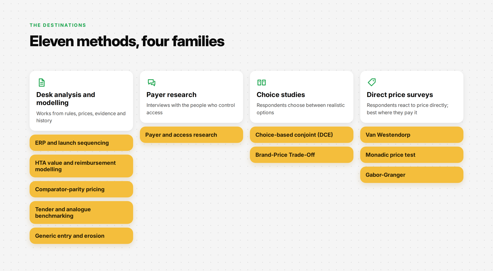
The methods fall into four families, and the map's recommendations make more sense when you see them grouped.
Desk analysis and modelling
These methods do not ask anyone a question. They work from rules, prices, evidence and history. In regulated and tender markets, that is often where the answer lives.
External reference pricing and launch-sequencing analysis. Models the price each reference country's rule would allow, using that country's legal definition of price, then tests launch orders so a low price in one market does not pull down the rest. You get list-price or negotiation-range limits by country, and a recommended launch sequence. If your drug has no price anywhere yet, this becomes a forward-looking scenario model built on explicit assumptions. The map sends you here when reference pricing sets the first limit in your launch market, and shows it alongside HTA or parity work when your price will be referenced elsewhere. [LINK: Reference pricing deep dive]
HTA value and reimbursement modelling. Builds the value case against the relevant standard of care: cost per QALY (a year of life in full health) where the assessor uses it, and the impact on the health budget. Early in development, this works from projected evidence with the uncertainty made explicit. You get the evidence base for reimbursement and price negotiation. The map sends you here when an assessment applies and you expect to show added benefit. [LINK: HTA value modelling post, coming soon]
Comparator-parity pricing analysis. Prices against the cost of reimbursed comparators with similar benefit, under whatever mechanism applies locally: a formal reference-price group, a cost-comparison appraisal or a negotiated parity limit. You get a supportable price range relative to comparator cost. The map sends you here when you expect an assessment to find similar benefit. [LINK: Comparator-parity pricing post, coming soon]
Tender and analogue benchmarking. Studies comparable tenders and launches: award criteria, lot design, volume commitments, supply terms and the number of likely bidders. You get plausible bid-price ranges and award-risk scenarios. It cannot predict a tender result with certainty, because competitors' bids are partly unknowable, but it turns a guess into a reasoned range. The map sends you here whenever a tender or procurement award decides use, for generics, biosimilars and new medicines bought by hospital systems. [LINK: Tender benchmarking post, coming soon]
Generic entry and erosion analysis. Models the entry price for a generic and how it erodes as more copies arrive, under local substitution rules, channel margins and statutory price cuts. You get an expected entry price and erosion curve. The map sends you here for generics sold through retail and pharmacy substitution. [LINK: Generic erosion post, coming soon]
Payer research
Payer and access research. Qualitative or mixed-method interviews with payers, formulary committees or protocol committees. They react to your product profile, the comparators they would use, the evidence they would need, and price, rebate and access scenarios. A focused study often runs to 10 to 20 interviews, but the right number depends on covering every relevant type of payer until the answers stop telling you anything new. You get likely objections, restrictions and access scenarios. You do not get a statistically valid price threshold, and a good report will not pretend otherwise. The map sends you here whenever payers or protocols control use, and shows it alongside choice studies in insured markets. [LINK: Payer research post, coming soon]
Choice studies
These methods show respondents realistic options and ask them to choose. The pattern of choices reveals what matters and how much.
Choice-based conjoint (discrete choice experiment). Respondents choose between product profiles that vary in features, price or discount, and the access consequences they face. The profiles can be hypothetical; you do not need named competitors. A simple study often needs 200 to 300 or more respondents, more for segment comparisons or several countries. You get feature trade-offs and preference shares. A preference share becomes a market-share forecast only after it is calibrated against real access, availability and market data. The map sends you here whenever products differ on features and the person choosing can act on the price or its consequences: biosimilar switching, covered options in insured markets, and differentiated self-pay products. [LINK: Conjoint deep dive, coming soon]
Brand-Price Trade-Off. Respondents choose among recognised brands at prices they can see. The price of the brand they pick rises each round until they switch. A study often needs 150 or more respondents with a small, familiar set of brands. You get an estimate of how much of a price premium a brand can hold under the test conditions. The map sends you here for self-pay products where brand against visible price really is the main trade-off. [LINK: Brand-Price Trade-Off deep dive, coming soon]
Direct price surveys
These methods ask respondents directly about price. They work best when the respondent sees, pays and acts on the price, which in this map means self-pay markets, plus one biosimilar fallback.
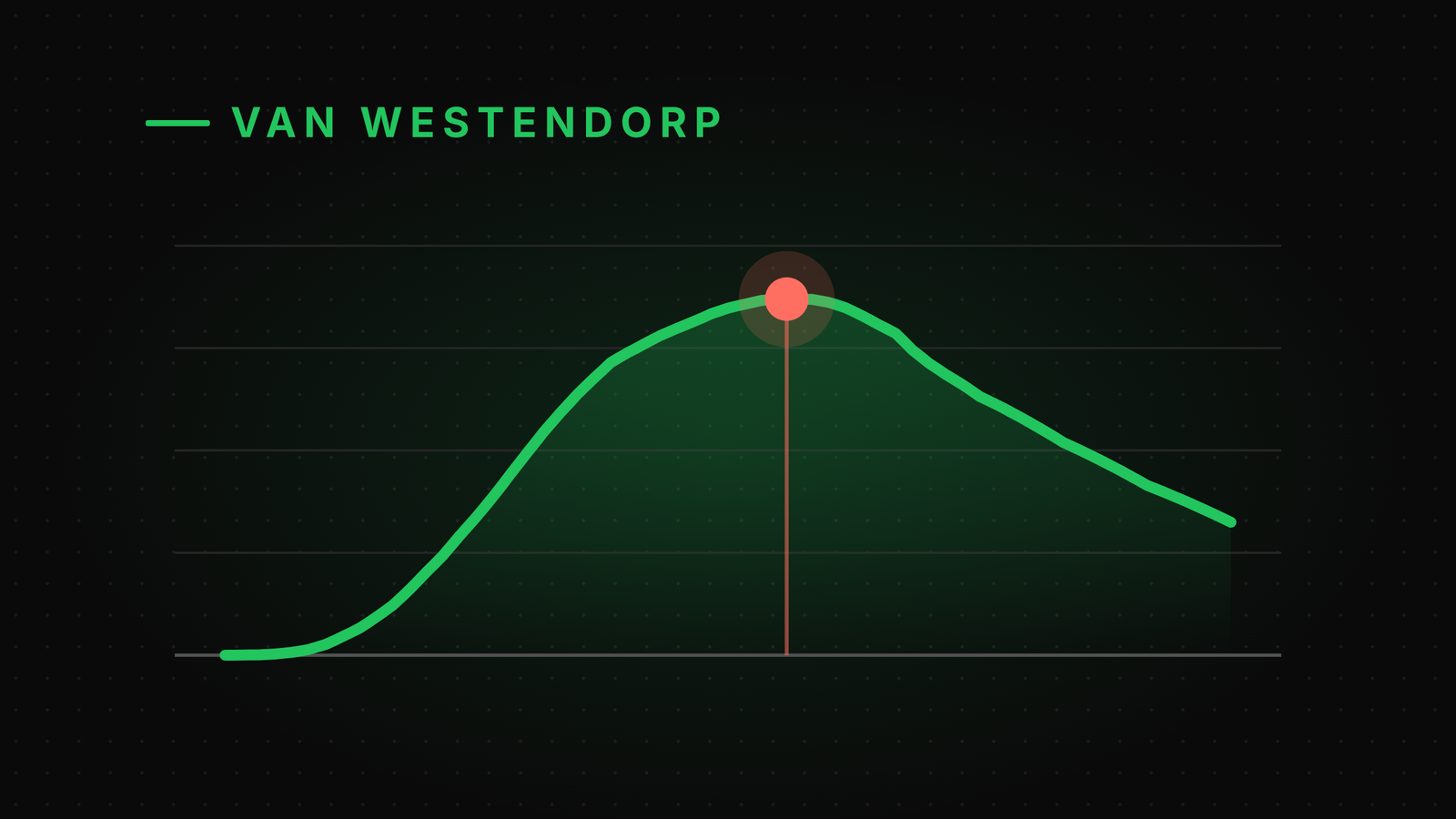
Van Westendorp price sensitivity meter. Four questions about when the price would be too cheap, a bargain, getting expensive and too expensive to consider. Where the answers cross marks out an acceptable range. It is exploratory, suits new or established products, and often needs 100 or more completed interviews. You get a perceived acceptable price range; you do not get an uptake forecast. The map sends you here for self-pay products with no comparable option, when you need to find the plausible range first.
Monadic price test. Each group of respondents sees the product at one price only, so nobody compares prices. Uptake is compared across groups. Several independent groups give a demand curve. Each group needs enough respondents for the precision you need; 100 per group is a common starting point. You get stated uptake at each tested price. The map sends you here for self-pay products with no comparable option, when you need to test a proposed price or build a demand curve cleanly. [LINK: Monadic testing post, coming soon]
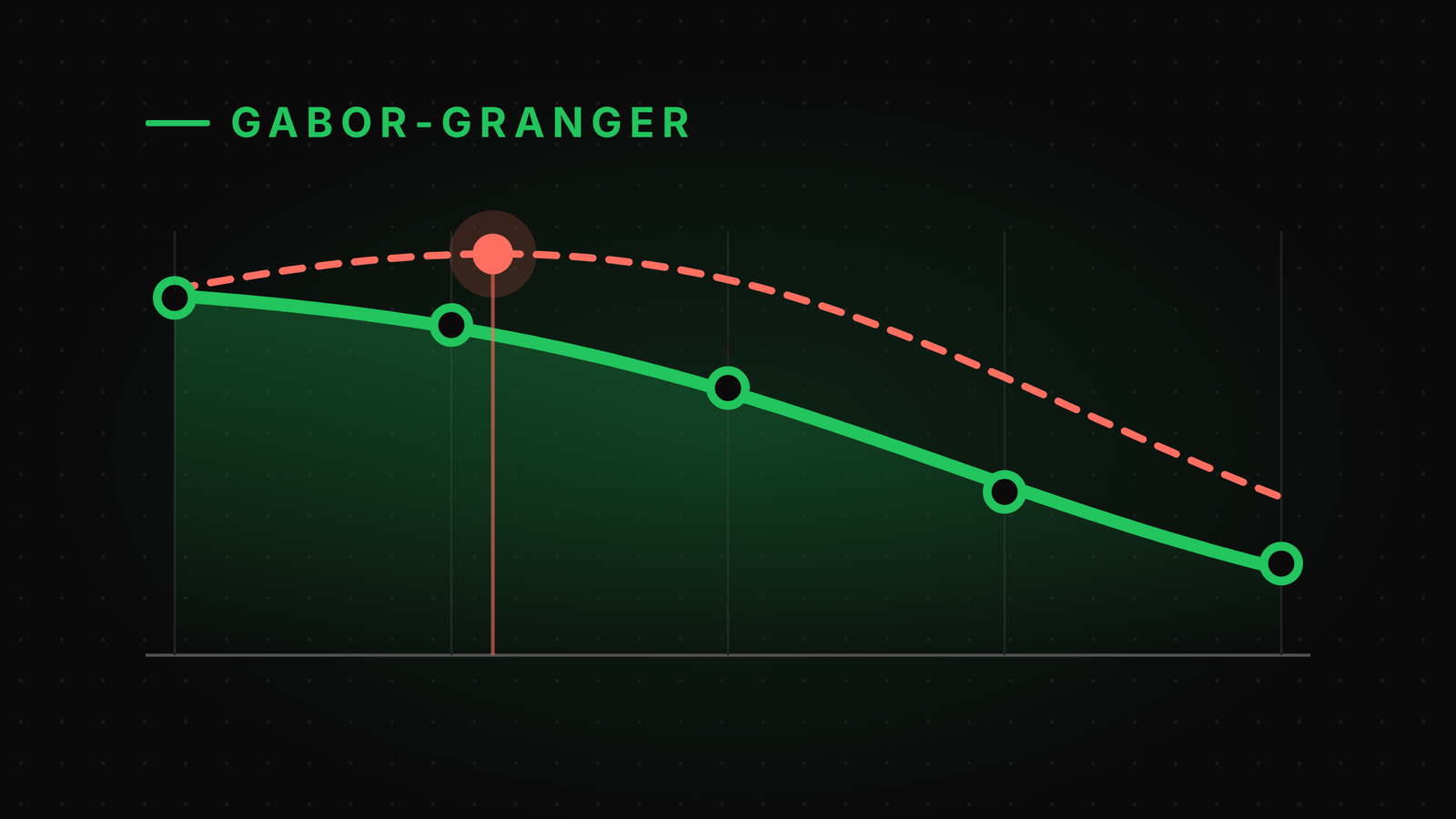
Gabor-Granger. Respondents state how likely they are to buy or switch at a ladder of plausible prices or discounts. The answers form a demand curve with an indicative revenue-maximising point. A study often needs 150 to 300 or more respondents depending on the ladder and segments. It is the best fit when price is the one thing that varies and nothing else materially drives the choice. In this map, it appears as a fallback in three places, where a simpler survey is acceptable under constraints. Seeing prices in sequence can anchor answers, and the ladder has to be built from commercially plausible prices or the output is unusable.
Gabor-Granger Pricing for a Pharma Launch: From Five Price Questions to a Defensible Launch Price
Traps the map is designed to avoid
Looking back over the projects where I have seen pricing research disappoint, the problems usually fall into a few patterns. The map is built to steer around each of them.
Surveying people who do not feel the price. Asking doctors in an insured market how likely they are to prescribe at a list price they never see produces numbers, but not decisions. The map only recommends direct price surveys where the respondent sees and acts on the price.
Treating stated preference as market share. A choice study tells you what respondents prefer under test conditions. Real share depends on access, availability, awareness and time. The method cards label outputs for what they are, and the map pairs choice studies with payer research where access is the gate.
Studying one country as if it were alone. In many markets, a price agreed in one country becomes the reference for others. The run-alongside lines make that link visible instead of leaving it to someone to remember.
Researching the wrong decision maker. In tender and protocol-driven markets, a study of individual prescribers can be well designed and entirely beside the point. The map asks who decides use before it recommends who to study.
Optimism about added benefit. Choosing the HTA path that matches the team's hopes, rather than the evidence, sets up a price the assessment will not support. The question wording pushes towards an honest answer.
What this map does not cover
A map is only useful if it is honest about its edges, so here are mine.
It does not cover cost-plus pricing. That is an internal calculation, not research. It does not cover contracting mechanisms such as outcomes-based agreements, confidential rebates or managed entry schemes, which shape the final net price after the methods here have set the target. And it does not build the integrated price, access and volume forecast that brings all of these results together. That forecast is where the outputs of these methods end up, but it is a different piece of work.
The sample sizes on the method cards are planning ranges for one market and one type of respondent. A real study should be sized for the precision it needs, the number of segments it compares and the countries it covers.
More broadly, this map reflects how I have learned to approach the choice over the years. It has been reviewed and pressure-tested several times, and I stand behind its logic. But pricing is a wide field, every market has its quirks, and no single map captures every situation. Some products will not fit neatly. Treat it as a way to think, not a rulebook.
Help make it better
If you have approached this differently, or there is a method, a market or a situation you would handle another way, I would genuinely like to hear about it. The aim is to make this map more useful for everyone who has to answer this question, and that works best with more minds on it.
[LINK: Contact or comment]
At what price?
We started with three words, and a wall of methods standing between the question and the answer.
The method was never the hard part. Choosing it is. And choosing it turns out to be less about the methods than about the product: what it is, who pays for it, who decides whether it gets used, and what the people choosing actually compare it with. Answer those honestly and the wall becomes a path.
So the next time someone asks you "at what price?", you will know where to start. Not with the method you know best, but with a few plain facts about the product in front of you. Follow them through the map, and the right way to find the answer will be waiting at the end.
In the posts that follow, I will take each method in turn: a real business scenario, the case for choosing it, the questions to ask, the analysis step by step and how to turn the result into a decision.
[LINK: Series index]