A worked case study with a downloadable dataset, an Excel workbook and a Python notebook
Part of the series: Healthcare Product Pricing Methods - [link to series overview post]
Contents
Introduction
The business scenario
Why Van Westendorp for this launch
Collecting the data
4.1 The questionnaire
4.2 What the respondent sees
4.3 Survey platforms that support the method
4.4 Notes for the survey programmer
4.5 Which markets, which physicians
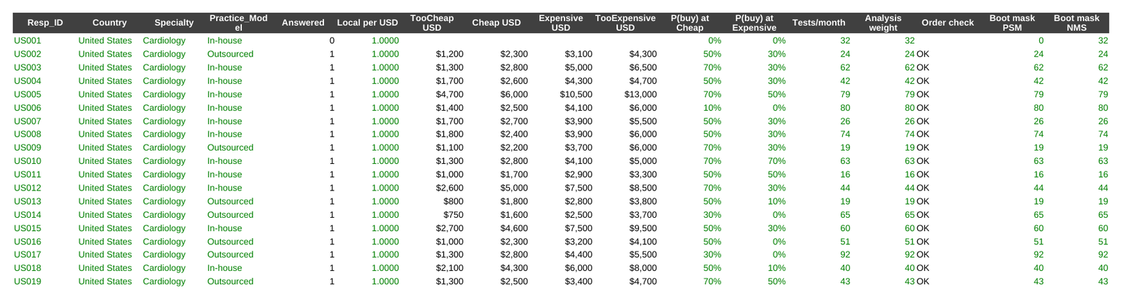
4.6 What the data looks like
Analysis, layer by layer (Excel tab | Python tab)
Reading the results
From results to a pricing strategy
Limitations and what comes next
Downloads: Van_Westendorp_ECG_Recorder.xlsx | Van_Westendorp_Analysis.ipynb | van_westendorp_analysis.py
1. Introduction
The opening post of this series set out five questions that decide which pricing research method fits a healthcare product. Is there already a product that does what yours does? How is it paid for? Does anything besides price differ? Who can you reach? What decision must the number support? [link to series overview post]
The previous post worked through Gabor-Granger, a method that needs a known reference price to build its price ladder on. This post covers the method you reach for when there is no such anchor: Peter van Westendorp's Price Sensitivity Meter (PSM). Van Westendorp, a Dutch economist, presented it at the ESOMAR congress in 1976.
The idea is simple. Instead of showing respondents prices, you ask them for prices. Each respondent answers four open questions: at what price would this product be so cheap you would doubt its quality, a bargain, getting expensive, and so expensive you would not consider it? Plot the four sets of answers as cumulative curves and the points where the curves cross mark out a range of prices the market finds acceptable.
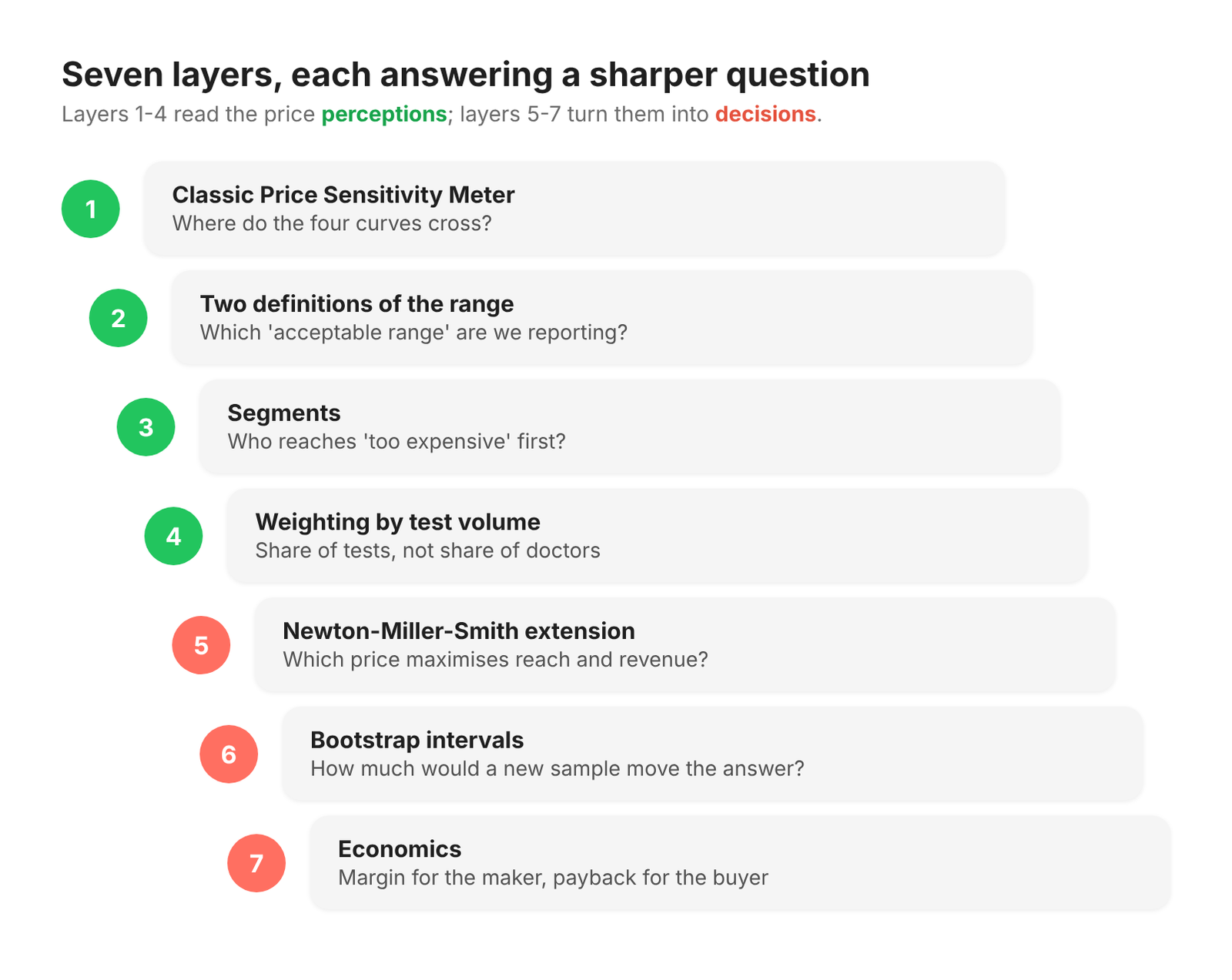
That is where most write-ups stop: four curves, four intersections, a range. In practice the classic chart is the start of the analysis, not the end. This post builds it up in seven layers, each one answering a sharper question:
The classic four curves and four price points.
Two definitions of the "acceptable range" - and why you must say which one you used.
The same curves split by segment - who reaches "too expensive" first?
Weighting each practice by its test volume - share of tests, not share of doctors.
The Newton-Miller-Smith extension - turning a range into reach and revenue.
Bootstrapping - how much would a different sample move the answer?
Economics - the maker's margin and the buyer's payback.
Every layer is shown twice, once in Excel and once in Python, from the same input file. Both reach the same numbers to the cent. Pick the tab that matches how you work; the business sections before and after the analysis are shared.
All data in this post is synthetic. It was generated to behave the way real physician pricing data behaves, but no real respondent, brand or company is involved.
2. The business scenario
The client. A mid-sized medical device company is preparing to launch Product X in its first four markets.
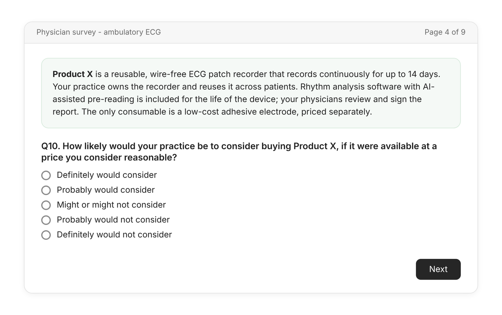
The product. Product X is a reusable, wire-free ECG patch recorder that records continuously for up to 14 days. The practice buys the recorder outright and reuses it across patients. Rhythm analysis software with AI-assisted pre-reading is included for the life of the device; the practice's physicians review and sign the report. The only consumable is a low-cost adhesive electrode, priced separately.
The market. Office-based practices that monitor heart rhythm today mostly do one of two things:
Own wired Holter recorders, typically for 24 to 48 hours of recording. As one public reference point, a UK NHS trust reported paying £2,219.63 per Holter monitor in a January 2026 freedom-of-information response, with analysis software licensed separately.
Outsource long-duration monitoring to a service that supplies a single-use patch and returns a report.
Product X sits between the two: a practice-owned recorder with long recording and built-in analysis. Physicians know roughly what a Holter costs and what a monitoring service charges per test, but there is no settled price for this kind of product.
The decision. Launch is 12 to 18 months away. The commercial team needs an acceptable price range per market for the business case and a defensible opening position for the first price discussions. The commercial director's question:
"There's nothing quite like this to price against. What would practices accept for one recorder - and where in that range should we open?"
The business objective. Set a launch price per market that practices will accept, that maximises revenue from early adopters, and that a practice can recover from its own per-test reimbursement in a reasonable time.
3. Why Van Westendorp for this launch
Run the five questions from the series framework against this scenario:
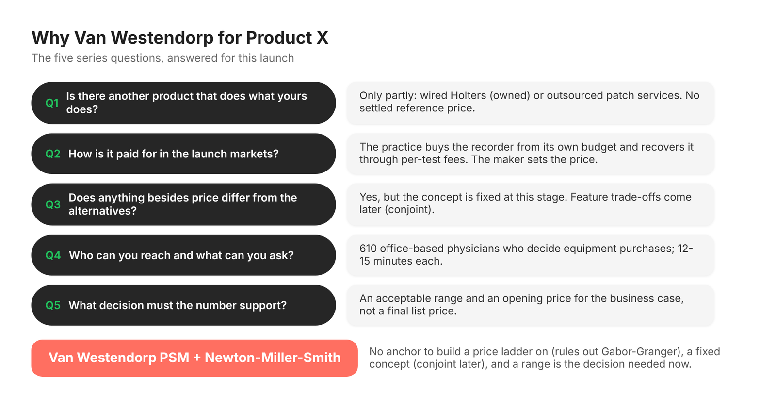
Is there already a product that does what yours does? Only partly. Respondents have loose anchors (the Holter they own, the per-test fee of a service) but no reference price for this product. That rules out Gabor-Granger in its usual form: to build a five-price ladder you would have to invent the prices, and whatever range you chose would anchor every answer. Van Westendorp lets respondents tell you where the range is.
How is it paid for in the launch markets? The practice buys the recorder from its own budget and recovers the cost through the fee it receives for each test. The manufacturer sets the device price, and the respondent is the buyer. Both conditions a price-perception study needs are met.
Does anything besides price differ from the alternatives? Yes - wear time, no wires, built-in analysis. But at this stage the concept is fixed; the team is not choosing between feature bundles. Once it is, a conjoint study (which measures how people trade features against price) becomes the better tool.
Who can you reach and what can you ask? 610 office-based physicians who decide or co-decide equipment purchases, at 12 to 15 minutes each. Four open price questions and two short follow-ups fit easily.
What decision must the number support? A range and an opening price for a business case, not the final list price. That is what Van Westendorp gives, especially once the Newton-Miller-Smith extension (Layer 5) adds a revenue view.
Why not the alternatives?
Gabor-Granger gives a demand curve at named prices, but needs those prices to be credible to respondents. Without a reference price, the ladder is guesswork.
Conjoint analysis is the stronger tool when features vary and when you need to model competitors. Sawtooth Software, for example, states that it considers choice-based conjoint the preferred technique for measuring price sensitivity, and positions Van Westendorp for cases where a simpler tool will do. This is one of those cases - for now.
Monadic price testing (each respondent sees one price) avoids anchoring between prices but needs a much larger sample, and again needs you to choose the prices.
Van Westendorp's home ground is early-stage pricing for a product without a clear anchor. That is exactly where Product X is.
4. Collecting the data
4.1 The questionnaire
The pricing questions sit inside a broader physician survey. The ones that matter here are:
Screening and profiling
S1. Country (United States, Germany, France, Japan).
S2. Specialty: Cardiology, or Primary care (general practice, family medicine, and in Japan general internal medicine clinics).
S3. Practice setting: office-based practice or clinic (hospital-employed physicians are screened out).
S4. Your role in buying diagnostic equipment for the practice: sole decision, shared decision, or no role (terminate).
S5. How many ambulatory ECG tests (Holter or longer recordings) does your practice run in a typical month?
S6. How does your practice provide ambulatory ECG today: mostly in-house with its own recorders, or mostly outsourced to a monitoring service?
Concept (Q9). A neutral, factual description of Product X (see 4.2). No price.
Consideration (Q10). "How likely would your practice be to consider buying Product X, if it were available at a price you consider reasonable?" Five-point scale from "definitely would consider" to "definitely would not consider".
Physicians who answer in the bottom two boxes skip the price questions. They are not deleted: they cannot tell us where the price range is, so they are left out of the four price curves, but they are kept as zero-probability buyers in the Newton-Miller-Smith reach calculation in Layer 5. Dropping them there would overstate reach.
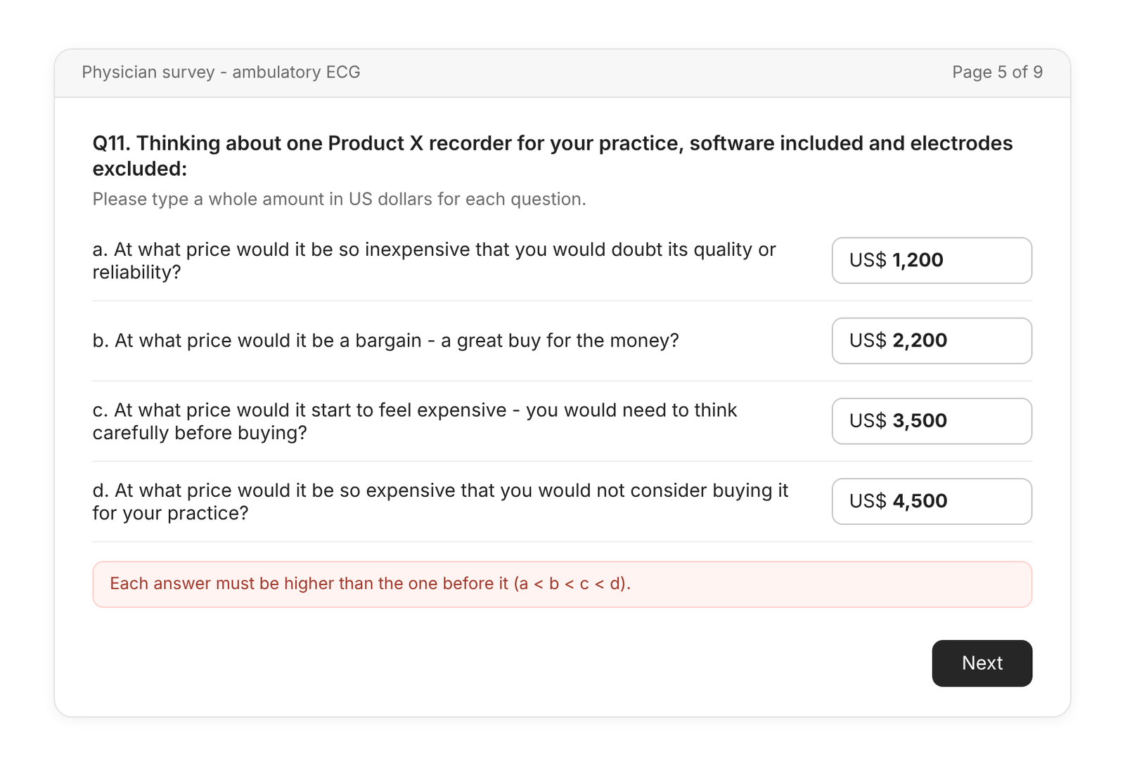
The four Van Westendorp questions (Q11a-d). "Thinking about one Product X recorder for your practice, software included and electrodes excluded:"
Q11a (too cheap). "At what price would it be so inexpensive that you would doubt its quality or reliability?"
Q11b (cheap / a bargain). "At what price would it be a bargain - a great buy for the money?"
Q11c (expensive). "At what price would it start to feel expensive - you would need to think carefully before buying?"
Q11d (too expensive). "At what price would it be so expensive that you would not consider buying it for your practice?"
Each answer is an open numeric entry in local currency.
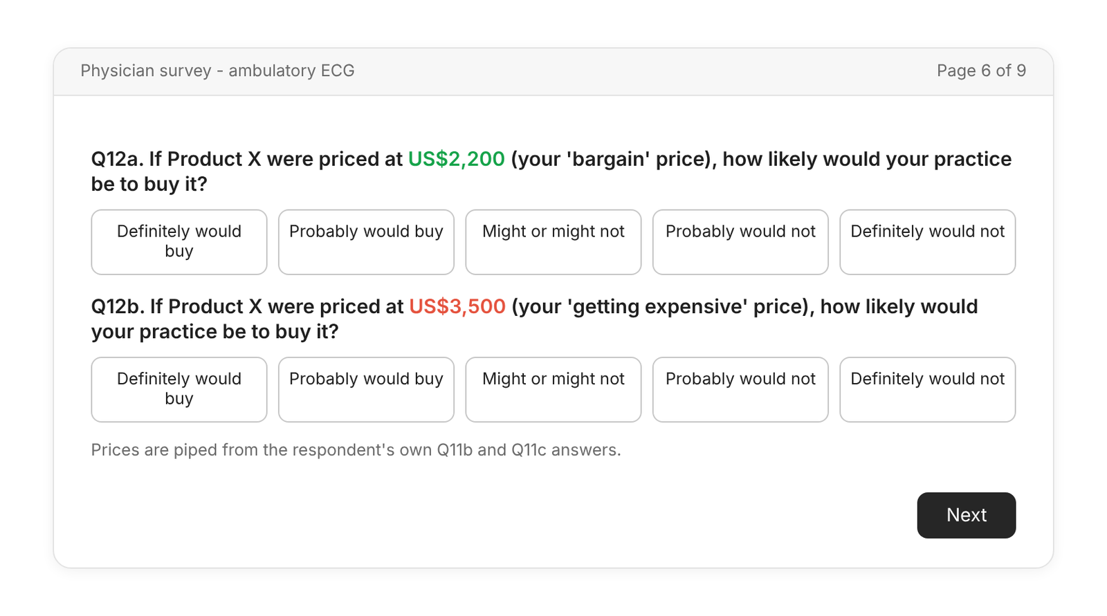
The two Newton-Miller-Smith questions (Q12a-b). "If Product X were priced at [respondent's Q11b price], how likely would your practice be to buy it?" and the same at the respondent's Q11c price. Five-point scale from "definitely would buy" to "definitely would not buy".
Four design choices are worth explaining.
Open entry, not a slider. A slider has end points, and the end points tell the respondent what range you have in mind. The whole point of Van Westendorp is to let the respondent supply the range.
The unit is spelled out. "One recorder, software included, electrodes excluded." Without it, one physician prices a single device, another a starter kit of five, a third adds a year of consumables, and the curves blur.
One fixed question order. There is no single industry-standard order: van Westendorp's original paper asked "cheap" first, and platforms such as Sawtooth Software and QuestionPro offer an option to reverse the order. What matters is that every respondent sees the same order. Here it runs from too cheap to too expensive.
Why the two extra questions. The four classic questions say nothing about whether anyone would actually buy. Asking purchase likelihood at each respondent's own "cheap" and "expensive" prices is the Newton-Miller-Smith extension, published by Newton, Miller and Smith at the American Marketing Association's Advanced Research Techniques Forum in 1993. It is what lets Layer 5 estimate reach and revenue.
4.2 What the respondent sees
The physician first reads the concept and answers the consideration question:
Then the four price questions on one screen, with an ordering check:
Then the two follow-ups, with the respondent's own prices piped in:
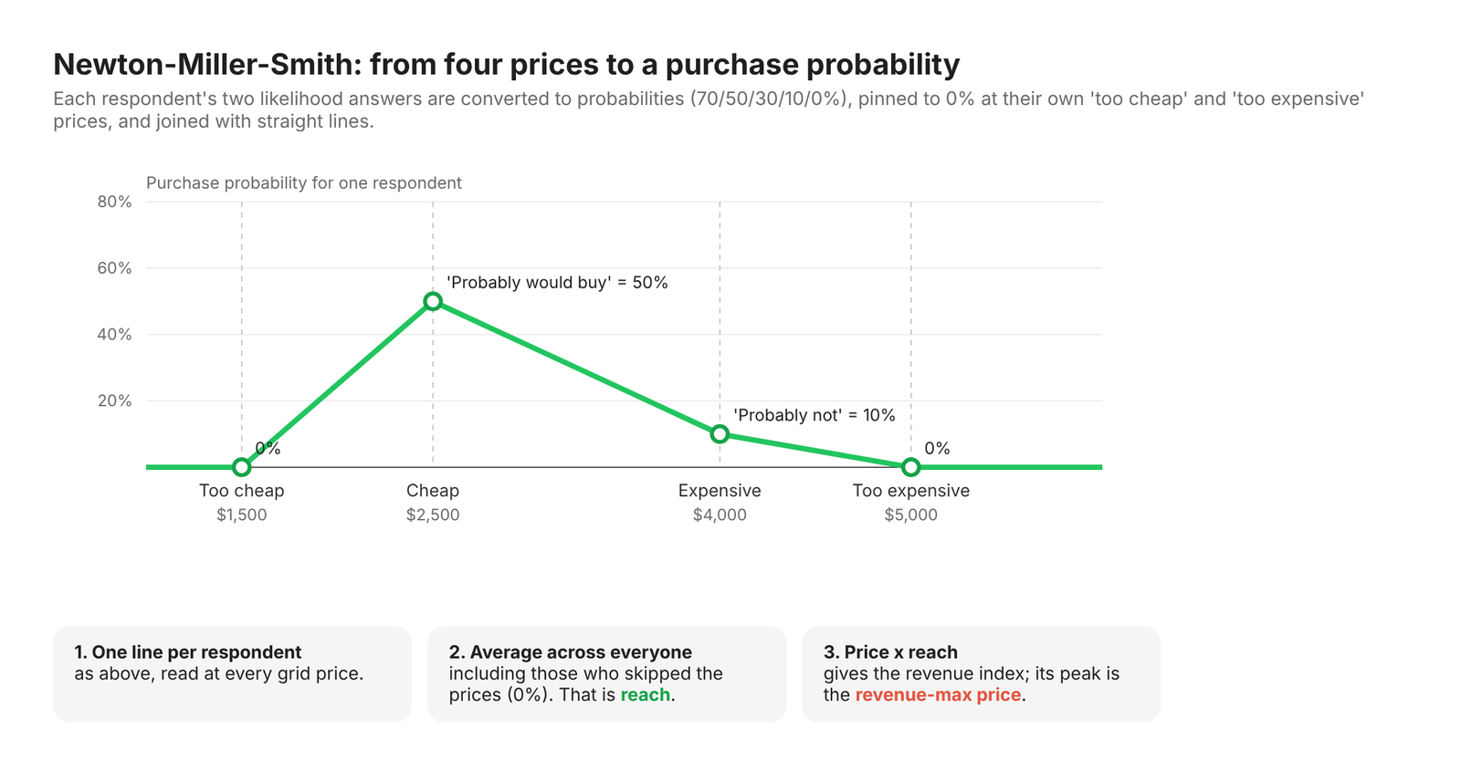
The diagram below shows how those six answers become one respondent's purchase-probability line in Layer 5:
4.3 Survey platforms that support the method
Van Westendorp is supported directly by most professional survey platforms:
Conjointly - dedicated Van Westendorp module; can add the two Newton-Miller-Smith purchase-likelihood questions after the four price questions.
Sawtooth Software - question-library template with the four questions followed by the two Newton-Miller-Smith questions, in numeric-entry and drop-down versions, plus a downloadable simulator.
Qualtrics - pre-built Van Westendorp pricing study in its marketplace, with survey and report.
SurveyMonkey - "Price Optimization (Van Westendorp)" solution; the standard questions are fixed, with currency and minimum/maximum price limits configurable.
QuestionPro - built-in Van Westendorp question type with a reverse-order option.
On any other platform the method needs only four numeric questions, an ordering check and two piped follow-ups, which every professional platform supports.
4.4 Notes for the survey programmer
[CAUTION BOX] Hand this list to whoever programs the survey. Each rule says what to do and why, so both the consultant passing it on and a less experienced programmer understand the intent.
Show the concept with no price anywhere on the page. Why: any number on screen becomes an anchor for all four answers.
Use open numeric boxes, not sliders or drop-down ranges. Why: the ends of a slider tell respondents what range you expect, which is the very thing you are trying to learn.
Ask the four questions in the same order for everyone, on one screen. Why: changing the order between respondents adds noise; one screen lets respondents see and keep their answers consistent.
Block illogical orderings with a hard check: too cheap < cheap < expensive < too expensive. Why: a respondent whose "bargain" price is higher than their "expensive" price cannot be placed on the curves. Most analyses would delete them afterwards; preventing it upstream keeps them in the sample.
Set sanity limits on each box. For example, nothing below 1% or above 20 times the typical price of a Holter recorder in that market. Why: catches typing errors (an extra zero) without suggesting a range.
Accept whole numbers in local currency and store the currency code. Why: respondents think in their own currency; the analyst converts at one fixed exchange rate.
Pipe Q11b and Q11c into Q12a and Q12b exactly as typed. Why: the follow-ups only make sense at the respondent's own prices; a rounded or converted figure would be a different question.
Route Q10 bottom-two-box respondents past Q11 and Q12, but keep them in the data file. Why: they count as non-buyers in reach; deleting them inflates every reach and revenue figure.
Set quotas by market and specialty, and flag thin cells. Aim for at least 30 completes per cell. Why: below that, a cell's curves are too jumpy to read with confidence.
Spell out the unit in every price question. Why: "per recorder, software included, electrodes excluded" stops respondents pricing different things.
4.5 Which markets, which physicians
Markets. Each candidate market was checked against one test: does the manufacturer have genuine discretion over the price, and does that price reach the respondent's own buying decision?
| Market | Include? | Reason |
|---|---|---|
| United States | Yes | Practices buy their own equipment. Medicare pays $279.23 for a long-term recording (CPT 93241, more than 48 hours up to 7 days, 2026 national average) against $70.48 for a standard Holter of up to 48 hours (CPT 93224). |
| Germany | Yes | Office-based doctors buy their own recorders and need regional approval to bill ambulatory ECG to statutory insurance. The statutory fee for GPs is about €17 per test (EBM 03322 + 03241); specialists bill it inside broader flat-rate complexes; private patients pay more (GOÄ 659). |
| France | Yes | Office-based cardiologists buy their own equipment and bill a fixed tariff of €77.01 per recording of at least 24 hours (CCAM DEQP005). |
| Japan | Yes | Clinics buy the recorder as equipment; the national fee schedule pays per test (D210: 1,730 points for 8 hours or more, plus a 320-point add-on for recordings of 7 days or more introduced in the June 2026 revision). |
| United Kingdom | No | NHS ambulatory ECG is largely run by hospital and community diagnostic services on GP referral, and recorders are bought by NHS trusts, so the physician respondent is not the buyer. |
| Italy, Spain | Not fielded | Not scoped for this wave. Check whether office-based physicians buy their own recorders before adding them. |
Unlike the Gabor-Granger post, Japan and France are in. That post priced a drug, whose price is set or negotiated by government in those markets. Here the regulated number is the per-test fee, not the price of the device, so the manufacturer keeps its pricing discretion. The market test has to be rerun for every method and product.
Physicians. Two segments: cardiology and primary care.
France: cardiology only. We expect office-based cardiologists to be the main buyers of ambulatory ECG equipment in France. A real study should confirm GP ownership with a screener before excluding them.
Japan: only 40 cardiologists, of whom 34 answered the price questions. Readable, but close to the 30 minimum.
| Market | Cardiology | Primary care | Total | Skipped price questions (Q10 = 1-2) |
|---|---|---|---|---|
| United States | 110 | 100 | 210 | 24 |
| Germany | 70 | 90 | 160 | 15 |
| France | 100 | - | 100 | 11 |
| Japan | 40 | 100 | 140 | 20 |
| Total | 320 | 290 | 610 | 70 |
A second, diagnostic cut is the practice model: in-house (owns Holter recorders today) versus outsourced. The two groups are likely to anchor on different things - the price of the equipment they already own, versus a per-test service fee. France's outsourced group is small (15 answered the price questions) and is read as directional only.
As in the Gabor-Granger post, segmentation here is diagnostic, not prescriptive: it shows which group resists first as price rises. A company cannot sell the same recorder at one price to cardiologists and another to GPs in the same market. One market, one price.
Currency. Respondents typed prices in their own currency (US dollars, euros, yen). All analysis is in US dollars at the European Central Bank reference rates of 1 July 2026 (USD 1.1383 and JPY 185.21 per euro): a straight conversion with no purchasing-power adjustment.
4.6 What the data looks like
One row per respondent, laid out the way a survey export would be. Prices are in local currency, exactly as typed.
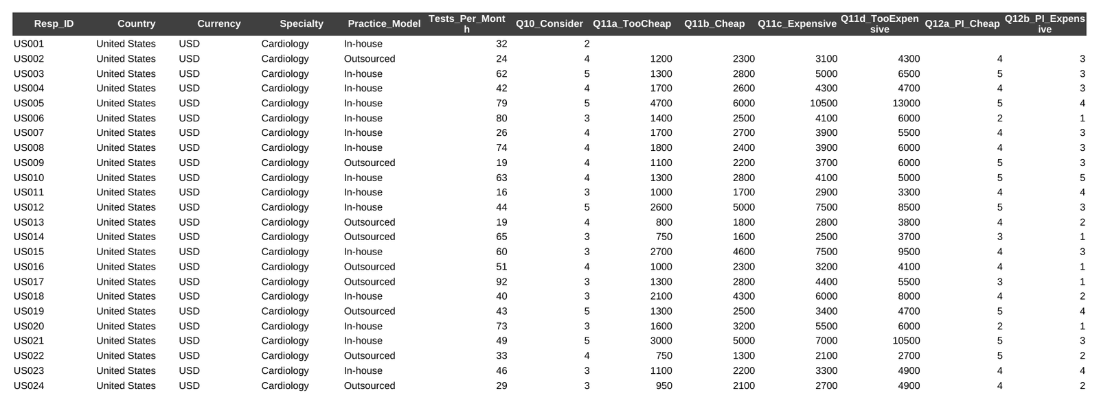
| Column | Meaning |
|---|---|
| Resp_ID | Respondent identifier |
| Country, Currency | Market and the currency the respondent answered in |
| Specialty | Cardiology or Primary care |
| Practice_Model | In-house (owns Holter recorders) or Outsourced |
| Tests_Per_Month | Ambulatory ECG tests the practice runs in a typical month |
| Q10_Consider | Consideration, 5 = definitely would consider … 1 = definitely would not |
| Q11a … Q11d | Too cheap, cheap, expensive, too expensive prices (local currency); blank = skipped |
| Q12a, Q12b | Purchase likelihood at own cheap and own expensive price, 5 = definitely … 1 = definitely not |
Notice how respondents type round numbers: $2,500, €1,500, ¥300,000. That is realistic, and it matters later: the curves move in steps, and the bootstrap in Layer 6 inherits that lumpiness.
Download the workbook: [Van_Westendorp_ECG_Recorder.xlsx]
5. Analysis, layer by layer
[TAB: EXCEL] and [TAB: PYTHON] below hold the same seven layers. Each tab is self-contained.
[TAB: EXCEL]
How the workbook is organised
| Sheet | Purpose |
|---|---|
| README | Sheet guide, colour code, curve conventions |
| Dashboard | Pick a market: range, price points, NMS optima, interval, payback; all-markets table |
| Study_Design | Markets, currencies, exchange rates, per-test fees, achieved sample |
| Raw_Data | One row per respondent, local currency |
| Levers | Analyst choices: NMS calibration, headline weighting, minimum base, tests per recorder, unit cost |
| Prep | Helper columns: USD prices, purchase probabilities, analysis weight, order check |
| Curves_All | The four cumulative curves for every market × segment cell on one price grid |
| Points | The six intersections for every cell |
| Step1_PSM … Step7_Economics | One sheet per analysis layer |
| NMS_Grid | Purchase probability for every respondent at every grid price |
| Boot_OPP, Boot_NMS, Boot_Weights | Bootstrap working grids and the stored resampling weights |
Colour code: blue text on yellow = inputs you may change; black = formulas; green text = links to another sheet; green fill = key results. Every number is a live formula, so changing a lever recalculates the whole chain. The workbook holds about 166,000 formulas, so allow a few seconds after a change.
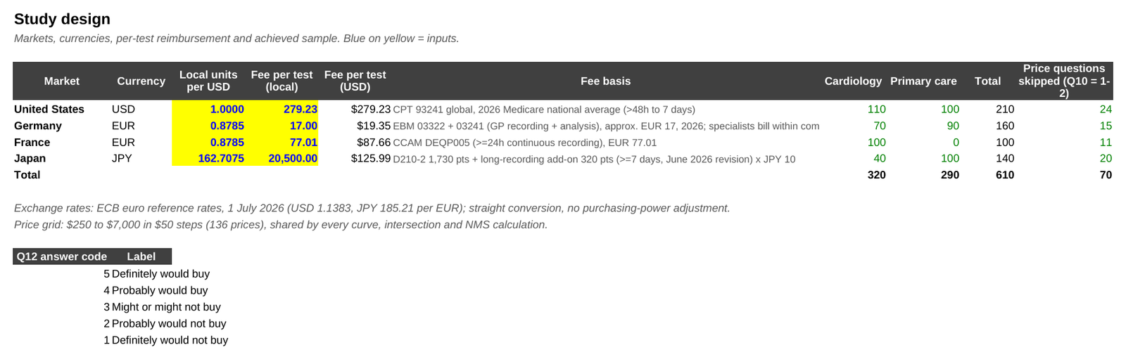
Excel Step 0 - Set the levers and prepare the data
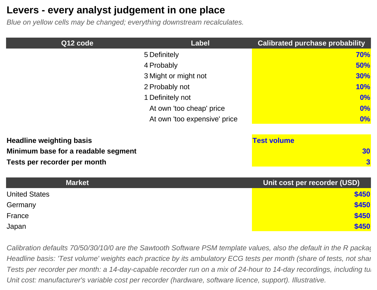
The Levers sheet holds every judgement call:
NMS calibration. The purchase probability assumed for each answer to Q12: 70% for "definitely", 50% "probably", 30% "might or might not", 10% "probably not", 0% "definitely not". These are the defaults of Sawtooth Software's Excel template for the method, also used as defaults by the R package pricesensitivitymeter. Like the 100/50 weighting in the Gabor-Granger post, they discount what people say they will do.
Probability at the respondent's own "too cheap" and "too expensive" prices. 0%, following van Westendorp's logic: at "too cheap" the respondent doubts the quality, at "too expensive" they will not consider it.
Headline weighting basis. "Physician" (everyone counts once) or "Test volume" (each practice counts in proportion to its monthly tests). Used from Layer 4.
Minimum base. Cells below 30 respondents are flagged as directional.
Tests per recorder per month and unit cost. Used in Layer 7.
The Prep sheet converts every price to US dollars and every Q12 answer to a probability, so later sheets never hard-code a rate or a percentage:
Prep!G2  =IF(E2=1,Raw_Data!H2/F2,"")
Prep!K2  =IF(E2=1,INDEX(Levers!$C$5:$C$9,MATCH(Raw_Data!L2,Levers!$A$5:$A$9,0)),0)
E is 1 if the respondent answered the price questions, F is the market's exchange rate. Prep also runs the order check (too cheap < cheap < expensive < too expensive) on every row; all 540 rows pass.
Excel Step 1 - The classic Price Sensitivity Meter
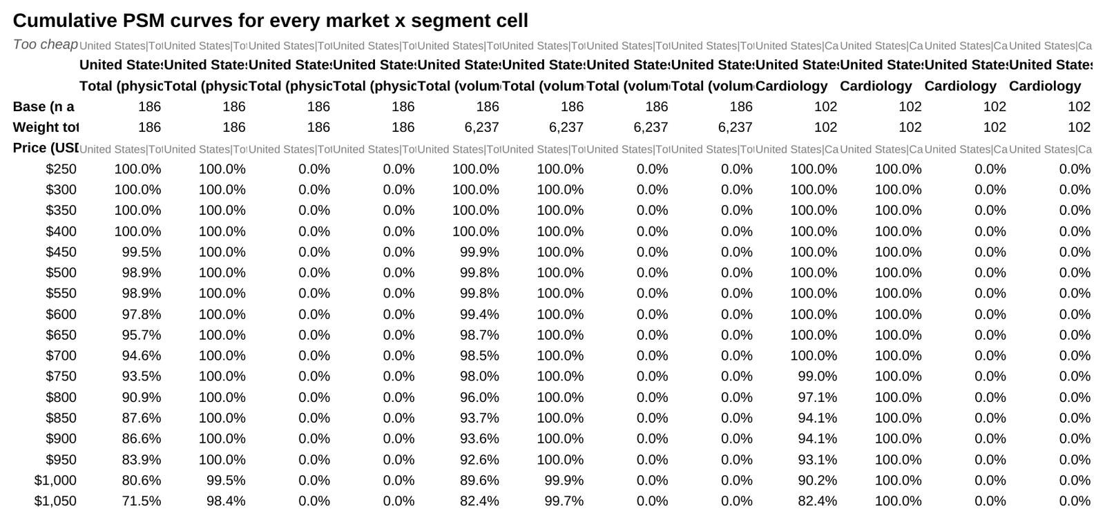
The curves. Curves_All evaluates every curve on one shared price grid: $250 to $7,000 in $50 steps, 136 prices. For each grid price it asks four questions of the respondents in a cell:
Too cheap: what share named a "too cheap" price at or above this price? (At this price, they would doubt the quality.)
Cheap: what share named a "bargain" price at or above this price?
Expensive: what share named an "expensive" price at or below this price? (At this price, it already feels expensive to them.)
Too expensive: what share named a "too expensive" price at or below this price?
The first two are "inverted" cumulative curves that fall as price rises; the last two rise. In the formula, the comparison does the work:
Curves_All!B8  =SUMPRODUCT((Prep!$B$2:$B$611=B$3)*1*Prep!$E$2:$E$611*(Prep!$G$2:$G$611>=$A8))/B$6
Curves_All!E8  =SUMPRODUCT((Prep!$B$2:$B$611=B$3)*1*Prep!$E$2:$E$611*(Prep!$J$2:$J$611<=$A8))/E$6
Read the first as: among respondents in this market (B3) who answered (column E), count those whose too-cheap price (G) is at or above the grid price (A8), then divide by the cell's total (B6). The *1 is where a segment condition goes in segment cells (for example (Prep!$C$2:$C$611="Cardiology")).
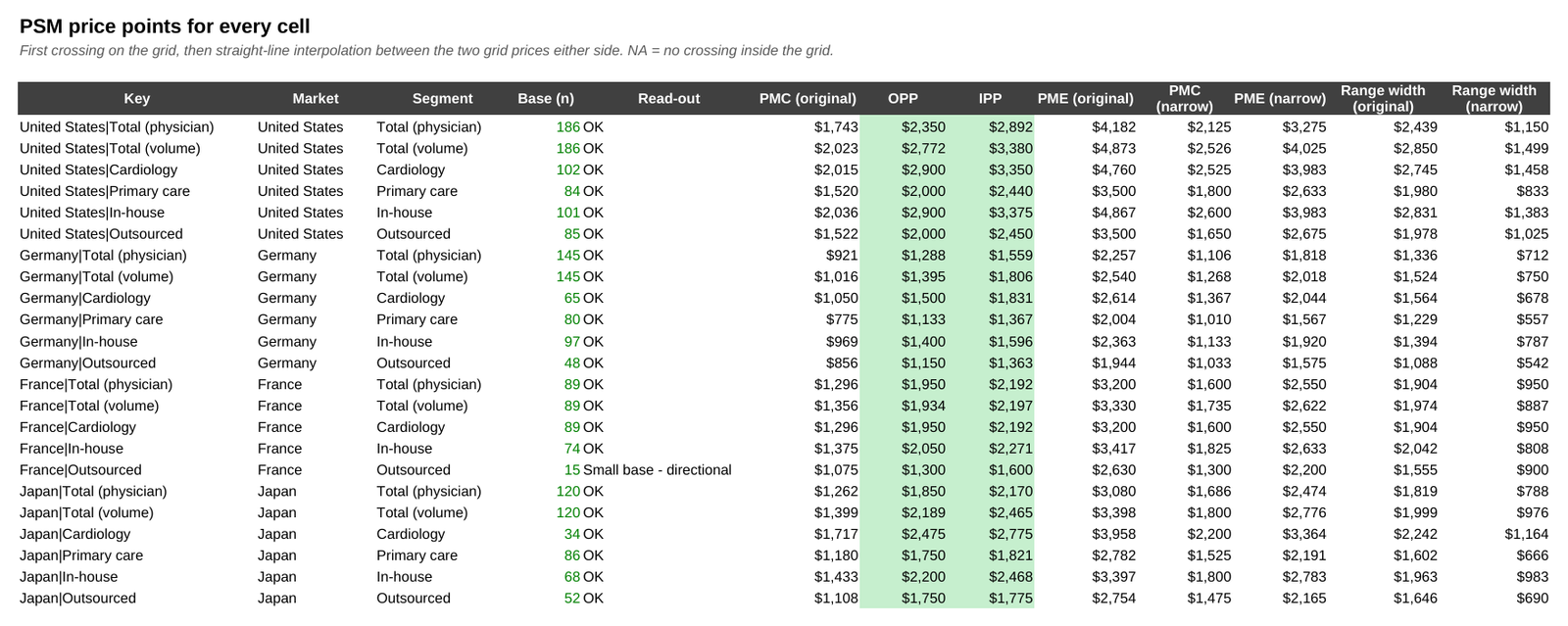
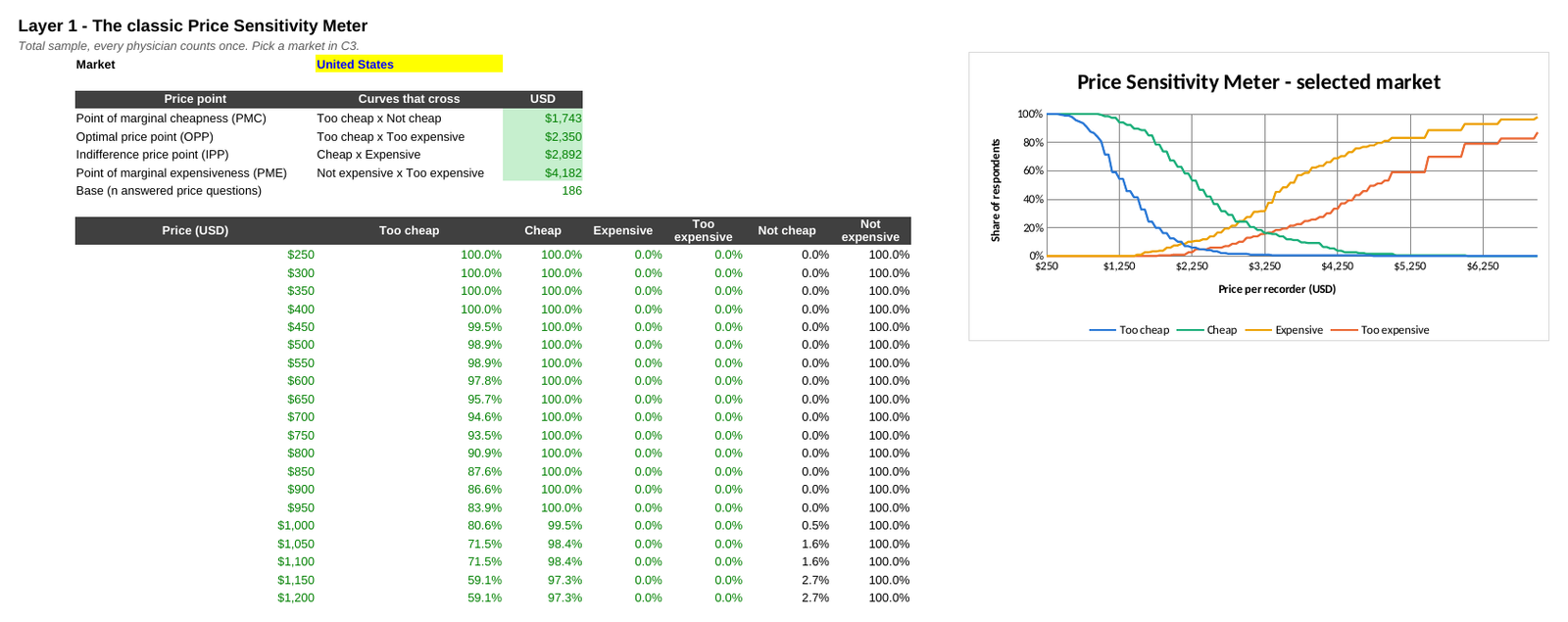
The four price points. Each is where two curves cross:
Point of marginal cheapness (PMC): too cheap crosses not cheap (1 − cheap). Below it, more people think the price is too cheap than think it is not cheap. The floor of the acceptable range.
Optimal price point (OPP): too cheap crosses too expensive. Van Westendorp argued that resistance to the price is particularly low here.
Indifference price point (IPP): cheap crosses expensive - as many find the price cheap as expensive. Van Westendorp read it as the median price paid in the market, or the price of an important market leader.
Point of marginal expensiveness (PME): not expensive (1 − expensive) crosses too expensive. The ceiling of the acceptable range.
Finding a crossing without array formulas. The difference between two crossing curves only ever falls as price rises (an inverted curve minus a rising one). So the number of grid prices where the difference is still positive tells you exactly where the crossing is:
Points!O5 =SUMPRODUCT(--((Curves_All!$B$8:$B$143-(1-Curves_All!$C$8:$C$143))>0.000000001))That gives k, the last grid price before the crossing. The price point is then a straight-line interpolation between grid price k and k + 1: price_k + $50 × d_k / (d_k − d_k+1), where d is the gap between the curves. The tiny tolerance stops an exact tie at a grid price being read as a crossing by rounding noise. If the curves never cross inside the grid, the cell shows NA.
| United States, physician-level | USD |
|---|---|
| Point of marginal cheapness (PMC) | $1,743 |
| Optimal price point (OPP) | $2,350 |
| Indifference price point (IPP) | $2,892 |
| Point of marginal expensiveness (PME) | $4,182 |
| Base (answered the price questions) | 186 |
In plain words: US physicians, counted one each, find a recorder acceptable somewhere between about $1,740 and $4,180, with the four curves balancing out between $2,350 and $2,900.
Excel Step 2 - Two definitions of the acceptable range
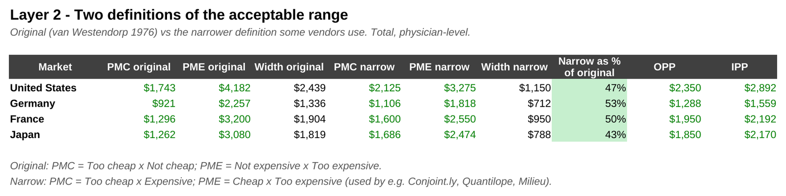
Here is a detail most write-ups skip. There are two definitions of the acceptable range in use:
Original (van Westendorp's paper): PMC = too cheap × not cheap; PME = not expensive × too expensive. As in Step 1.
Narrow (used by some vendors, for example Conjoint.ly, Quantilope and Milieu): PMC = too cheap × expensive; PME = cheap × too expensive.
Both are on the Points sheet; Step 2 sets them side by side:
| Total, physician-level | Original range | Narrow range | Narrow as % of original |
|---|---|---|---|
| United States | $1,743 - $4,182 | $2,125 - $3,275 | 47% |
| Germany | $921 - $2,257 | $1,106 - $1,818 | 53% |
| France | $1,296 - $3,200 | $1,600 - $2,550 | 50% |
| Japan | $1,262 - $3,080 | $1,686 - $2,474 | 43% |
The narrow range is roughly half as wide. Two agencies could run the identical study, report "the acceptable range" and differ by $900 at the top end in the US. Neither is wrong; failing to say which one you used is. This post reports both from here on.
Excel Step 3 - Segments: who reaches "too expensive" first?
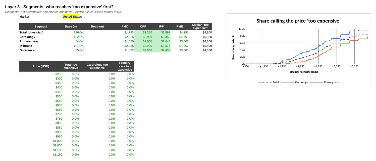
Same curves, now per segment. Step 3 pulls the price points for the selected market from Points and charts the "too expensive" curve by specialty: the share who would not consider the recorder at each price.
| United States, physician-level | n | OPP | IPP | PME |
|---|---|---|---|---|
| Cardiology | 102 | $2,900 | $3,350 | $4,760 |
| Primary care | 84 | $2,000 | $2,440 | $3,500 |
| In-house | 101 | $2,900 | $3,375 | $4,867 |
| Outsourced | 85 | $2,000 | $2,450 | $3,500 |
In the US, cardiologists and practices that already own Holter recorders place the OPP and IPP about $900 higher than GPs and practices that outsource. The same ordering holds in every market (Germany: cardiology OPP $1,500 vs primary care $1,133; Japan: $2,475 vs $1,750). The two cuts overlap - cardiologists are more likely to run monitoring in-house - so they are two views of the same divide, not two independent effects.
The sheet also shows each segment's median "too expensive" price: the first grid price at which half the segment would no longer consider the product.
Step3_Segments!I6  =IFERROR(INDEX(Curves_All!$A$8:$A$143,SUMPRODUCT(--(INDEX(Curves_All!$B$8:$CO$143,0,
                     MATCH($C$3&"|Total (physician)|TE",Curves_All!$B$7:$CO$7,0))<0.5))+1),NA())
Excel Step 4 - From share of doctors to share of tests
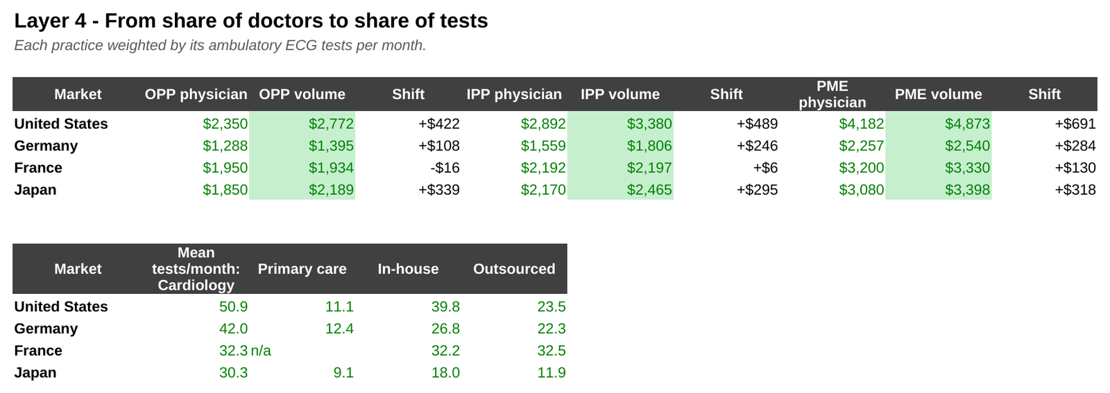
So far each physician counts once. But a US cardiology practice in this sample runs about 51 ambulatory ECG tests a month; a primary-care practice about 11. The big users will buy more recorders and matter more to the launch. Weighting each respondent by tests per month answers a different question: what share of tests, rather than of doctors, sits in the acceptable range?
In the formula, the weight simply multiplies in (column M is tests per month):
Curves_All!F8 =SUMPRODUCT((Prep!$B$2:$B$611=F$3)*1*Prep!$E$2:$E$611*Prep!$M$2:$M$611*(Prep!$G$2:$G$611>=$A8))/F$6| Total | OPP physician | OPP test-weighted | Shift | IPP physician | IPP test-weighted | Shift |
|---|---|---|---|---|---|---|
| United States | $2,350 | $2,772 | +$422 | $2,892 | $3,380 | +$489 |
| Germany | $1,288 | $1,395 | +$108 | $1,559 | $1,806 | +$246 |
| France | $1,950 | $1,934 | -$16 | $2,192 | $2,197 | +$6 |
| Japan | $1,850 | $2,189 | +$339 | $2,170 | $2,465 | +$295 |
In the US and Japan, weighting moves every price point up by $300 to $500, because the least price-sensitive respondents are also the heaviest users. France barely moves: its sample is all cardiologists, so there is no specialty mix to shift. This is the basis used for the headline numbers from here on (Levers C13 = "Test volume").
Excel Step 5 - Newton-Miller-Smith: from a range to reach and revenue
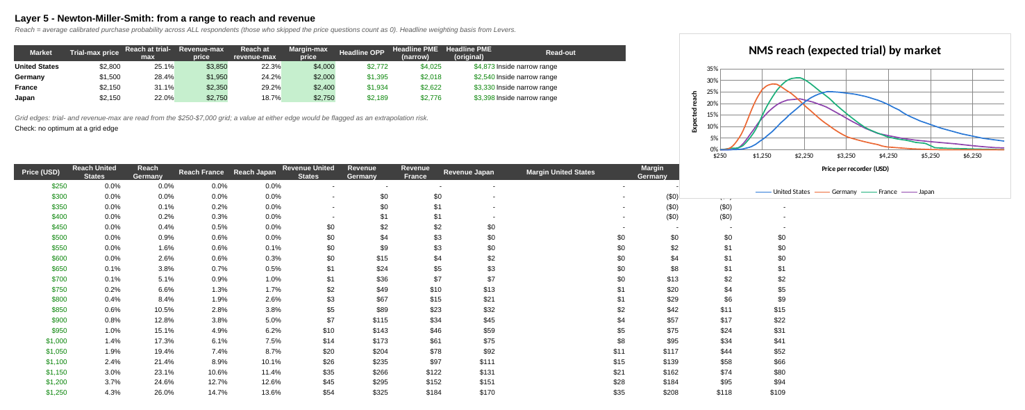
A range is not a price. The four classic curves describe how prices are perceived; they do not say how many practices would buy at each price, so they cannot locate a revenue-maximising price. The Newton-Miller-Smith extension adds that.
One line per respondent. NMS_Grid holds a purchase probability for every respondent at every grid price. At the respondent's own "cheap" price it is the calibrated value of their Q12a answer; at their "expensive" price, the value of their Q12b answer; at their "too cheap" and "too expensive" prices, 0%. Between those four prices it runs in straight lines, and outside them it stays at 0%:
NMS_Grid!B2  =IF(Prep!$E2=0,0,IF(B$1<=Prep!$G2,Levers!$C$10,IF(B$1>=Prep!$J2,Levers!$C$11,
               IF(B$1<=Prep!$H2,Levers!$C$10+(Prep!$K2-Levers!$C$10)*(B$1-Prep!$G2)/(Prep!$H2-Prep!$G2),
               IF(B$1<=Prep!$I2,Prep!$K2+(Prep!$L2-Prep!$K2)*(B$1-Prep!$H2)/(Prep!$I2-Prep!$H2),
               Prep!$L2+(Levers!$C$11-Prep!$L2)*(B$1-Prep!$I2)/(Prep!$J2-Prep!$I2))))))
Respondents who skipped the price questions get 0% everywhere (the first IF).
Reach. Expected reach at a price is the weighted average of those probabilities across all respondents in the market:
Step5_NMS!B16  =SUMPRODUCT((Prep!$B$2:$B$611="United States")*Prep!$N$2:$N$611*NMS_Grid!B$2:B$611)
                /SUMPRODUCT((Prep!$B$2:$B$611="United States")*Prep!$N$2:$N$611)
Column N is the analysis weight from Levers (tests per month here). Revenue index is price × reach, and margin index is (price − unit cost) × reach. Neither is a revenue forecast; they compare prices on one scale. The optima are read with INDEX/MATCH on MAX:
Step5_NMS!D5 =INDEX($A$16:$A$151,MATCH(MAX(F16:F151),F16:F151,0))| Test-weighted | Trial-max price | Reach there | Revenue-max price | Reach there | OPP | Narrow PME |
|---|---|---|---|---|---|---|
| United States | $2,800 | 25.1% | $3,850 | 22.3% | $2,772 | $4,025 |
| Germany | $1,500 | 28.4% | $1,950 | 24.2% | $1,395 | $2,018 |
| France | $2,150 | 31.1% | $2,350 | 29.2% | $1,934 | $2,622 |
| Japan | $2,150 | 22.0% | $2,750 | 18.7% | $2,189 | $2,776 |
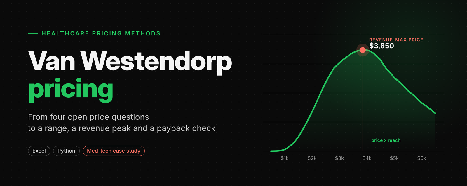
Two readings matter. First, the price that maximises reach (trial) sits close to the OPP: the OPP is a good guide to the price fewest people object to. Second, the revenue-maximising price sits well above both, 22% to 40% above the OPP. Above the trial-max, reach falls slowly at first, so each extra dollar of price is worth more than the few buyers it costs. In every market the revenue-max stays inside the narrow range, but in Japan only just ($2,750 against $2,776). That is not guaranteed: the documentation of the R package pricesensitivitymeter notes that the NMS optimum can fall above the upper end of the narrow range, which is one more reason to say which range you report.
The weighting choice from Layer 4 matters even more here. On a physician-level basis the US revenue-max would be $2,900, not $3,850; Germany $1,600 instead of $1,950; Japan $2,350 instead of $2,750. France, with its single specialty, moves by only $50.
The sheet also checks that no optimum sits at either end of the grid, which would mean the answer lies outside the prices we can read.
Excel Step 6 - How sure are we? A bootstrap interval
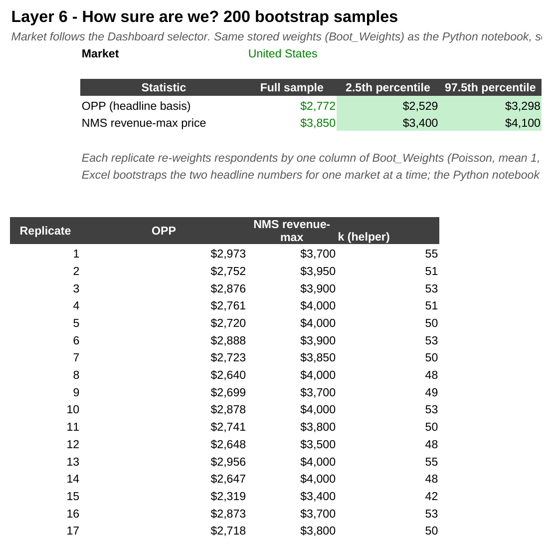
$3,850 and $2,772 come from one sample of 210 US physicians. A different sample would give different answers. The bootstrap estimates how different.
The idea. Create many alternative samples from the one we have by resampling respondents, re-run the calculation on each, and see how much the answer moves. The middle 95% of the results is the interval.
How it is done here. The Boot_Weights sheet holds 200 columns of whole numbers, one per respondent, averaging 1 (a "Poisson bootstrap", generated once with a fixed seed and stored). Each column is one alternative sample: weight 2 counts a respondent twice, 0 leaves them out. The Python notebook reads the same sheet, so both tools use identical samples.
For the market chosen on the Dashboard, Boot_OPP and Boot_NMS repeat Layers 1 and 5 for each of the 200 samples. One shortcut keeps this light: the OPP only needs the sign and ratio of the gap between the two curves, not the shares themselves, so the gap is left unscaled:
Boot_OPP!B3  =SUMPRODUCT(Boot_Weights!$B$2:$B$611,Prep!$P$2:$P$611,(Prep!$G$2:$G$611>=B$2)-(Prep!$J$2:$J$611<=B$2))
Boot_NMS!B3  =B$2*SUMPRODUCT(Boot_Weights!$B$2:$B$611,Prep!$Q$2:$Q$611,NMS_Grid!B$2:B$611)
               /SUMPRODUCT(Boot_Weights!$B$2:$B$611,Prep!$Q$2:$Q$611)
Prep columns P and Q hold the selected-market mask times the analysis weight (P also excludes respondents who skipped the prices). Step 6 then finds each replicate's OPP with the same crossing rule as Step 1, its revenue-max with MATCH on MAX, and reads the 2.5th and 97.5th percentiles with PERCENTILE.
| United States, test-weighted | Estimate | 95% interval |
|---|---|---|
| Optimal price point | $2,772 | $2,529 - $3,298 |
| NMS revenue-max price | $3,850 | $3,400 - $4,100 |
Excel bootstraps the two headline numbers for one market at a time; the Python tab runs all four price points and the revenue-max for all markets on the same draws, and its US figures match these exactly.
Excel Step 7 - Economics: the maker's margin and the buyer's payback
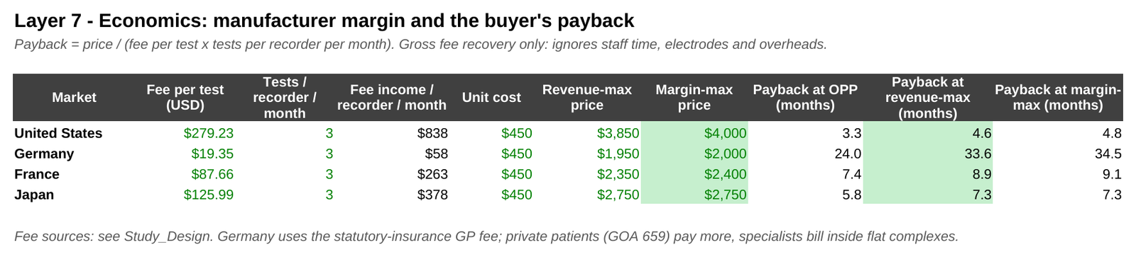
Margin. Step 5 already computes (price − unit cost) × reach. At an illustrative unit cost of $450 per recorder, the margin-max price sits $0 to $150 above the revenue-max ($4,000 against $3,850 in the US). Useful as the top of a corridor, not as a separate answer.
Payback - the step a perception study cannot take on its own. A practice buys the recorder to earn per-test fees. How many months of fees does it take to recover the price?
Payback (months) = price ÷ (fee per test × tests per recorder per month)
Step7_Economics!I5  =F5/D5
The fee per test comes from Study_Design (the sourced fee schedules in 4.5), and tests per recorder per month is a lever (default 3: a mix of 1-day to 14-day recordings, including turnaround). This is gross fee recovery only: it ignores staff time, electrodes and overheads, so real payback is longer.
| Market | Fee per test (USD) | Fee income per recorder per month | Payback at OPP | Payback at revenue-max |
|---|---|---|---|---|
| United States | $279.23 | $838 | 3.3 months | 4.6 months |
| Germany | $19.35 | $58 | 24.0 months | 33.6 months |
| France | $87.66 | $263 | 7.4 months | 8.9 months |
| Japan | $125.99 | $378 | 5.8 months | 7.3 months |
Germany stands out. Its price range is already the lowest of the four, but even there, a recorder bought at the revenue-max price takes almost three years of statutory fees to pay back. Price perceptions alone would never have shown this.
Excel - The dashboard
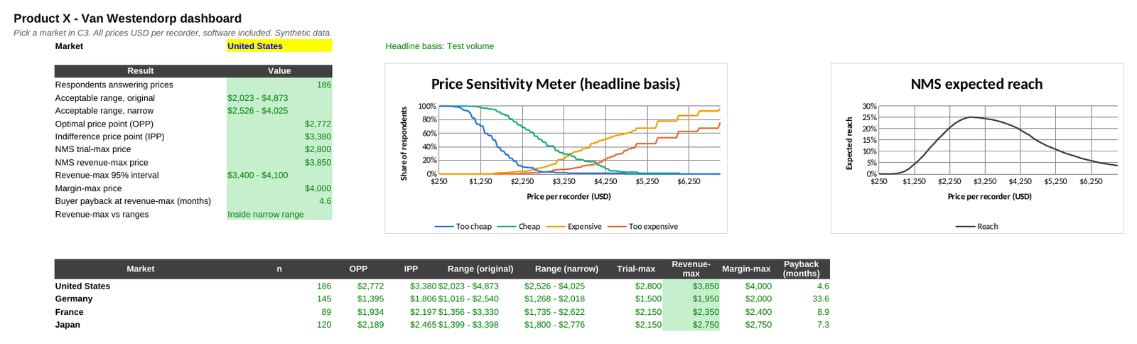
The Dashboard pulls everything together for the market chosen in C3: both ranges, OPP, IPP, the NMS optima, the bootstrap interval, the margin-max price and the payback, plus the classic curves and the reach curve. A table underneath compares all four markets on the headline basis.
[TAB: PYTHON]
The notebook reads the same Excel file - Raw_Data, Study_Design, Levers and Boot_Weights - so a lever changed in Excel flows into Python too. Code is shown in full at every step; output is shown where a step produces something to look at.
Requirements: pandas, numpy, matplotlib, openpyxl.
Python Step 0 - Libraries and settings
import numpy as np
import pandas as pd
import matplotlib.pyplot as plt
from matplotlib.ticker import PercentFormatter, StrMethodFormatter

pd.set_option("display.width", 160)
pd.set_option("display.max_columns", 20)

FILE = "Van_Westendorp_ECG_Recorder.xlsx"
GRID = np.arange(250, 7001, 50.0)            # shared USD price grid, same as the workbook
MARKETS = ["United States", "Germany", "France", "Japan"]
Q = {"TC": "Q11a_TooCheap", "C": "Q11b_Cheap", "E": "Q11c_Expensive", "TE": "Q11d_TooExpensive"}
CURVE_COLORS = {"Too cheap": "#2a78d6", "Cheap": "#1baf7a", "Expensive": "#eda100", "Too expensive": "#eb6834"}
SEG_COLORS = {"Total": "#404040", "Primary care": "#2a78d6", "Cardiology": "#eb6834",
              "In-house": "#1baf7a", "Outsourced": "#e87ba4"}
usd = StrMethodFormatter("${x:,.0f}")
r0 = lambda v: np.floor(v + 0.5)                          # round half up, as Excel does
USD0 = lambda v: "" if pd.isna(v) else f"${r0(v):,.0f}"

def label_ends(ax, items, x, gap=0.05):
    """Direct labels at line ends, nudged apart so they never overlap."""
    items = sorted(items, key=lambda t: t[1]); placed = []
    for name, y in items:
        if placed and y - placed[-1] < gap:
            y = placed[-1] + gap
        placed.append(y)
        ax.annotate(name, (x, y), xytext=(6, 0), textcoords="offset points", va="center", fontsize=9, color="#333333")

plt.rcParams.update({"font.family": "DejaVu Sans", "font.size": 10, "axes.spines.top": False,
                     "axes.spines.right": False, "axes.grid": True, "grid.color": "#e6e6e6",
                     "grid.linewidth": 0.8, "text.parse_math": False, "axes.edgecolor": "#8c8c8c", "figure.dpi": 110})
The shared grid ($250 to $7,000 in $50 steps) is the same one the workbook uses. r0 rounds half up for display, as Excel does, so a price point of $1,742.50 shows as $1,743 in both tools.
Python Step 1 - Read the survey data
raw = pd.read_excel(FILE, sheet_name="Raw_Data")
for c in list(Q.values()) + ["Q12a_PI_Cheap", "Q12b_PI_Expensive"]:
    raw[c] = raw[c].astype("Int64")            # whole numbers; blank = skipped the price questions
print(raw.shape)
raw.head(8)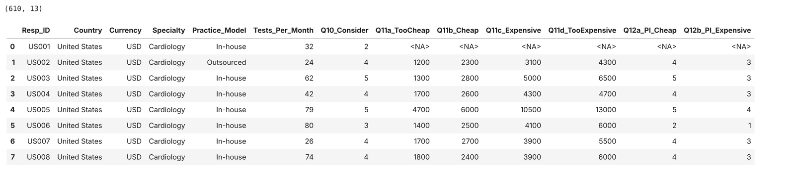
The price and likelihood columns are read as nullable integers: blank means the respondent skipped the price questions.
Python Step 2 - Read the study design and the levers
design = pd.read_excel(FILE, sheet_name="Study_Design", header=3, nrows=4, usecols="A:E").set_index("Market")
levers = pd.read_excel(FILE, sheet_name="Levers", header=None)

pi_calibrated = dict(zip(levers.iloc[4:9, 0].astype(int), levers.iloc[4:9, 2].astype(float)))
pi_toocheap, pi_tooexp = float(levers.iloc[9, 2]), float(levers.iloc[10, 2])
basis = levers.iloc[12, 2]                    # "Test volume" or "Physician"
min_base = int(levers.iloc[13, 2])
tests_per_recorder = float(levers.iloc[14, 2])
unit_cost = dict(zip(levers.iloc[17:21, 0], levers.iloc[17:21, 2].astype(float)))

print("NMS calibration:", pi_calibrated, "| at too cheap / too expensive:", pi_toocheap, pi_tooexp)
print("Headline basis:", basis, "| min base:", min_base, "| tests per recorder per month:", tests_per_recorder)
print("Unit cost:", unit_cost)
design
Reading the levers from the workbook, rather than typing them into the code, keeps the two analyses in step.
Python Step 3 - Check the sample and the price ordering
raw["Answered"] = raw[Q["TC"]].notna()
sample = pd.crosstab(raw["Country"], raw["Specialty"], margins=True, margins_name="Total").reindex(MARKETS + ["Total"])
sample["Skipped prices"] = (~raw["Answered"]).groupby(raw["Country"]).sum().reindex(MARKETS + ["Total"])
sample.loc["Total", "Skipped prices"] = (~raw["Answered"]).sum()
sample = sample.fillna(0).astype(int)

# Survey logic check: too cheap < cheap < expensive < too expensive for every respondent who answered
a = raw[raw["Answered"]]
assert ((a[Q["TC"]] < a[Q["C"]]) & (a[Q["C"]] < a[Q["E"]]) & (a[Q["E"]] < a[Q["TE"]])).all(), "illogical price order found"
print("Price-order check passed for", len(a), "respondents")
sample
The assert is the analyst's version of survey-programming rule 4: it stops the notebook if any respondent's four prices are out of order.
Python Step 4 - Convert to US dollars and define the curves
fx = raw["Country"].map(design["Local units per USD"])
for k, col in Q.items():
    raw[k] = raw[col].astype(float) / fx       # NaN for respondents who skipped
raw["w_phys"] = raw["Answered"].astype(float)
raw["w_vol"] = raw["w_phys"] * raw["Tests_Per_Month"]

def curves(d, w):
    """Four cumulative curves on the grid. Too cheap / Cheap are inverted (share at or above the price)."""
    W = w.sum()
    at_or_above = lambda x: (w.values[:, None] * (d[x].values[:, None] >= GRID)).sum(0) / W
    at_or_below = lambda x: (w.values[:, None] * (d[x].values[:, None] <= GRID)).sum(0) / W
    return {"Too cheap": at_or_above("TC"), "Cheap": at_or_above("C"),
            "Expensive": at_or_below("E"), "Too expensive": at_or_below("TE")}

def cross(a, b):
    """First crossing of a falling difference a-b on the grid, interpolated linearly."""
    diff = a - b
    k = int((diff > 1e-9).sum())            # tolerance guards exact ties against rounding noise
    if k == 0 or k == len(GRID):
        return np.nan
    d1, d2 = diff[k - 1], diff[k]
    return GRID[k - 1] + (GRID[k] - GRID[k - 1]) * d1 / (d1 - d2)

def points(cv):
    tc, ch, ex, te = cv["Too cheap"], cv["Cheap"], cv["Expensive"], cv["Too expensive"]
    return {"PMC": cross(tc, 1 - ch), "OPP": cross(tc, te), "IPP": cross(ch, ex), "PME": cross(1 - ex, te),
            "PMC narrow": cross(tc, ex), "PME narrow": cross(ch, te)}

raw.loc[raw["Answered"], ["Resp_ID", "Country", "Currency", Q["TC"], "TC", "C", "E", "TE"]].head(6).round(0)
Three small functions carry the whole method. curves builds the four cumulative curves on the grid with NumPy broadcasting: comparing a column of respondents' prices against a row of grid prices gives a respondents × prices table of true/false, and a weighted sum down each column is the share. cross finds the first crossing and interpolates, exactly as the Points sheet does. points names the six crossings.
Why hand-written functions rather than a package? The method is a few lines of NumPy, and writing it out makes every convention visible: which side of the price counts as "at or above", which curves define the range, how ties are handled. The R package pricesensitivitymeter is a well-documented reference implementation if you want to compare conventions.
Python Step 5 - Layer 1: the classic Price Sensitivity Meter
MARKET = "United States"
m = raw[(raw["Country"] == MARKET) & raw["Answered"]]
cv = curves(m, m["w_phys"])
l1 = pd.Series(points(cv))[["PMC", "OPP", "IPP", "PME"]].to_frame(f"{MARKET}, physician-level (USD)")
l1.loc["Base (n)"] = len(m)
l1.style.format(lambda v: f"{r0(v):,.0f}")
fig, ax = plt.subplots(figsize=(8, 4.6))
X = GRID <= 6200
for name, y in cv.items():
    ax.plot(GRID[X], y[X], color=CURVE_COLORS[name], lw=2)
ax.plot(GRID[X], (1 - cv["Cheap"])[X], color=CURVE_COLORS["Cheap"], lw=1.2, ls=":")
ax.plot(GRID[X], (1 - cv["Expensive"])[X], color=CURVE_COLORS["Expensive"], lw=1.2, ls=":")
p = points(cv)
for key, yv, txt in [("OPP", np.interp(p["OPP"], GRID, cv["Too expensive"]), (3350, 0.055)),
                     ("IPP", np.interp(p["IPP"], GRID, cv["Expensive"]), (3180, 0.255))]:
    ax.scatter([p[key]], [yv], s=50, color="#404040", zorder=4, edgecolor="white", linewidth=1.5)
    ax.annotate(f"{key} ${r0(p[key]):,.0f}", (p[key], yv), xytext=txt, textcoords="data", fontsize=9, color="#333333",
                va="center", arrowprops=dict(arrowstyle="-", color="#8a8a8a", lw=0.8))
ax.axvspan(p["PMC"], p["PME"], color="#2a78d6", alpha=0.06)
ax.text((p["PMC"] + p["PME"]) / 2, 1.02, f"acceptable range ${r0(p['PMC']):,.0f} - ${r0(p['PME']):,.0f}",
        ha="center", fontsize=9, color="#595959")
label_ends(ax, [(n, cv[n][np.searchsorted(GRID, 6200)]) for n in cv], 6200, gap=0.06)
ax.set(title=f"{MARKET}: Price Sensitivity Meter (dotted = not cheap / not expensive)",
       xlabel="Price per recorder (USD)", ylabel="Share of respondents", ylim=(0, 1.08), xlim=(250, 7300))
ax.yaxis.set_major_formatter(PercentFormatter(1.0)); ax.xaxis.set_major_formatter(usd)
plt.tight_layout(); plt.savefig("fig_l1_psm.png", dpi=200, bbox_inches="tight"); plt.show()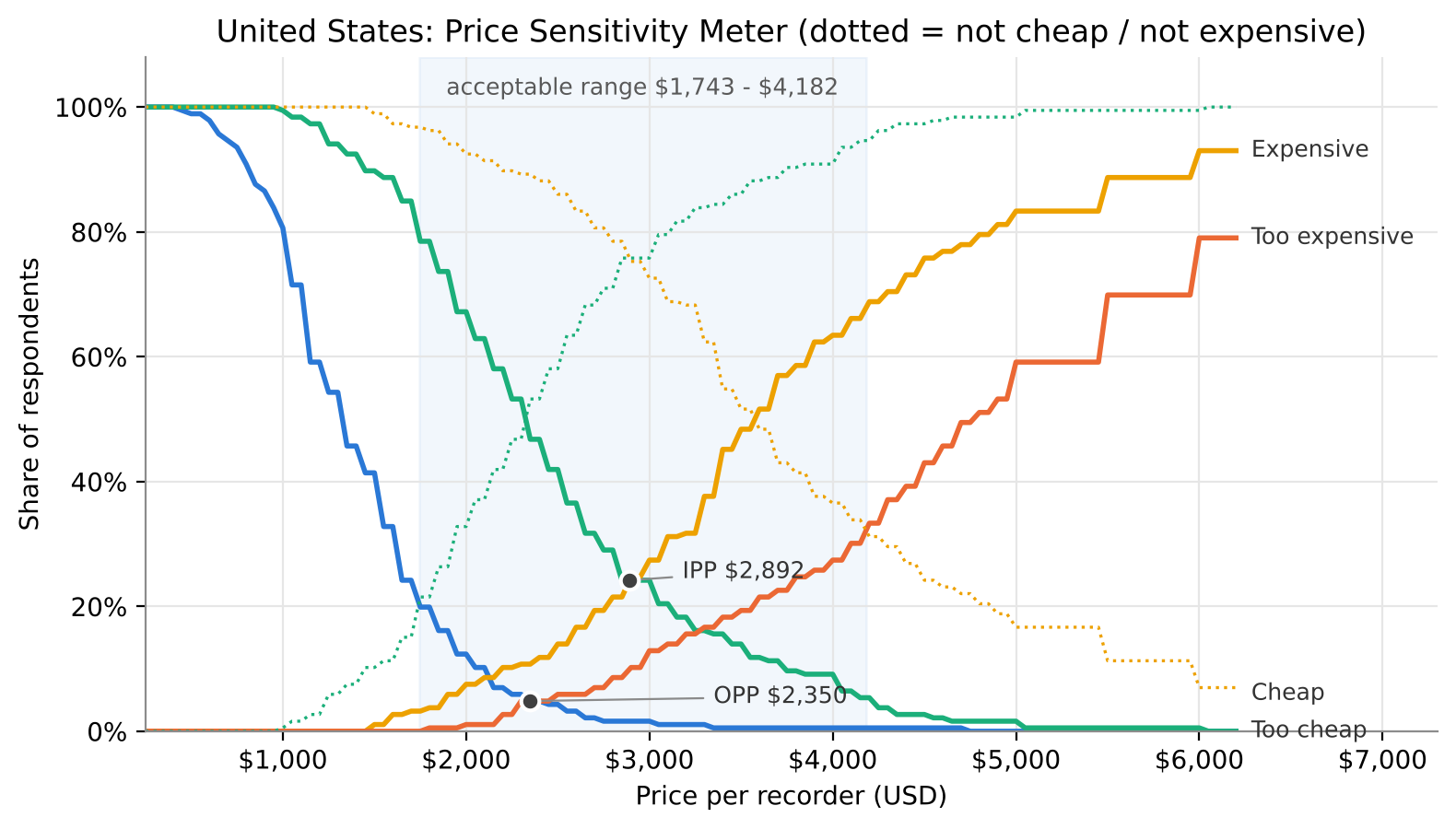
The dotted lines are "not cheap" and "not expensive", the mirror images used for the original range. The shaded band is the original acceptable range.
Python Step 6 - Layer 2: two definitions of the acceptable range
SEGS = {"Total (physician)": None, "Total (volume)": None, "Cardiology": ("Specialty", "Cardiology"),
        "Primary care": ("Specialty", "Primary care"), "In-house": ("Practice_Model", "In-house"),
        "Outsourced": ("Practice_Model", "Outsourced")}
rows = []
for c in MARKETS:
    d = raw[(raw["Country"] == c) & raw["Answered"]]
    for s, rule in SEGS.items():
        sub = d if rule is None else d[d[rule[0]] == rule[1]]
        if sub.empty:
            continue                                  # France: no primary-care cell
        w = sub["w_vol"] if s == "Total (volume)" else sub["w_phys"]
        rows.append({"Market": c, "Segment": s, "n": len(sub), **points(curves(sub, w))})
pts = pd.DataFrame(rows)
pts["Width original"] = pts["PME"] - pts["PMC"]
pts["Width narrow"] = pts["PME narrow"] - pts["PMC narrow"]

l2 = pts[pts.Segment == "Total (physician)"].set_index("Market")[["PMC", "PME", "Width original", "PMC narrow", "PME narrow", "Width narrow", "OPP", "IPP"]]
l2["Narrow as % of original"] = l2["Width narrow"] / l2["Width original"]
l2.style.format({c: USD0 for c in l2.columns if c != "Narrow as % of original"} | {"Narrow as % of original": "{:.0%}"})
This cell also builds pts, the price points for every market × segment cell, used by every later step. Note the France check: there is no primary-care cell, so the loop skips it rather than reporting curves for nobody.
fig, ax = plt.subplots(figsize=(8, 3.4))
for i, c in enumerate(MARKETS):
    r = l2.loc[c]
    ax.plot([r["PMC"], r["PME"]], [i + 0.15] * 2, color="#86b6ef", lw=7, solid_capstyle="round")
    ax.plot([r["PMC narrow"], r["PME narrow"]], [i - 0.15] * 2, color="#1c5cab", lw=7, solid_capstyle="round")
    ax.scatter([r["OPP"]], [i], marker="|", s=260, color="#404040", zorder=4)
ax.set_yticks(range(len(MARKETS)), MARKETS); ax.invert_yaxis()
ax.xaxis.set_major_formatter(usd); ax.grid(axis="y", visible=False)
ax.set(title="Acceptable range: original (light) vs narrow (dark); tick = OPP", xlabel="Price per recorder (USD)")
plt.tight_layout(); plt.savefig("fig_l2_ranges.png", dpi=200, bbox_inches="tight"); plt.show()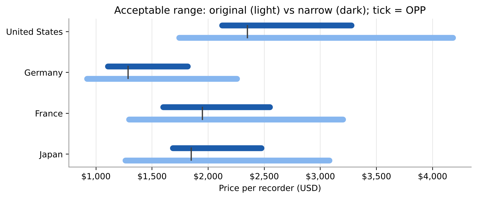
Python Step 7 - Layer 3: segments
l3 = pts[pts.Segment != "Total (volume)"].copy()
l3["Read-out"] = np.where(l3["n"] < min_base, "Small base - directional", "OK")
l3[["Market", "Segment", "n", "Read-out", "PMC", "OPP", "IPP", "PME"]].style.format(
    {c: USD0 for c in ["PMC", "OPP", "IPP", "PME"]}).hide(axis="index")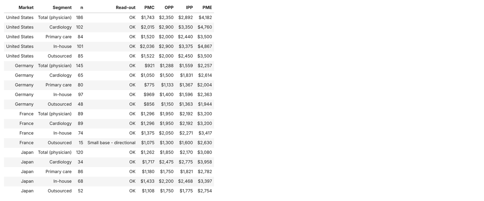
fig, axes = plt.subplots(1, 2, figsize=(11, 4), sharey=True)
d = raw[(raw["Country"] == MARKET) & raw["Answered"]]
for ax, (col, groups) in zip(axes, [("Specialty", ["Cardiology", "Primary care"]), ("Practice_Model", ["In-house", "Outsourced"])]):
    ends = []
    X = GRID <= 5600
    y = curves(d, d["w_phys"])["Too expensive"]
    ax.plot(GRID[X], y[X], color=SEG_COLORS["Total"], lw=2.2, ls="--"); ends.append(("Total", y[X][-1]))
    for g in groups:
        sub = d[d[col] == g]
        y = curves(sub, sub["w_phys"])["Too expensive"]
        ax.plot(GRID[X], y[X], color=SEG_COLORS[g], lw=2); ends.append((g, y[X][-1]))
    label_ends(ax, ends, 5600, gap=0.07)
    ax.set(title=f"{MARKET}: 'too expensive' by {col.replace('_', ' ').lower()}", xlabel="Price per recorder (USD)",
           xlim=(250, 6700), ylim=(0, 1))
    ax.xaxis.set_major_formatter(usd)
axes[0].yaxis.set_major_formatter(PercentFormatter(1.0)); axes[0].set_ylabel("Share calling it too expensive")
plt.tight_layout(); plt.savefig("fig_l3_segments.png", dpi=200, bbox_inches="tight"); plt.show()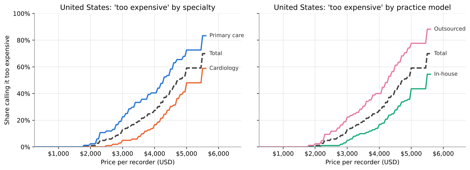
Python Step 8 - Layer 4: from share of doctors to share of tests
ph = pts[pts.Segment == "Total (physician)"].set_index("Market")
vo = pts[pts.Segment == "Total (volume)"].set_index("Market")
l4 = pd.DataFrame({f"{k} {lab}": src[k] for k in ["OPP", "IPP", "PME"] for lab, src in [("physician", ph), ("volume", vo)]})
for k in ["OPP", "IPP", "PME"]:
    l4[f"{k} shift"] = l4[f"{k} volume"] - l4[f"{k} physician"]
mean_tests = raw.pivot_table(index="Country", columns="Specialty", values="Tests_Per_Month", aggfunc="mean").reindex(MARKETS)
print("Mean ambulatory ECG tests per month:"); print(mean_tests.round(1).to_string()); print()
l4.reindex(MARKETS).style.format(USD0)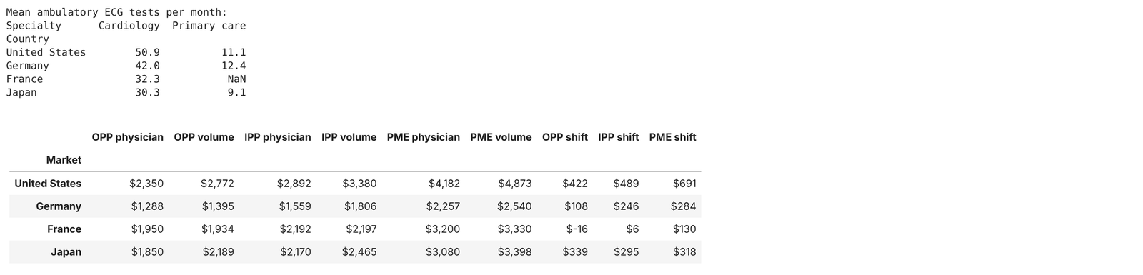
d = raw[(raw["Country"] == MARKET) & raw["Answered"]]
fig, ax = plt.subplots(figsize=(8, 4.2))
for w, ls, lab in [("w_phys", "--", "physician"), ("w_vol", "-", "test-volume")]:
    cvw = curves(d, d[w])
    ax.plot(GRID, cvw["Too cheap"], color=CURVE_COLORS["Too cheap"], lw=2, ls=ls)
    ax.plot(GRID, cvw["Too expensive"], color=CURVE_COLORS["Too expensive"], lw=2, ls=ls)
    o = points(cvw)["OPP"]
    ax.scatter([o], [np.interp(o, GRID, cvw["Too expensive"])], color="#404040", s=40, zorder=4, edgecolor="white")
    ax.annotate(f"OPP {lab} ${r0(o):,.0f}", (o, np.interp(o, GRID, cvw["Too expensive"])),
                xytext=(2000, 0.62) if lab == "physician" else (2900, 0.47), textcoords="data", fontsize=9, color="#333333",
                arrowprops=dict(arrowstyle="-", color="#8a8a8a", lw=0.8))
ax.set(title=f"{MARKET}: too cheap and too expensive, physician-level (dashed) vs test-weighted (solid)",
       xlabel="Price per recorder (USD)", ylabel="Share", xlim=(250, 6200), ylim=(0, 1))
ax.yaxis.set_major_formatter(PercentFormatter(1.0)); ax.xaxis.set_major_formatter(usd)
plt.tight_layout(); plt.savefig("fig_l4_weighting.png", dpi=200, bbox_inches="tight"); plt.show()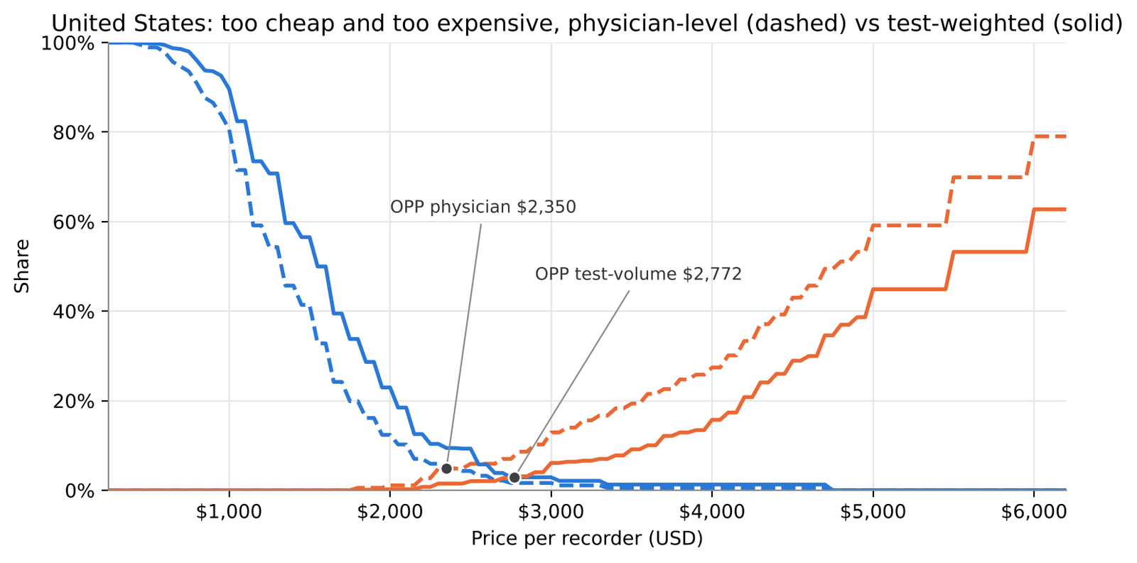
Both OPPs sit where the too-cheap and too-expensive curves cross; weighting by tests pushes the too-expensive curve to the right, and the crossing moves with it.
Python Step 9 - Layer 5: Newton-Miller-Smith reach and revenue
def purchase_prob(df_):
    """Respondent x grid matrix: calibrated probability, linear between each respondent's four prices."""
    P = np.zeros((len(df_), len(GRID)))
    for i, r in enumerate(df_.itertuples()):
        if not r.Answered:
            continue                               # skipped the price questions -> 0 at every price
        P[i] = np.interp(GRID, [r.TC, r.C, r.E, r.TE],
                         [pi_toocheap, pi_calibrated[int(r.Q12a_PI_Cheap)], pi_calibrated[int(r.Q12b_PI_Expensive)], pi_tooexp])
    return P

P_all = purchase_prob(raw)
w_head = raw["Tests_Per_Month"].values.astype(float) if basis == "Test volume" else np.ones(len(raw))
head_seg = "Total (volume)" if basis == "Test volume" else "Total (physician)"

nms_rows, reach = [], {}
for c in MARKETS:
    mask = (raw["Country"] == c).values
    w = w_head * mask
    rch = (P_all * w[:, None]).sum(0) / w.sum()
    reach[c] = rch
    rev, mar = GRID * rch, (GRID - unit_cost[c]) * rch
    hp = pts[(pts.Market == c) & (pts.Segment == head_seg)].iloc[0]
    rm = GRID[rev.argmax()]
    nms_rows.append({"Market": c, "Trial-max price": GRID[rch.argmax()], "Reach at trial-max": rch.max(),
                     "Revenue-max price": rm, "Reach at revenue-max": rch[rev.argmax()],
                     "Margin-max price": GRID[mar.argmax()], "OPP": hp["OPP"], "PME narrow": hp["PME narrow"], "PME": hp["PME"],
                     "Read-out": "Above original range" if rm > hp["PME"] else ("Above narrow range" if rm > hp["PME narrow"] else "Inside narrow range")})
nms = pd.DataFrame(nms_rows).set_index("Market")
assert not nms[["Trial-max price", "Revenue-max price"]].isin([GRID[0], GRID[-1]]).any().any(), "optimum at a grid edge"
nms.style.format({c: USD0 for c in ["Trial-max price", "Revenue-max price", "Margin-max price", "OPP", "PME narrow", "PME"]}
                 | {"Reach at trial-max": "{:.1%}", "Reach at revenue-max": "{:.1%}"})
np.interp does the per-respondent straight lines in one call: given the four prices and four probabilities, it returns the probability at every grid price, and it holds the end values (0%) outside the respondent's range - exactly the rule in NMS_Grid. The assert is the Python version of the grid-edge check.
fig, axes = plt.subplots(1, 2, figsize=(11, 4))
r, row = reach[MARKET], nms.loc[MARKET]
axes[0].plot(GRID, r, color="#2a78d6", lw=2)
axes[0].axvline(row["OPP"], color="#8a8a8a", lw=1, ls=":"); axes[0].text(row["OPP"], r.max() * 1.08, f"OPP ${r0(row['OPP']):,.0f} ", ha="right", fontsize=8, color="#595959")
axes[0].annotate(f"trial-max ${r0(row['Trial-max price']):,.0f}", (row["Trial-max price"], r.max()), xytext=(10, 4), textcoords="offset points", fontsize=8, color="#595959")
axes[0].set(title=f"{MARKET}: expected reach (NMS)", xlabel="Price per recorder (USD)", ylim=(0, r.max() * 1.15), xlim=(250, 7000))
axes[0].yaxis.set_major_formatter(PercentFormatter(1.0))
rev = GRID * r
axes[1].plot(GRID, rev, color="#404040", lw=2)
for x, lab, off, ha in [(row["OPP"], "OPP", (-8, 30), "right"), (row["Revenue-max price"], "revenue-max", (8, 12), "left")]:
    axes[1].axvline(x, color="#8a8a8a", lw=1, ls=":")
    axes[1].annotate(f"{lab} ${r0(x):,.0f}", (x, np.interp(x, GRID, rev)), xytext=off, textcoords="offset points",
                     ha=ha, fontsize=9, color="#333333")
axes[1].set(title="Revenue index (price x reach)", xlabel="Price per recorder (USD)", ylim=(0, rev.max() * 1.2), xlim=(250, 7000))
for ax in axes: ax.xaxis.set_major_formatter(usd)
axes[1].yaxis.set_major_formatter(usd)
plt.tight_layout(); plt.savefig("fig_l5_nms.png", dpi=200, bbox_inches="tight"); plt.show()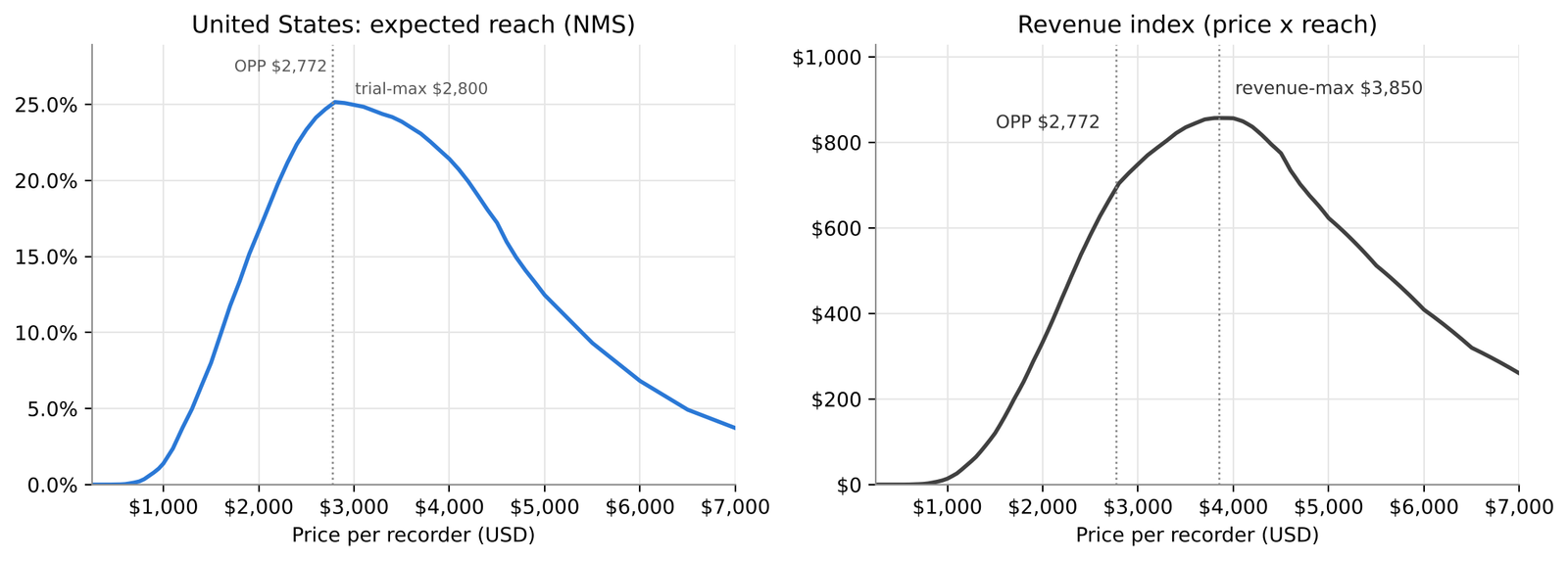
Python Step 10 - Layer 6: bootstrap intervals
bw = pd.read_excel(FILE, sheet_name="Boot_Weights").set_index("Resp_ID").loc[raw["Resp_ID"]].values   # same draws as Excel
N_BOOT = bw.shape[1]
answered = raw["Answered"].values
boot_rows, boot_dist = [], {}
for c in MARKETS:
    mask = (raw["Country"] == c).values
    rec = {k: [] for k in ["PMC", "OPP", "IPP", "PME", "Revenue-max"]}
    sub = raw[mask & answered]
    for j in range(N_BOOT):
        wb_ = bw[:, j] * w_head
        p = points(curves(sub, pd.Series(wb_[mask & answered], index=sub.index)))
        for k in ["PMC", "OPP", "IPP", "PME"]:
            rec[k].append(p[k])
        w = wb_ * mask
        rch = (P_all * w[:, None]).sum(0) / w.sum()
        rec["Revenue-max"].append(GRID[(GRID * rch).argmax()])
    boot_dist[c] = rec
    full = pts[(pts.Market == c) & (pts.Segment == head_seg)].iloc[0]
    for k, v in rec.items():
        est = nms.loc[c, "Revenue-max price"] if k == "Revenue-max" else full[k]
        boot_rows.append({"Market": c, "Statistic": k, "Estimate": est,
                          "2.5%": np.percentile(v, 2.5), "97.5%": np.percentile(v, 97.5)})
boot = pd.DataFrame(boot_rows)
boot["Width"] = boot["97.5%"] - boot["2.5%"]
boot.style.format({c: USD0 for c in ["Estimate", "2.5%", "97.5%", "Width"]}).hide(axis="index")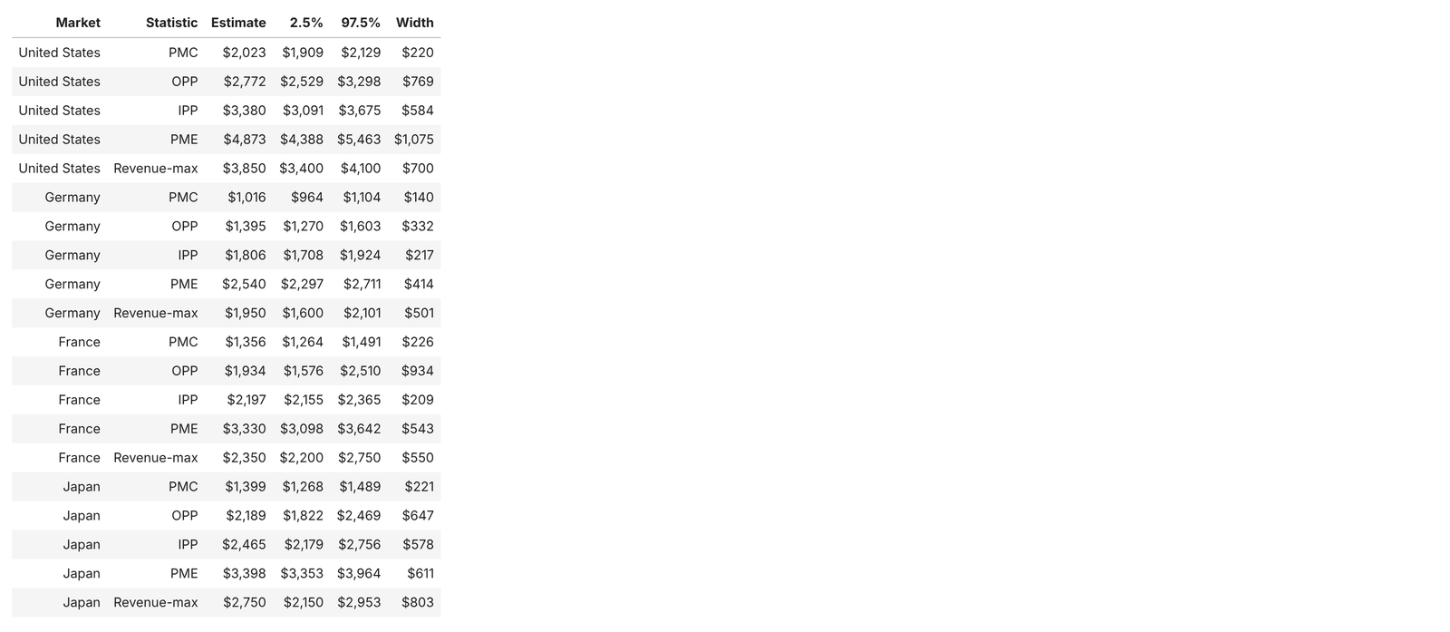
The weights are read from the Boot_Weights sheet, so Python resamples the same 200 alternative samples as Excel. Excel covers the OPP and revenue-max for one market; this loop covers all four price points and the revenue-max for every market.
fig, axes = plt.subplots(1, 2, figsize=(11, 3.6))
for ax, k in zip(axes, ["OPP", "Revenue-max"]):
    v = np.array(boot_dist[MARKET][k]); lo, hi = np.percentile(v, [2.5, 97.5])
    ax.hist(v, bins=20, color="#2a78d6", edgecolor="white", linewidth=1.5)
    ax.axvspan(lo, hi, color="#2a78d6", alpha=0.08)
    est = boot[(boot.Market == MARKET) & (boot.Statistic == k)]["Estimate"].iloc[0]
    ax.axvline(est, color="#404040", lw=2)
    ax.set(title=f"{MARKET}: {k} across {N_BOOT} bootstrap samples", xlabel="Price per recorder (USD)", ylabel="Replicates")
    ax.text(0.02, 0.95, f"95%: ${r0(lo):,.0f} - ${r0(hi):,.0f}", transform=ax.transAxes, ha="left", va="top", fontsize=9, color="#333333",
            bbox=dict(facecolor="white", edgecolor="none", pad=2))
    ax.xaxis.set_major_formatter(usd); ax.grid(axis="x", visible=False)
plt.tight_layout(); plt.savefig("fig_l6_bootstrap.png", dpi=200, bbox_inches="tight"); plt.show()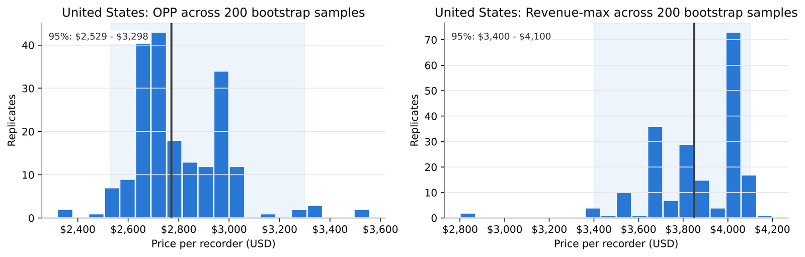
The histograms are lumpy, and that is real: respondents type round prices, so the curves move in steps and many replicates land on the same few crossings. A bigger sample smooths this; so would asking for prices to the nearest $10, at some cost to how natural the question feels.
Python Step 11 - Layer 7: economics
eco = pd.DataFrame(index=MARKETS)
eco["Fee per test (USD)"] = design["Fee per test (USD)"]
eco["Fee income / recorder / month"] = eco["Fee per test (USD)"] * tests_per_recorder
eco["Unit cost"] = pd.Series(unit_cost)
eco["Revenue-max price"] = nms["Revenue-max price"]
eco["Margin-max price"] = nms["Margin-max price"]
eco["Payback at OPP (months)"] = nms["OPP"] / eco["Fee income / recorder / month"]
eco["Payback at revenue-max (months)"] = eco["Revenue-max price"] / eco["Fee income / recorder / month"]
eco.style.format({"Fee per test (USD)": "${:,.2f}", "Fee income / recorder / month": USD0, "Unit cost": USD0,
                  "Revenue-max price": USD0, "Margin-max price": USD0,
                  "Payback at OPP (months)": "{:.1f}", "Payback at revenue-max (months)": "{:.1f}"})
fig, ax = plt.subplots(figsize=(7.5, 3.2))
vals = eco["Payback at revenue-max (months)"]
ax.barh(MARKETS, vals, color="#2a78d6", height=0.55)
for i, v in enumerate(vals):
    ax.text(v + 0.5, i, f"{v:.1f} months", va="center", fontsize=9, color="#333333")
ax.invert_yaxis(); ax.grid(axis="y", visible=False); ax.set_xlim(0, vals.max() * 1.25)
ax.set(title="Months of per-test fees to recover one recorder at the revenue-max price",
       xlabel=f"Months (fee per test x {tests_per_recorder:.0f} tests per recorder per month)")
plt.tight_layout(); plt.savefig("fig_l7_payback.png", dpi=200, bbox_inches="tight"); plt.show()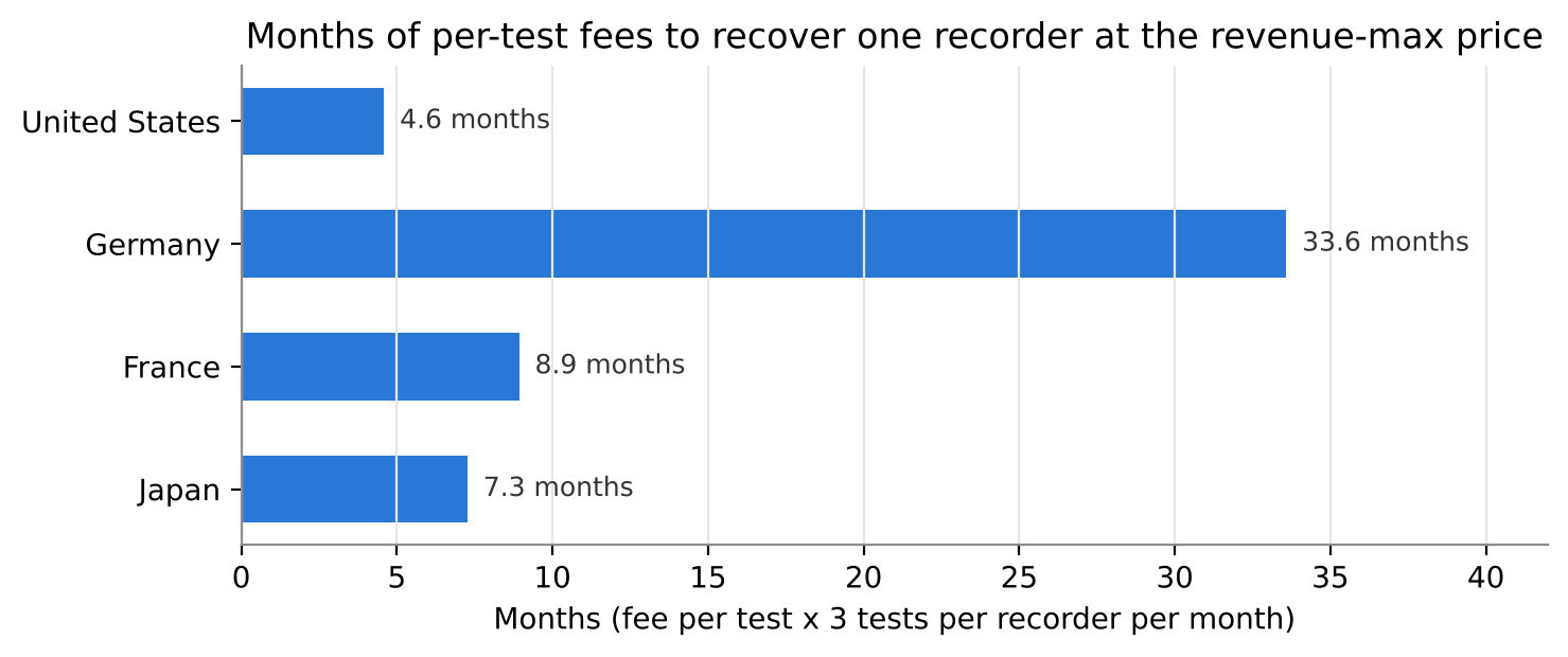
Python Step 12 - Bring it together
hp = pts[pts.Segment == head_seg].set_index("Market").reindex(MARKETS)
ci = boot[boot.Statistic == "Revenue-max"].set_index("Market")
summary = pd.DataFrame({"n": hp["n"], "Range (original)": hp["PMC"].map(USD0) + " - " + hp["PME"].map(USD0),
                        "Range (narrow)": hp["PMC narrow"].map(USD0) + " - " + hp["PME narrow"].map(USD0),
                        "OPP": hp["OPP"], "IPP": hp["IPP"], "Revenue-max": nms["Revenue-max price"],
                        "Revenue-max 95%": ci["2.5%"].map(USD0) + " - " + ci["97.5%"].map(USD0),
                        "Margin-max": nms["Margin-max price"], "Payback (months)": eco["Payback at revenue-max (months)"]})
summary.style.format({"OPP": USD0, "IPP": USD0, "Revenue-max": USD0, "Margin-max": USD0, "Payback (months)": "{:.1f}"})
fig, axes = plt.subplots(1, 4, figsize=(15, 3.8), sharey=True)
for ax, c in zip(axes, MARKETS):
    d = raw[(raw["Country"] == c) & raw["Answered"]]
    cvm = curves(d, d["w_vol"] if basis == "Test volume" else d["w_phys"])
    for name, y in cvm.items():
        ax.plot(GRID, y, color=CURVE_COLORS[name], lw=1.8, label=name)
    ax.axvline(nms.loc[c, "Revenue-max price"], color="#404040", lw=1.2, ls="--")
    ax.set(title=c, xlabel="Price per recorder (USD)", xlim=(250, 6500), ylim=(0, 1))
    ax.xaxis.set_major_formatter(StrMethodFormatter("${x:,.0f}")); ax.tick_params(axis="x", labelrotation=30)
axes[0].yaxis.set_major_formatter(PercentFormatter(1.0)); axes[0].set_ylabel("Share (headline basis)")
h, l = axes[0].get_legend_handles_labels()
fig.legend(h, l, loc="lower center", ncol=4, frameon=False, bbox_to_anchor=(0.5, -0.08))
plt.tight_layout(); plt.savefig("fig_markets_small_multiples.png", dpi=200, bbox_inches="tight"); plt.show()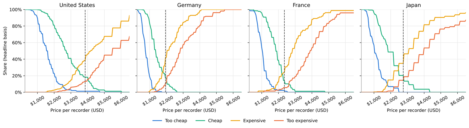
Four panels, one per market, instead of 16 lines on one chart. The dashed line in each is the NMS revenue-max price.
Python Step 13 - Cross-check against the workbook
xl_pts = pd.read_excel(FILE, sheet_name="Points", header=3, nrows=len(pts)).set_index(["Market", "Segment"])
mine = pts.set_index(["Market", "Segment"])
diff_pts = (xl_pts[["OPP", "IPP", "PMC (original)", "PME (original)"]].values - mine[["OPP", "IPP", "PMC", "PME"]].loc[xl_pts.index].values)
xl_nms = pd.read_excel(FILE, sheet_name="Step5_NMS", header=3, nrows=4).set_index("Market")
xl_boot = pd.read_excel(FILE, sheet_name="Step6_Bootstrap", header=None)
boot_market = xl_boot.iloc[2, 2]
xl_ci = xl_boot.iloc[5:7, 3:5].values.astype(float)
py_ci = np.array([[np.percentile(boot_dist[boot_market]["OPP"], q) for q in (2.5, 97.5)],
                  [np.percentile(boot_dist[boot_market]["Revenue-max"], q) for q in (2.5, 97.5)]])
print("Max |Excel - Python| across all price points:", round(float(np.nanmax(np.abs(diff_pts))), 6))
print("NMS revenue-max equal in every market:", bool((xl_nms["Revenue-max price"].values == nms["Revenue-max price"].values).all()))
print(f"Bootstrap intervals for {boot_market}: Excel {xl_ci.round(2).tolist()} | Python {py_ci.round(2).tolist()}")
Every price point in every cell, the four revenue-max prices and the bootstrap intervals agree between the two tools.
(End of tabs. Both tracks arrive at the same results.)
6. Reading the results
Headline. In every market the price that maximises expected revenue sits 22% to 40% above the classic optimal price point, and inside the narrow acceptable range. Germany's range is roughly half the US range, and at any price in it a German practice needs years of statutory fees to pay back the recorder.
| Market (test-weighted) | Acceptable range, original | Narrow range | OPP | IPP | NMS revenue-max (95% interval) | Payback at revenue-max |
|---|---|---|---|---|---|---|
| United States | $2,023 - $4,873 | $2,526 - $4,025 | $2,772 | $3,380 | $3,850 ($3,400 - $4,100) | 4.6 months |
| Germany | $1,016 - $2,540 | $1,268 - $2,018 | $1,395 | $1,806 | $1,950 ($1,600 - $2,101) | 33.6 months |
| France | $1,356 - $3,330 | $1,735 - $2,622 | $1,934 | $2,197 | $2,350 ($2,200 - $2,750) | 8.9 months |
| Japan | $1,399 - $3,398 | $1,800 - $2,776 | $2,189 | $2,465 | $2,750 ($2,150 - $2,953) | 7.3 months |
What the numbers say, market by market
United States. The widest and highest range. Revenue peaks at $3,850, where about 22% of tests sit with practices that would expect to buy (stated, calibrated intent). The OPP of $2,772 would maximise trial instead, at about 25%. Fee recovery is quick: under five months at the revenue-max.
Germany. The lowest range by far ($1,268 to $2,018 narrow). Physicians price the recorder against a statutory fee of about €17 per test, and it shows. Even at the OPP, payback is two years.
France. A tight, cardiology-only market: the indifference price is precise (interval $2,155 to $2,365) and the revenue-max sits close to it, at $2,350.
Japan. The revenue-max of $2,750 is right at the top of the narrow range ($2,776), and its interval is wide ($2,150 to $2,953). Treat the upper end as uncertain.
What each layer added
Layer 2, the range definition, halves the width of the range. A report that says "the acceptable range is $2,023 to $4,873" and one that says "$2,526 to $4,025" can come from the same data.
Layer 3, segments, shows a consistent divide: cardiologists place the OPP and IPP 32% to 52% higher than GPs, and in-house practices sit above outsourcers in every market. GPs reach "too expensive" first.
Layer 4, test weighting, moves the US and Japanese price points up by $300 to $500, and the US revenue-max from $2,900 to $3,850. Physician-level results understate tolerance here, because the heaviest users are the least price-sensitive. Skipping this step would have pulled the recommendation down by about a quarter.
Layer 5, NMS, is what turns perception into a decision. Without it, the natural reading of the classic chart is "price near the OPP" - which here would maximise trial but sit 28% below the revenue-maximising price in the US.
Layer 6, the bootstrap, shows which numbers to trust. The OPP's interval is $650 to $930 wide in three of the four markets; the IPP's is $210 to $580. The OPP is where two thin tails cross (only a few percent of respondents are on either curve there), so a handful of respondents can move it.
Layer 7, economics, adds the one constraint respondents were not asked about: whether the price makes sense for the buyer's own business.
What these numbers are not.
They are stated perceptions and stated intent, not behaviour. The 70/50/30/10/0 calibration is a standard discount, not one calibrated against this company's launches. Read reach levels (22%, 29%) as relative, not as market-share forecasts.
They are not a demand curve in the economic sense. The four PSM curves are cumulative counts of answers. Only the NMS layer carries purchase intent, and it rests on two answers per respondent joined by straight lines.
They assume the concept stays as described. A change in wear time, analysis or service terms changes the product being priced.
They ignore competitors' responses. If an outsourcing service cuts its per-test fee, the anchor for half the market moves.
7. From results to a pricing strategy
For the commercial leadership team.
Recommendation in one line. Open price discussions near the NMS revenue-max in the US, France and Japan; treat Germany as a market where the price question is really a business-model question.
| Market | Recommended opening corridor (USD per recorder) | Anchor point | Watch-out |
|---|---|---|---|
| United States | $3,500 - $4,000 | Revenue-max $3,850; margin-max $4,000 | Above $4,025 leaves the narrow range |
| France | $2,200 - $2,400 | Revenue-max $2,350 | Small outsourced group prices lower |
| Japan | $2,400 - $2,750 | Revenue-max $2,750, at the top of the narrow range | Wide interval; lean to the lower half |
| Germany | $1,500 - $1,950 | OPP $1,395 to revenue-max $1,950 | Payback of 2 to 3 years at any of these prices |
Why not the optimal price point? Because in this study the OPP is a trial-maximising price, not a revenue-maximising one. In the US, moving from $2,772 to $3,850 costs under 3 points of expected reach (25.0% to 22.3%) and raises the revenue index by about a quarter. For a device whose adoption the company wants to grow steadily, there may be a case for opening lower, but that is a strategic choice to be made explicitly, not a default read off the classic chart.
Five strategic implications
Report the range with its definition. Put "narrow range" or "original range" next to every number that leaves this study. The difference is not cosmetic; it is half the width of the answer.
Price for the test, not the doctor - and know who that leaves out. The heaviest users, cardiology practices running their own monitoring, tolerate the highest prices and will buy the most recorders, so the launch price can reflect them. But $3,850 is above the US primary-care range on either definition (narrow range up to $2,633, original up to $3,500). That is acceptable if the launch targets cardiology. If GPs matter early, the lever is a different commercial model for low-volume practices (leasing or per-test pricing), not a lower list price for everyone.
Germany needs a different model, not just a lower price. At €17 per test, an outright purchase does not pay back in a reasonable time at any price this study supports. Options to test: a leasing or per-test model, positioning around private patients (GOÄ 659 pays more), or a later launch. The Van Westendorp study did its job here by surfacing the question; it cannot answer it.
Use the corridor, not the point. The US revenue-max interval runs from $3,400 to $4,100. Any price in the recommended corridor is consistent with the data, which leaves room for price architecture, volume tiers and round local-currency prices.
Set the four prices together. A buyer in one market can see the price in another, and distributors talk. The gap between a $3,850 US price and a $1,950 German price should be a deliberate decision, explained by the reimbursement difference, not an accident of four separate analyses.
Next steps before the price is final
Validate the opening corridor with a Gabor-Granger or monadic test. Now that a credible range exists, a five-price ladder inside it gives a sharper demand curve. This is the natural follow-on from a Van Westendorp study. [link to Gabor-Granger post]
Calibrate the NMS weights against the company's past device launches (stated "definitely/probably" versus actual first-year purchases) and replace the 70/50/30/10/0 defaults on the Levers sheet.
Model the German business case for leasing or per-test pricing before committing to a list price there.
Move to conjoint once the commercial model has options (bundle sizes, service tiers, leasing versus purchase).
8. Limitations and what comes next
Single product, single concept. Real launches often price a family (one recorder, a five-pack, a subscription). Van Westendorp extends to multi-product studies by repeating the four questions per product, at the cost of a longer survey and more respondent fatigue.
No competitive response. Respondents react to Product X against today's market. Methods that model competitor moves, such as choice-based conjoint, handle this better.
Stated, not revealed, preference. The NMS calibration reduces overstatement; it does not remove it.
Payback is gross. It ignores staff time, electrodes and overheads, and uses one fee per market. Real practices mix payers and recording lengths.
Small cells. France's outsourced group (15) is directional only, and Japan's cardiology cell (34) is close to the minimum. Plan quotas to avoid this in a real study.
Synthetic data. The dataset was built to behave realistically, so it is ideal for learning the method, but its specific numbers should not be used for any real pricing decision.
Coming next in the series: monadic price testing - what changes when each respondent sees only one price. [link]
Downloads: Van_Westendorp_ECG_Recorder.xlsx (data + full Excel analysis) | Van_Westendorp_Analysis.ipynb (Python notebook) | van_westendorp_analysis.py (same code as a script). All data synthetic.
Price and fee references: Medicare 2026 national average payment rates for CPT 93224 and 93241 (Boston Scientific external cardiac monitoring coding and payment quick reference, January 2026); EBM 03322 / 03241 and GOÄ 659 (medizinio.de Langzeit-EKG purchasing guide, 2026; KV Baden-Württemberg; Ärzte Zeitung); CCAM DEQP005 tariff (Assurance Maladie CCAM schedule via sidecare.com); D210 points and the 7-day long-recording add-on (Omron Healthcare Heartnote catalogue v3.0; 2ndlabo, July 2026); NHS Holter monitor cost (Southern Health and Social Care Trust FOI 3577, January 2026); exchange rates (European Central Bank euro reference rates, 1 July 2026). Method references: van Westendorp (1976), Proceedings of the 29th ESOMAR Congress; Newton, Miller and Smith (1993), AMA Advanced Research Techniques Forum; documentation of the R package pricesensitivitymeter.