Part 1 of 1Pricing Methodologies
- Gabor-Granger Pricing for a Pharma Launch: From Five Price Questions to a Defensible Launch Price
A worked case study with a downloadable dataset, an Excel workbook and a Python notebook
Part of the series: Healthcare Product Pricing Methods - [link to series overview post]
Contents
Introduction
The business scenario
Why Gabor-Granger for this launch
Collecting the data
4.1 The questionnaire
4.2 What the respondent sees
4.3 Survey platforms that support the method
4.4 Notes for the survey programmer
4.5 Which markets, which physicians
4.6 What the data looks like
Analysis, layer by layer (Excel tab | Python tab)
Reading the results
From results to a pricing strategy
Limitations and what comes next
Downloads:
Access the Excel file with all raw data, working model, formulas, and charts.
Access the Python notebook file with all raw data, working model, syntax, and output
1. Introduction
In the opening post of this series we set out five questions that decide which pricing research method fits a healthcare product: is there already a drug that does what yours does, how is it paid for, does anything besides price differ, who can you reach, and what decision must the number support. [link to series overview post]
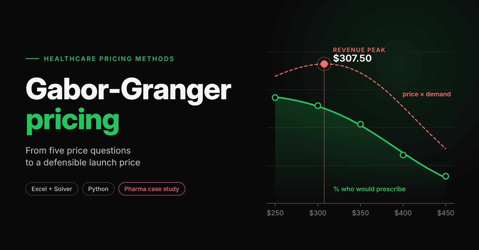
This post takes the first method off that list and works it end to end: the Gabor-Granger technique. It is one of the oldest and most widely used direct pricing methods, named after the economists André Gabor and Clive Granger, who developed it in the 1960s. The idea is simple. Show a respondent a product at a specific price, ask whether they would buy (here: prescribe) it, then show a higher or lower price depending on the answer. Repeat across a set of prices and you can trace a demand curve: the share of the market that would take up the product at each price. Multiply demand by price and you get a revenue curve, whose peak is the revenue-maximising price.
That is where most explanations stop. In practice, the plain curve is only the starting point. This post builds the analysis up in six layers, each one answering a sharper question:
The plain demand and revenue curve.
The same curve split by prescriber specialty - who drops off first?
Weighting physicians by the patients they actually treat - share of patients, not share of doctors.
Fitting a smooth logistic curve so we can read prices between the five we tested.
Bootstrapping the result to put an interval around the recommended price.
Moving from revenue to margin by subtracting unit cost.
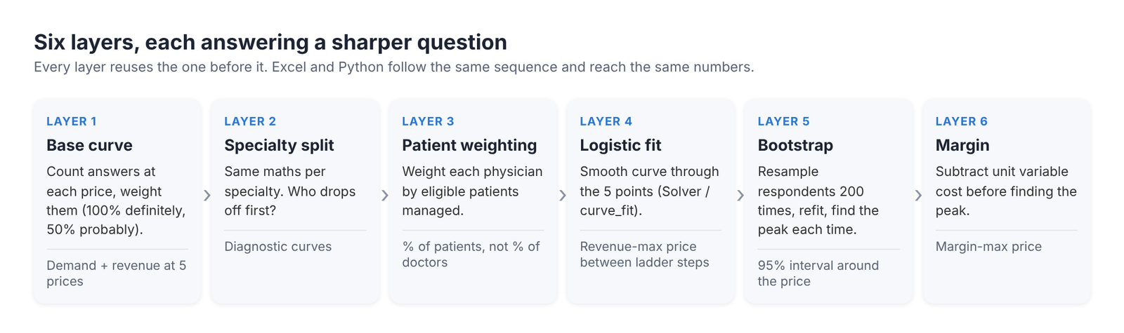
Every layer is shown twice, once in Excel and once in Python, using the same input file. Both reach the same numbers. Pick the tab that matches how you work; the business sections before and after the analysis are shared.
All data in this post is synthetic. It was generated to behave the way real physician pricing data behaves, but no real respondent, brand or company is involved.
2. The business scenario
The client. A mid-sized pharmaceutical company is preparing to launch Product X, a once-daily oral tablet for adults with type 2 diabetes whose blood sugar is not controlled on metformin alone.
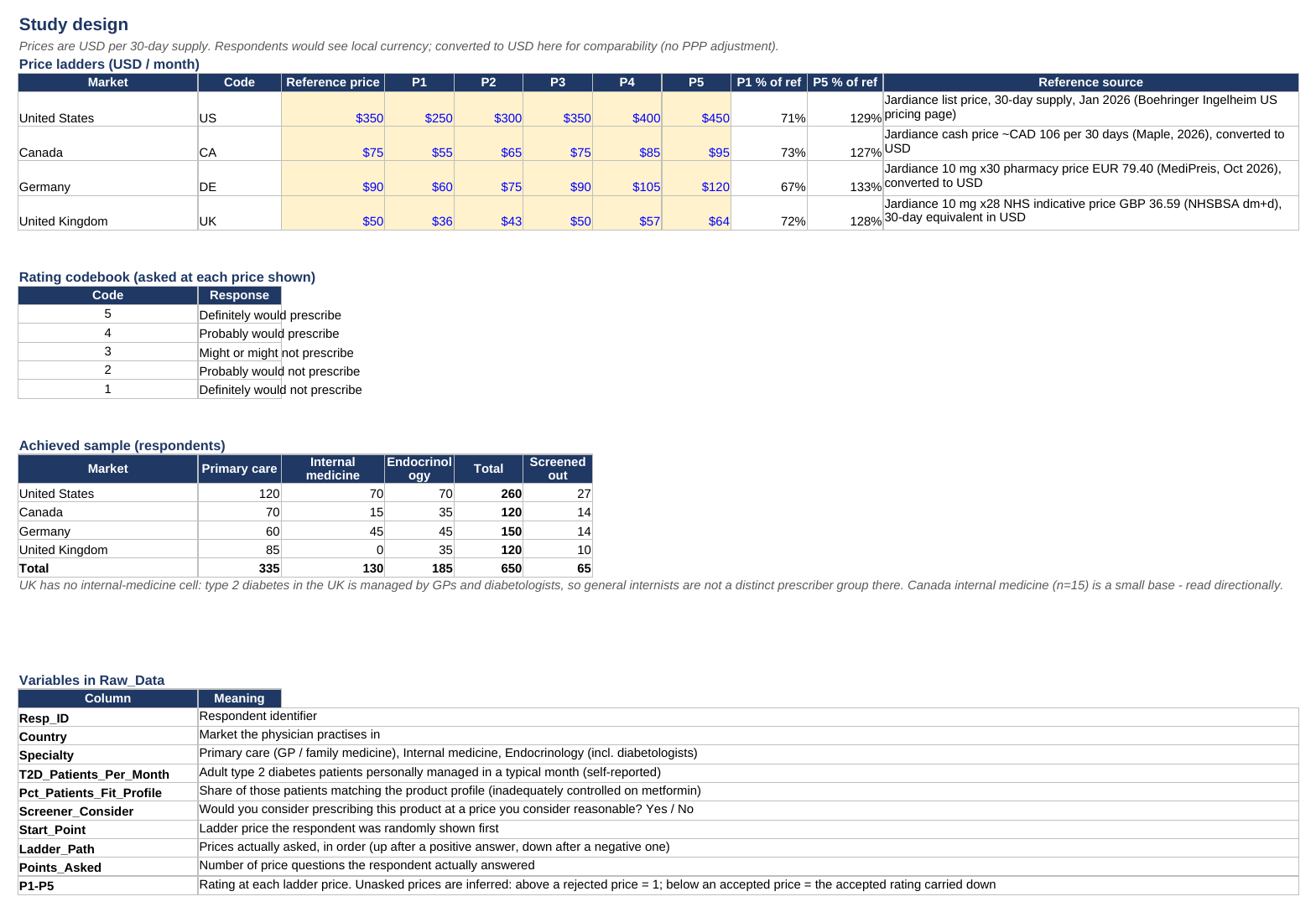
The market. Product X enters an established branded class. Physicians already prescribe one or two leading brands in that class and know roughly what they cost. For reference, the class leader's monthly list price is about $350 in the United States, about $75 in Canada, about $90 in Germany and about $50 in the United Kingdom (USD equivalents, 30-day supply).
The product. Clinical data shows efficacy comparable to the class leader, a similar safety profile, and no major new benefit. In other words, Product X is a credible alternative, not a breakthrough.
The decision. The launch team must recommend a list price per market to the pricing committee within the quarter. The commercial director's question is direct:
"Can we launch at parity with the class leader, or do we need a discount to win prescriptions - and if so, how much?"
The business objective. Maximise revenue (and ultimately margin) from Product X in its first years on the market, while building enough prescriber uptake to matter in a crowded class.
This is a narrow, concrete pricing question. That matters, because it is exactly the kind of question Gabor-Granger answers well.
3. Why Gabor-Granger for this launch
Run the five questions from the series framework against this scenario:
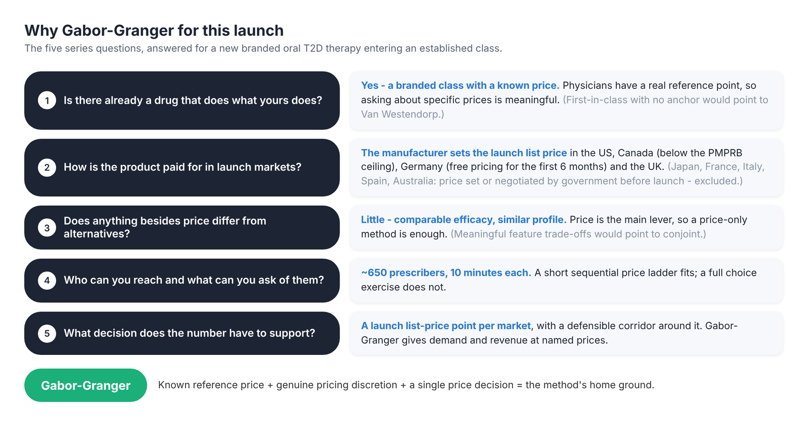
Is there already a drug that does what yours does? Yes, a branded class with a known price. Gabor-Granger needs this. It asks respondents to react to specific prices, and those reactions only mean something when the respondent has a reference point. For a first-in-class product with no anchor, an open-ended method such as Van Westendorp's Price Sensitivity Meter is the better first step.
How is it paid for in the launch markets? The manufacturer sets the launch list price. In the US the company sets the list price freely; in Canada it sets the price below a federal ceiling; in Germany it prices freely for the first six months before the negotiated price takes effect; in the UK it sets the list price. Where the government sets or negotiates the price before launch, a prescriber price survey has little to inform, so those markets are excluded (see section 4.5).
Does anything besides price differ from the alternatives? Very little. When the products are close substitutes, price is the main lever and a price-only method is enough. If Product X had meaningful trade-offs - a weekly dose, an outcomes claim, a different side-effect profile - a conjoint study, which measures how people trade features against price, would be the better tool.
Who can you reach and what can you ask? Around 650 prescribing physicians across four markets, with roughly ten minutes each. A short sequential price ladder fits easily; a full choice-based exercise would not.
What decision must the number support? One launch list price per market, with a defensible range around it. Gabor-Granger gives demand and revenue at named prices, which is exactly that.
Why not the alternatives?
Van Westendorp finds an acceptable price range from open-ended questions ("at what price would this be too expensive?"). It is useful early, but it does not produce a demand curve, so it cannot tell you which price maximises revenue.
Conjoint analysis is more powerful when features vary, but it is longer, costlier and harder to field with busy physicians. Here the features do not vary much.
Monadic price testing (each respondent sees only one price) avoids anchoring between prices but needs a much larger sample to get the same precision at five prices.
Gabor-Granger sits in the gap: a known reference price, genuine pricing discretion, and a single price decision. That is its home ground.
4. Collecting the data
4.1 The questionnaire
The pricing section sits inside a broader physician survey (practice profile, current prescribing, reaction to the product profile). The questions that matter for pricing are:
Screening and profiling
S1. Specialty: Primary care (general practice / family medicine), Internal medicine, Endocrinology (including diabetologists).
S2. How many adult patients with type 2 diabetes do you personally manage in a typical month?
S3. What percentage of those patients are inadequately controlled on metformin alone? (This defines the patients who fit Product X's profile.)
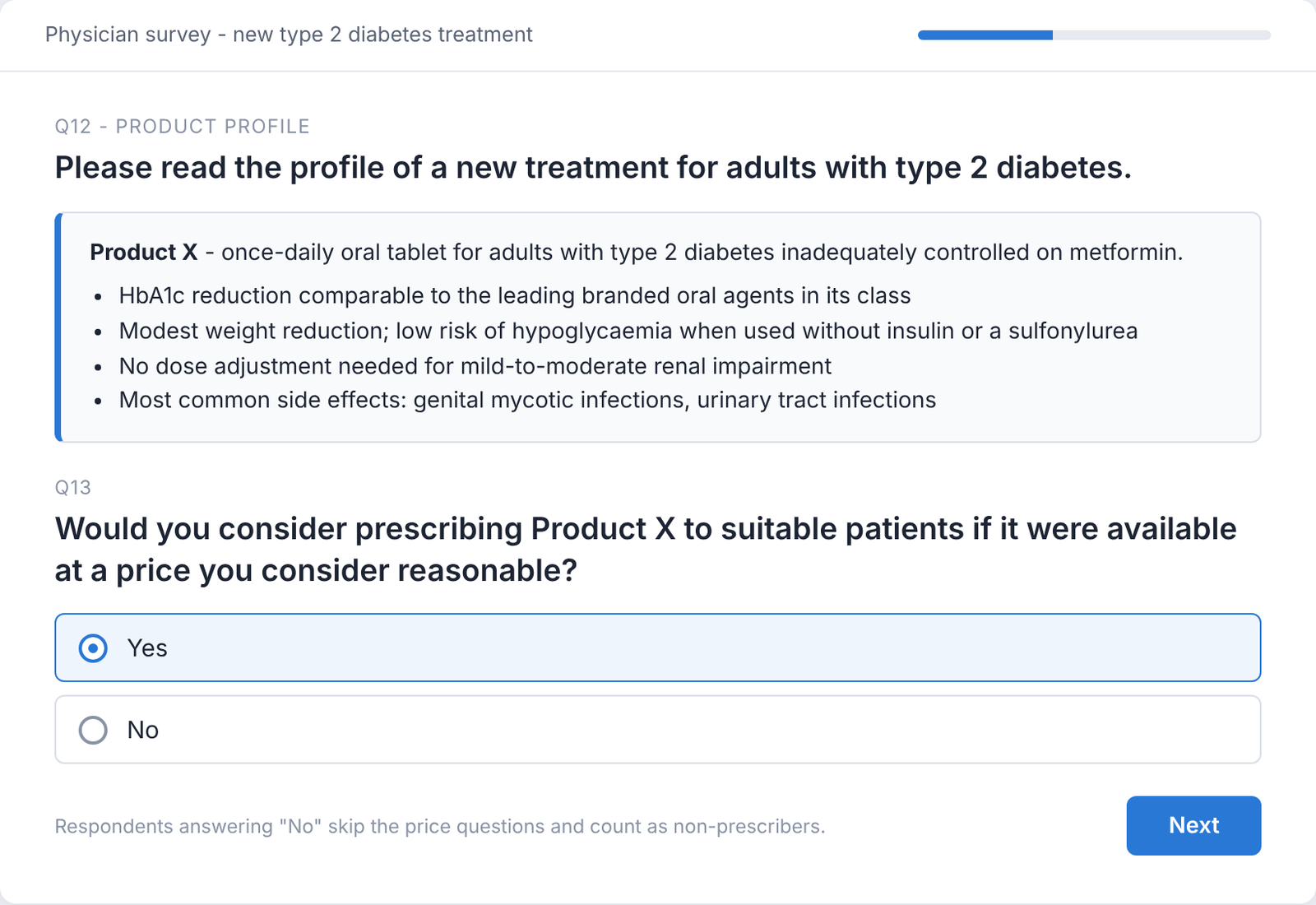
Product profile (Q12). A neutral, factual description of Product X: once-daily oral tablet, efficacy comparable to leading branded oral agents in its class, modest weight reduction, low risk of hypoglycaemia, common side effects. No price at this stage.
Consideration screener (Q13). "Would you consider prescribing Product X to suitable patients if it were available at a price you consider reasonable?" Yes / No.
Physicians who answer "No" skip the price questions. They are not dropped from the analysis: they stay in the base as non-prescribers at every price. Dropping them would inflate demand.
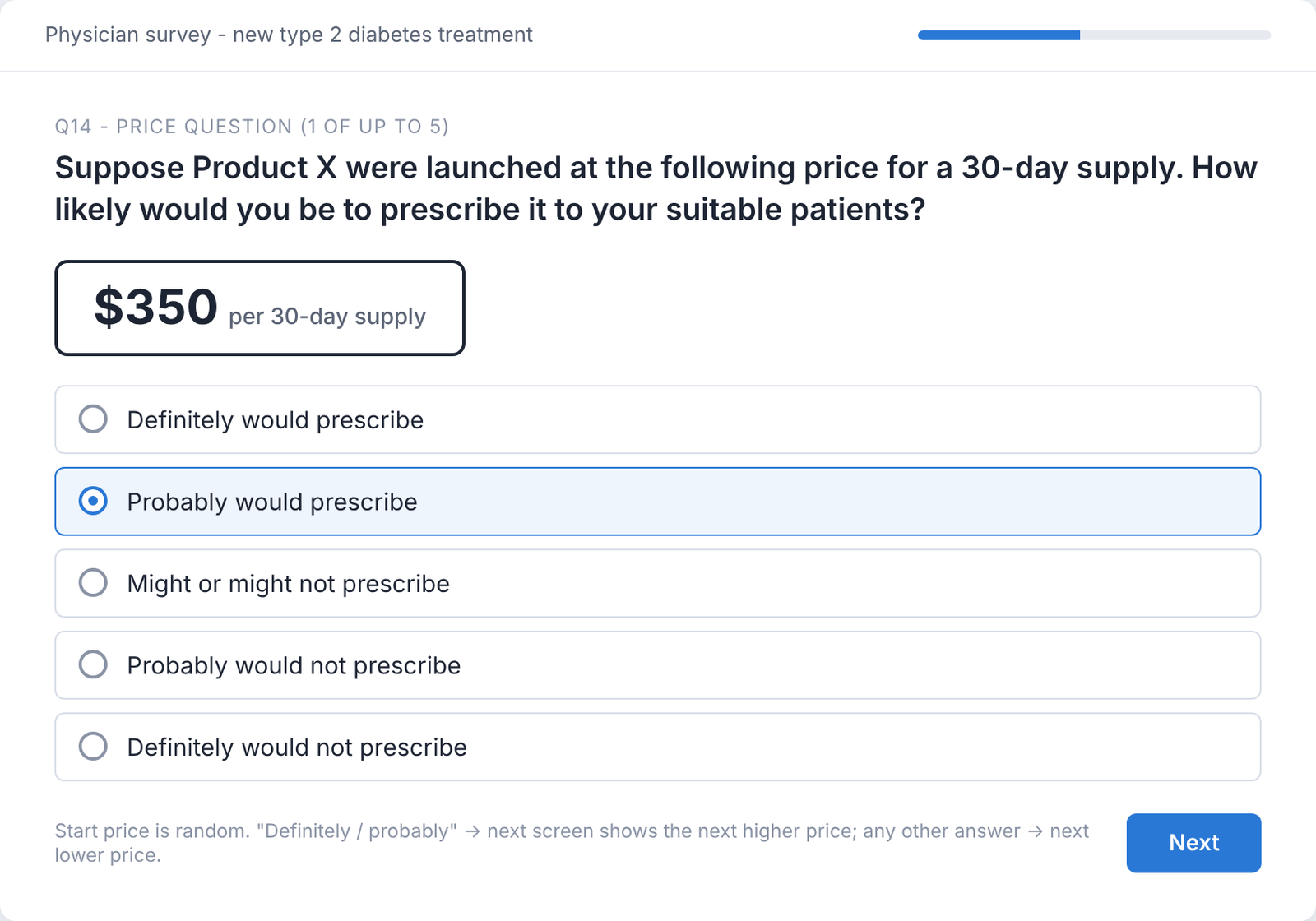
Price ladder (Q14), asked up to five times. "Suppose Product X were launched at the following price for a 30-day supply. How likely would you be to prescribe it to your suitable patients?"
5 = Definitely would prescribe
4 = Probably would prescribe
3 = Might or might not prescribe
2 = Probably would not prescribe
1 = Definitely would not prescribe
Two design choices are worth explaining.
Five price points. Five is the standard. Fewer and the curve is too coarse to locate a peak; more and respondents start to anchor on the sequence and fatigue sets in. The five prices bracket the class reference price: two below, one at, two above. For the US the ladder is $250, $300, $350, $400 and $450, roughly 70% to 130% of the class price. Every market uses the same proportional spread around its own reference price.
A 5-point likelihood scale, not yes/no. The scale at each price is the willingness-to-prescribe measure, just richer than a binary answer. It lets the analysis separate firm intent ("definitely") from softer intent ("probably"), which matters in Layer 1.
4.2 What the respondent sees
The physician first sees the product profile and the consideration question:
Then the first price. The starting price is chosen at random from the five, so that no single price always comes first and anchors every answer:
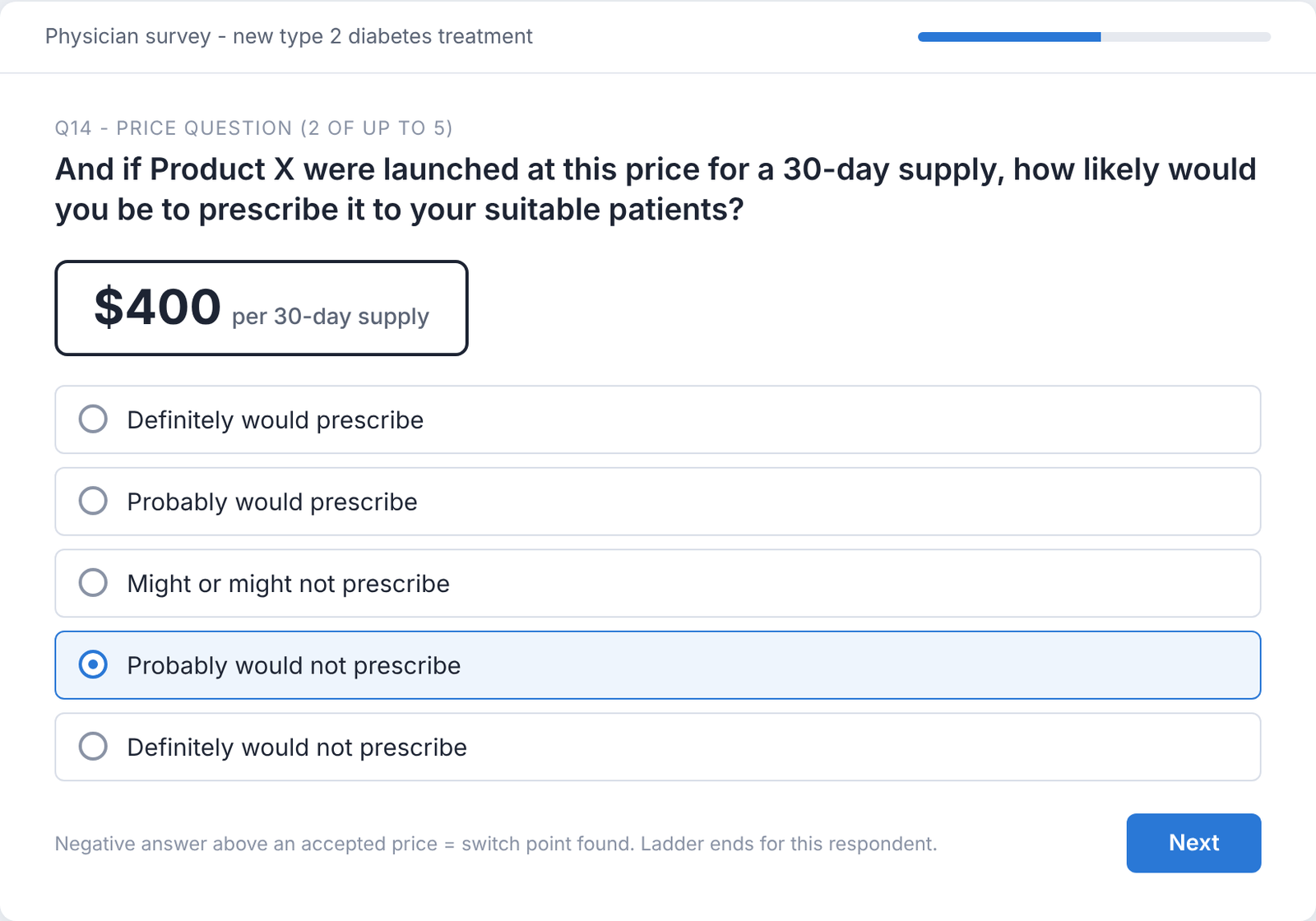
If the answer is "definitely" or "probably", the next screen shows the next higher price. Any other answer moves the respondent down. The ladder stops when the answer flips, because that is the respondent's switch point:
Each physician therefore answers only two to five price questions, not all five. The diagram below shows three typical paths and how the prices they never saw are filled in afterwards:
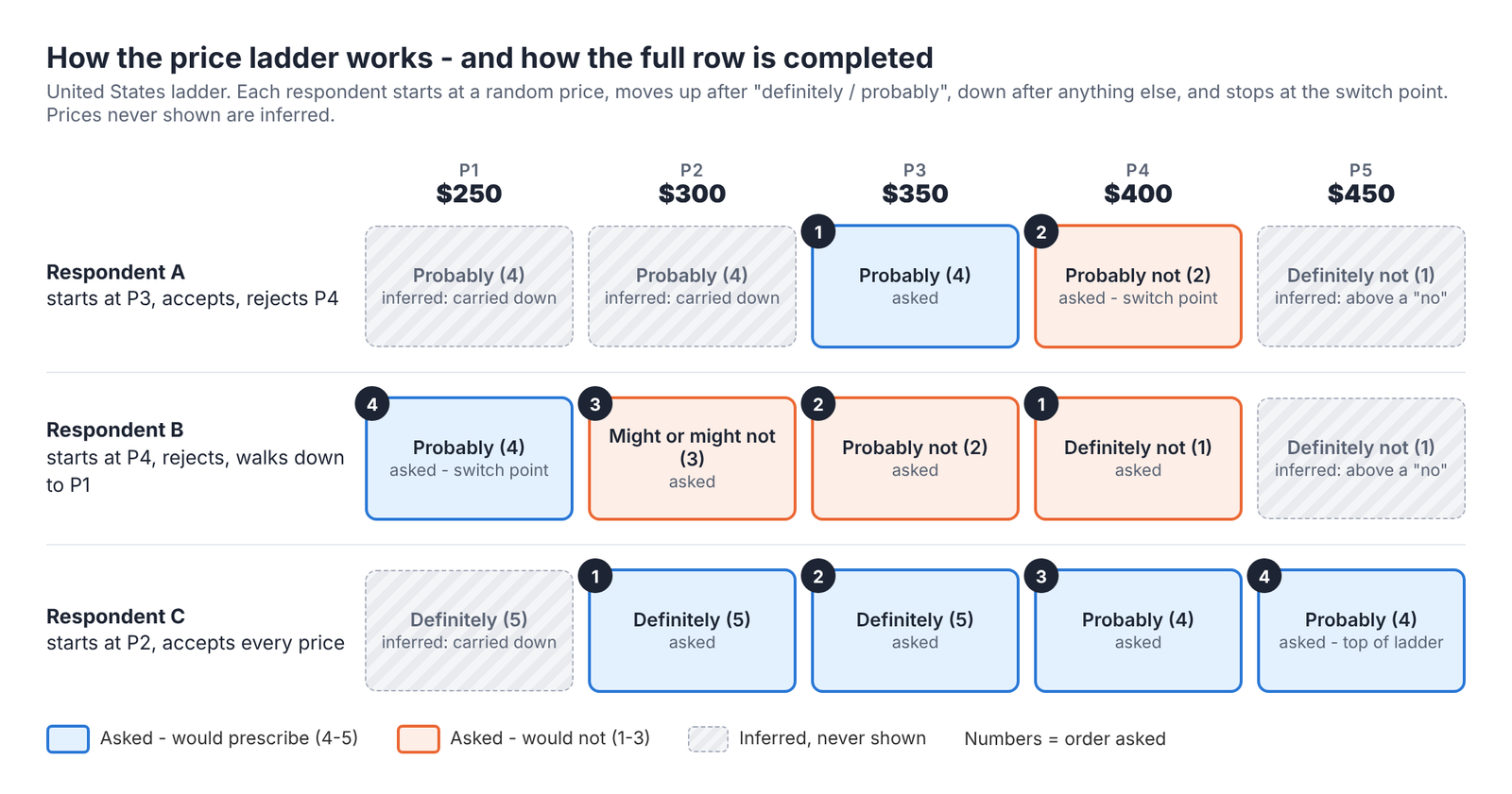
The fill-in rules are conservative and logical:
Above a rejected price: "definitely would not". If you would not prescribe at $400, you would not prescribe at $450.
Below an accepted price: the accepted answer is carried down. If you would "probably" prescribe at $350, you would at least "probably" prescribe at $300.
This gives every respondent a complete row of five answers, which keeps the analysis simple: one row per respondent, one column per price.
4.3 Survey platforms that support the method
Gabor-Granger is supported directly by most professional survey platforms, either as a built-in question type or through standard skip logic:
Conjointly - dedicated Gabor-Granger module with built-in analysis output.
Sawtooth Software - documents the method in detail; the ladder is built with its survey platform's branching.
Qualtrics - available as a marketplace pricing solution, or built with display logic.
SurveyMonkey - publishes Gabor-Granger guidance and pricing survey templates; the ladder is built with skip logic.
Survalyzer - offers a ready-made Gabor-Granger solution template.
Forsta (Decipher, Confirmit) and similar platforms common in healthcare fieldwork - built with standard loop-and-branch logic by the programming team.
The platform matters less than the logic behind it. That is what the next section covers.
4.4 Notes for the survey programmer
[CAUTION BOX] Hand this list to whoever programs the survey. Each rule says what to do and why, so both the consultant passing it on and a less experienced programmer understand the intent.
Randomise the starting price for each respondent. Pick one of the five prices at random as the first question. Why: if everyone starts at the lowest price, every answer is anchored on a bargain and demand at higher prices is overstated.
Branch on the answer, one step at a time. "Definitely" or "probably" → show the next higher price. Anything else → show the next lower price. Why: this finds each respondent's switch point with the fewest questions.
Stop when the direction reverses or the ladder ends. After a move up, the first negative answer ends the ladder; after a move down, the first positive answer ends it. Why: further questions add no information and increase fatigue.
Never show the same price twice. Why: repeated prices invite inconsistent answers.
Block illogical answers. A respondent must not give a more positive answer at a higher price than at a lower one. If the logic above is followed this cannot happen; add a hard check anyway. Why: illogical answers break the demand curve, and fixing them afterwards means guessing.
Store every answer and the order asked. Record the starting price, the path (for example "P3 > P4") and each answer. Why: the analyst needs to know which answers were asked and which were inferred.
Show local currency, store the USD equivalent. Each market sees its own currency and ladder; the data file carries a USD-converted price per point at a fixed exchange rate. Why: respondents react to prices they recognise; analysts need one currency to compare markets.
Keep screened-out respondents in the file. Do not delete physicians who answered "No" to the consideration question. Why: they are non-prescribers at every price and belong in the denominator.
Set quotas by market and specialty, and flag thin cells. Aim for at least 30 completes per specialty per market. Why: below that, a segment's curve swings too much to read with confidence.
Keep the price question wording identical across screens. Only the price changes. Why: any wording change becomes a hidden second variable.
4.5 Which markets, which physicians
Markets. The study was scoped for the US, Canada, the five largest EU markets, Australia and Japan. Each market was checked against one test: does the manufacturer have genuine discretion over the launch price, and does price reach the prescriber's decision?
| Market | Include? | Reason |
|---|---|---|
| United States | Yes | Manufacturer sets the list price; patient out-of-pocket costs and formulary tiers make physicians price-aware. |
| Canada | Yes | Manufacturer sets the price below a federal ceiling; a large share of patients pay through private plans or out of pocket. |
| Germany | Yes | Free pricing for the first six months after launch; physicians work under prescribing-cost checks. |
| United Kingdom | Yes | Manufacturer sets the list price; GPs prescribe within local formularies and budgets. |
| France, Italy, Spain | No | The price is negotiated with a national authority before launch; prescribers are largely insulated from it. |
| Japan | No | The government sets the price using a formula based on comparable drugs; the manufacturer has minimal discretion. |
| Australia | No | Public subsidy listing sets the effective price; patient co-payments are flat. |
In the excluded markets, a different question applies (what will the payer accept?), which needs a different method. That is a topic for a later post.
Physicians. Three prescriber groups: primary care, internal medicine and endocrinology. In real life primary care physicians write most type 2 diabetes prescriptions, so the sample is deliberately unbalanced towards them. That is acceptable because the segmentation here is diagnostic: it shows which group drops off first as price rises. It is not prescriptive: a company cannot charge different prices by specialty within one market. One market, one price.
Two realistic gaps are left in rather than smoothed over:
No internal medicine cell in the UK. Type 2 diabetes in the UK is managed by GPs and diabetologists; general internists are not a distinct prescriber group there.
Only 15 internists in Canada. Read directionally.
| Market | Primary care | Internal medicine | Endocrinology | Total | Screened out |
|---|---|---|---|---|---|
| United States | 120 | 70 | 70 | 260 | 27 |
| Canada | 70 | 15 | 35 | 120 | 14 |
| Germany | 60 | 45 | 45 | 150 | 14 |
| United Kingdom | 85 | - | 35 | 120 | 10 |
| Total | 335 | 130 | 185 | 650 | 65 |
Currency. Respondents would see prices in their own currency. For comparability, all prices in the dataset and this post are in US dollars at a straight exchange-rate conversion, with no purchasing-power adjustment.
4.6 What the data looks like
One row per respondent. The first nine columns describe the respondent and the path they took through the ladder; the last five hold their answer at each price.
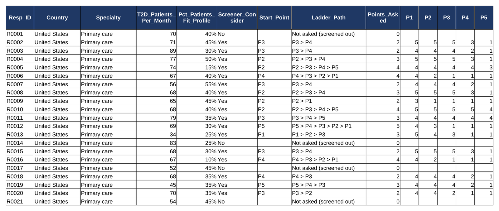
| Column | Meaning |
|---|---|
| Resp_ID | Respondent identifier |
| Country, Specialty | Market and prescriber group |
| T2D_Patients_Per_Month | Adult type 2 diabetes patients managed per month |
| Pct_Patients_Fit_Profile | Share of those patients who fit Product X's profile |
| Screener_Consider | Answer to the consideration question |
| Start_Point, Ladder_Path, Points_Asked | Where the ladder started, which prices were actually asked, how many |
| P1 - P5 | Answer at each ladder price (5 = definitely … 1 = definitely not); blank = screened out |
Download the workbook: [Gabor_Granger_T2D_Pricing.xlsx]
5. Analysis, layer by layer
[TAB: EXCEL] and [TAB: PYTHON] below hold the same six layers. Each tab is self-contained.
[TAB: EXCEL]
How the workbook is organised
| Sheet | Purpose |
|---|---|
| README | Sheet guide, colour code, how to run Solver |
| Dashboard | Final view: pick a market, see fitted curves, recommended price and interval |
| Study_Design | Price ladders, rating codebook, achieved sample |
| Raw_Data | One row per respondent |
| Levers | Analyst choices: scale weights, weighting basis, calibration, minimum base, unit cost |
| Prep | Helper columns: each answer's weight, each respondent's analysis weight |
| Step1_Base … Step6_Margin | One sheet per analysis layer |
| Curve_Grid | Fitted demand, revenue and margin at 81 prices per cell |
| Boot_Weights | Bootstrap resampling weights |
Colour code: blue text on yellow = inputs you may change; black = formulas; green fill = key results. Every number is a live formula, so changing a lever recalculates the whole chain.
Excel Step 0 - Set the levers
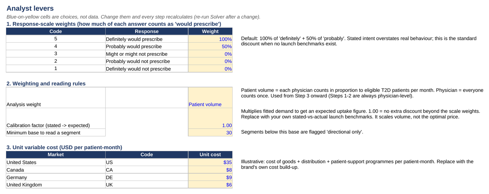
The Levers sheet holds every judgement call in one place:
Response-scale weights. How much of each answer counts as "would prescribe". Default: 100% of "definitely", 50% of "probably", 0% for the rest. Physicians, like consumers, overstate what they will do in a survey. Counting only half of the "probably" answers is the standard correction when no real launch data is available to calibrate against.
Analysis weight. "Physician" (everyone counts once) or "Patient volume" (each physician counts in proportion to the eligible patients they manage). Used from Step 3.
Calibration factor. Multiplies demand to get an expected uptake figure. Default 1.00, meaning no further discount beyond the scale weights.
Minimum base. Segments below 30 respondents are flagged as directional.
Unit variable cost. Cost per patient-month used in Step 6.
The Prep sheet then translates every answer into its weight using INDEX/MATCH against the weights table, so the analysis sheets never hard-code a percentage:
=IF(Raw_Data!J2="",0,INDEX(Levers!$C$5:$C$9,MATCH(Raw_Data!J2,Levers!$A$5:$A$9,0)))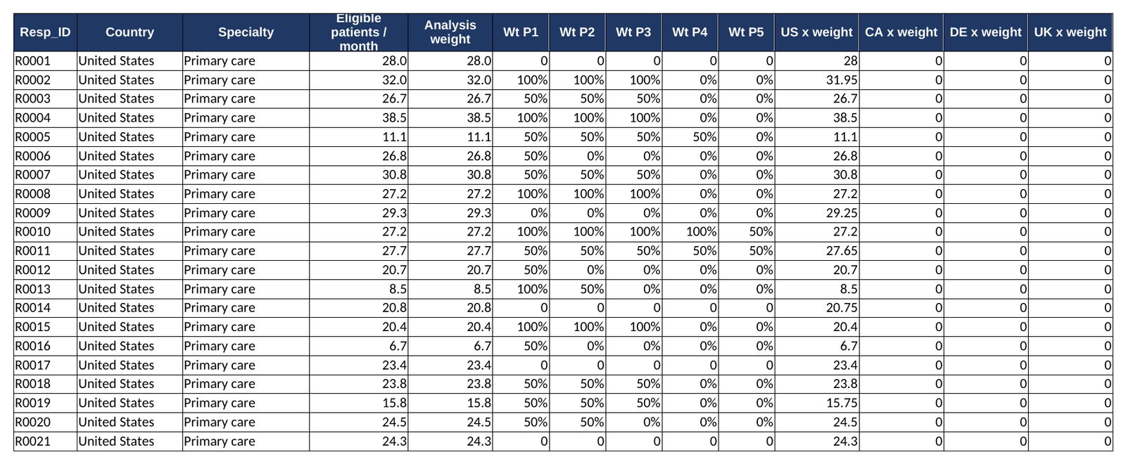
Excel Step 1 - The plain Gabor-Granger curve
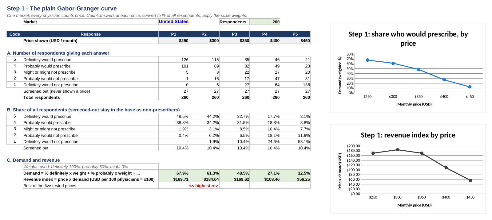
Choose a market in the yellow cell (C3). The sheet then does three things.
A. Count the answers at each price. For each price column and each answer code:
=COUNTIFS(Raw_Data!$B$2:$B$651,$C$3,Raw_Data!J$2:J$651,$A9)Screened-out physicians are counted on their own row so the total always equals all respondents in the market (260 in the US).
B. Convert counts to shares of all respondents. Each count divided by the total. In the US, at $350: 85 of 260 physicians said "definitely" (32.7%) and 82 said "probably" (31.5%).
C. Apply the weights to get demand. Demand at each price is the share-weighted sum:
=SUMPRODUCT(E18:E22,Levers!$C$5:$C$9)At $350 that is 32.7% × 100% + 31.5% × 50% = 48.5%. In plain words: we expect roughly half of US prescribers to adopt Product X at parity with the class leader.
Revenue index is simply price × demand. It is not a revenue forecast; it is a way to compare prices on the same scale.
| US, physician-level | $250 | $300 | $350 | $400 | $450 |
|---|---|---|---|---|---|
| Demand | 67.9% | 61.3% | 48.5% | 27.1% | 12.5% |
| Revenue index | $169.71 | $184.04 | $169.62 | $108.46 | $56.25 |
Of the five tested prices, $300 earns the most. That is already a useful first answer: parity ($350) is not the revenue-maximising choice. But the true peak could be anywhere between $250 and $350, and we do not yet know whether the answer holds across specialties or how sure we can be. The next layers address each of those.
Excel Step 2 - Split by specialty
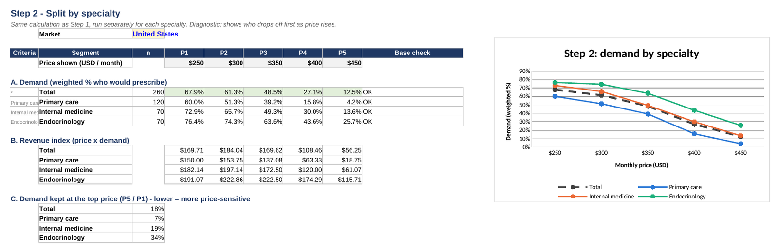
Same calculation, now per specialty. Each segment's demand at a price is a sum of COUNTIFS (one per answer code) multiplied by the matching weight, divided by the segment's size:
=IF($C9=0,NA(),(COUNTIFS(...,5)*INDEX(weights,1)+COUNTIFS(...,4)*INDEX(weights,2)+...)/$C9)The NA() matters: in the UK, where there is no internal medicine cell, the chart simply leaves that line out rather than plotting a misleading zero.
| US, physician-level | $250 | $300 | $350 | $400 | $450 | Demand kept at top price |
|---|---|---|---|---|---|---|
| Primary care (n=120) | 60.0% | 51.2% | 39.2% | 15.8% | 4.2% | 7% |
| Internal medicine (n=70) | 72.9% | 65.7% | 49.3% | 30.0% | 13.6% | 19% |
| Endocrinology (n=70) | 76.4% | 74.3% | 63.6% | 43.6% | 25.7% | 34% |
The last column, demand at $450 divided by demand at $250, is a quick read of price sensitivity: the lower it is, the more of the segment disappears as price rises. Primary care keeps only 7% of its starting demand; endocrinologists keep a third. Primary care is the most price-sensitive group, and it is also the group that writes most prescriptions.
Excel Step 3 - From physicians to patients
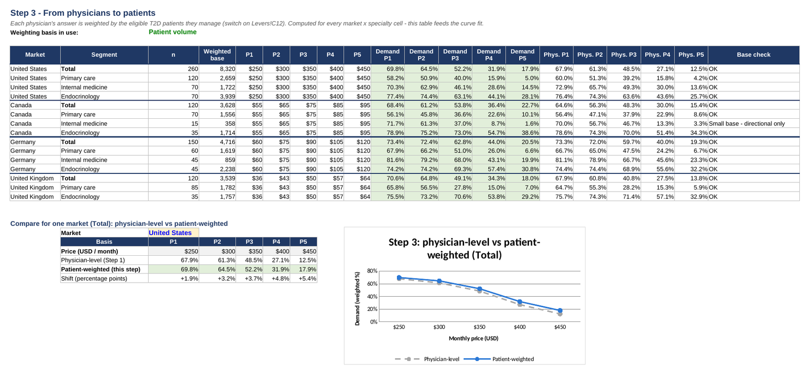
So far every physician counts once. But an endocrinologist managing 60 eligible patients a month matters more to Product X's uptake than a GP managing 15. Patient weighting fixes this: each physician's answer counts in proportion to their eligible patients (patients per month × share fitting the profile).
This sheet computes demand for every market × specialty cell at once with SUMPRODUCT, using the analysis weight from Prep:
=SUMPRODUCT((Prep!$B$2:$B$651=$A6)*(((Prep!$C$2:$C$651=$B6)+($B6="Total"))>0)*Prep!$E$2:$E$651*Prep!$F$2:$F$651)/$D6Read it as: for respondents in this market and this segment, add up (analysis weight × answer weight), then divide by the total analysis weight.
| US Total | $250 | $300 | $350 | $400 | $450 |
|---|---|---|---|---|---|
| Physician-level | 67.9% | 61.3% | 48.5% | 27.1% | 12.5% |
| Patient-weighted | 69.8% | 64.5% | 52.2% | 31.9% | 17.9% |
Demand rises most at the higher prices (+5.4 points at $450). Within each specialty the curves barely move; the change comes from the mix. Endocrinologists manage more eligible patients, and they are the least price-sensitive, so weighting by patients gives their tolerance more say. This is the curve the rest of the analysis uses: share of eligible patients, not share of doctors.
Excel Step 4 - Fit a logistic demand curve with Solver
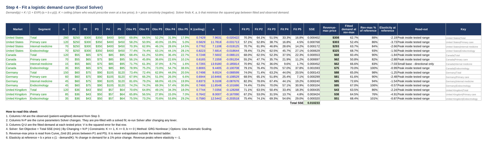
Five points tell us demand at five prices. To find the best price between them we need a smooth curve through the points. A logistic (S-shaped) curve is the natural choice for a share: it cannot go above its ceiling or below zero, and it falls fastest in the middle, where most physicians reach their switch point.
The curve used here has three parameters:
Demand(p) = K / (1 + EXP(-(a + b × p)))K, the ceiling: the share who would prescribe even at a very low price. It is below 100% because some physicians never will (screened out, or never above "might").
a, the position: shifts the curve left or right along the price axis.
b, the price sensitivity: negative; the larger its size, the steeper the drop.
What Solver does. For each market × segment row, columns Q to U compute the fitted demand at the five tested prices, and column V the sum of squared gaps between fitted and observed (SSE). Solver changes K, a and b to make the total SSE as small as possible.
How to run it.
Enable Solver once: File > Options > Add-ins > Manage Excel Add-ins > Go > tick Solver Add-in.
Data > Solver. The model is pre-loaded:
Set Objective: the Total SSE cell, To: Min
By Changing Variable Cells: the K, a, b columns (N6:P20)
Constraints: K ≤ 1, K ≥ 0, b ≤ 0
Solving method: GRG Nonlinear
Options: tick Use Automatic Scaling
Click Solve, then Keep Solver Solution.
[SCREENSHOT TO TAKE IN EXCEL: the Solver Parameters dialog with these settings]
One Solver run fits all 15 market × segment cells together. That works because the rows are independent: making the sum of their errors as small as possible makes each one as small as possible. The parameters are pre-filled with a solved fit, so the workbook opens ready; re-run Solver whenever you change a lever.
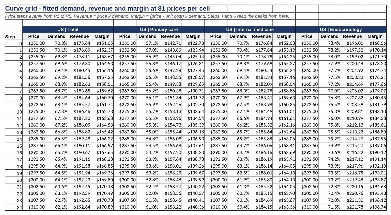
Finding the peak. Curve_Grid evaluates every fitted curve at 81 evenly spaced prices between the lowest and highest tested price, with revenue (price × demand) alongside. Step 4 reads the peak with:
=INDEX(price_column, MATCH(MAX(revenue_column), revenue_column, 0))The grid never goes beyond the tested ladder. A peak outside the prices respondents actually saw would be an extrapolation, and the Read-out column says so if it ever happens.
Elasticity. Step 4 also reports price elasticity at the class reference price: the percentage change in demand for a 1% change in price. For this curve it is b × price × (1 − demand / K). Revenue peaks where elasticity equals −1. So:
elasticity more negative than −1 at the reference price (e.g. −2.2) → demand is very price-sensitive there; a lower price would earn more;
elasticity between −1 and 0 → demand is not very sensitive; a higher price would earn more.
| Total, patient-weighted | Reference | Revenue-max price | % of reference | Elasticity at reference |
|---|---|---|---|---|
| United States | $350 | $307.50 | 88% | −2.19 |
| Canada | $75 | $67.50 | 90% | −1.84 |
| Germany | $90 | $87.75 | 98% | −1.25 |
| United Kingdom | $50 | $43.00 | 86% | −2.24 |
Excel Step 5 - How sure are we? A bootstrap interval
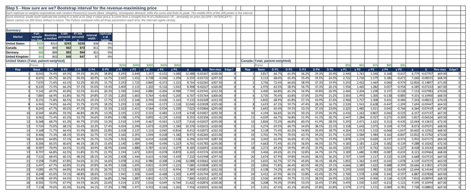
$307.50 is a point estimate from one sample of 260 US physicians. A different sample would give a slightly different answer. The bootstrap estimates how much.
The idea. Create many alternative samples from the one we have by resampling respondents, re-run the whole calculation on each, and see how much the answer moves. The middle 95% of the results is the interval.
How it is done here. The Boot_Weights sheet holds 200 columns of random whole numbers, one per respondent (mostly 0, 1 or 2, averaging 1). Each column is one alternative sample: a respondent with weight 2 counts twice, with weight 0 is left out. This is called a Poisson bootstrap; it behaves like drawing respondents with replacement but needs no sampling formulas.
For each of the 200 replicates and each market, Step 5:
recomputes patient-weighted demand at the five prices with
SUMPRODUCT(bootstrap weight × market flag × patient weight × answer weight);refits the curve;
finds the revenue peak on the same 81-point grid.
One honest shortcut. Solver cannot run 200 times without a macro. So inside each replicate, Excel holds the ceiling K at its Step 4 value and gets a and b from a straight-line fit (SLOPE and INTERCEPT) of LN(demand / (K − demand)) on price. That transformation turns the S-curve into a straight line. The Python tab refits all three parameters every time; the two intervals agree closely (see the comparison in the Python tab).
The peak for each replicate is a single array formula that searches the 81-point grid:
{=INDEX(grid_prices, MATCH(MAX(grid_prices/(1+EXP(-(a+b*grid_prices)))), grid_prices/(1+EXP(-(a+b*grid_prices))), 0))}| Market | Revenue-max | 95% interval (Excel) |
|---|---|---|
| United States | $307.50 | $292.50 - $330.00 |
| Canada | $67.50 | $62.00 - $73.00 |
| Germany | $87.75 | $82.50 - $93.75 |
| United Kingdom | $43.00 | $39.85 - $46.51 |
In every market the interval sits below the class reference price, except Germany, where it reaches up to parity.
Excel Step 6 - From revenue to margin
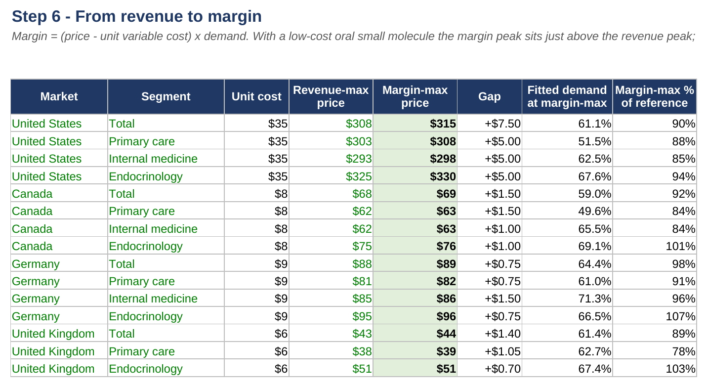
Revenue is not profit. Each patient-month carries a variable cost: goods, distribution, patient support. Margin per patient = (price − unit cost) × demand. Curve_Grid computes it alongside revenue, and Step 6 reads its peak in the same way.
| Total, patient-weighted | Unit cost | Revenue-max | Margin-max | Gap |
|---|---|---|---|---|
| United States | $35 | $307.50 | $315.00 | +$7.50 |
| Canada | $8 | $67.50 | $69.00 | +$1.50 |
| Germany | $9 | $87.75 | $88.50 | +$0.75 |
| United Kingdom | $6 | $43.00 | $44.40 | +$1.40 |
The margin peak is always a little higher than the revenue peak, because each lost patient also removes a cost. For an oral small molecule with low unit cost the gap is small. It grows quickly for products with high manufacturing or service costs, such as biologics or devices.
Excel - The dashboard
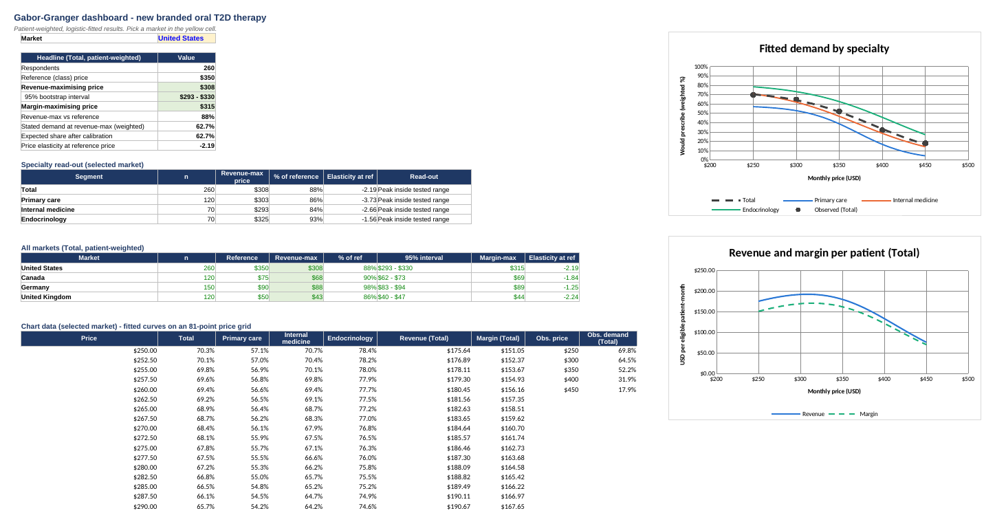
The Dashboard pulls everything together for the market chosen in C3: the headline price, its interval, the margin-max price, the specialty read-out, a fitted-curve chart with one line per specialty plus the observed points, and the revenue and margin curves. A table underneath compares all four markets at once.
Showing every market × specialty combination as lines on one chart would give 15 tangled lines. The dashboard instead uses a market selector, so each view shows at most four lines, and summarises markets in a table.
[TAB: PYTHON]
The notebook reads the same Excel file, including the Levers sheet, so a change made in Excel flows into Python too. Code is shown in full at every step; output is shown where a step produces something to look at.
Requirements: pandas, numpy, scipy, matplotlib, openpyxl.
Python Step 0 - Libraries and settings
import numpy as np
import pandas as pd
import matplotlib.pyplot as plt
from scipy.optimize import curve_fit

pd.set_option("display.width", 140)
pd.set_option("display.max_columns", 20)

FILE = "Gabor_Granger_T2D_Pricing.xlsx"
PRICE_COLS = ["P1", "P2", "P3", "P4", "P5"]
SEGMENTS = ["Total", "Primary care", "Internal medicine", "Endocrinology"]
COLORS = {"Total": "#404040", "Primary care": "#2a78d6",
          "Internal medicine": "#eb6834", "Endocrinology": "#1baf7a"}
def label_ends(ax, items, x, gap=0.045):
    # direct labels at line ends, nudged apart so they never overlap
    items = sorted(items, key=lambda t: t[1])
    placed = []
    for name, y in items:
        if placed and y - placed[-1] < gap:
            y = placed[-1] + gap
        placed.append(y)
        ax.annotate(name, (x, y), xytext=(6, 0), textcoords="offset points", va="center", fontsize=9, color="#333333")

plt.rcParams.update({"font.family": "DejaVu Sans", "font.size": 10, "axes.spines.top": False,
                     "axes.spines.right": False, "axes.grid": True, "grid.color": "#e6e6e6",
                     "grid.linewidth": 0.8, "text.parse_math": False, "axes.edgecolor": "#8c8c8c", "figure.dpi": 110})
Python Step 1 - Read the survey data
raw = pd.read_excel(FILE, sheet_name="Raw_Data")
raw[PRICE_COLS] = raw[PRICE_COLS].astype("Int64")     # ratings are whole numbers; blank = screened out
print(raw.shape)
raw.head(8)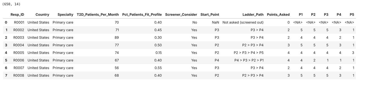
Ratings are read as whole numbers; blank means the physician was screened out.
Python Step 2 - Read the study design and the levers
ladders = (pd.read_excel(FILE, sheet_name="Study_Design", header=3, nrows=4, usecols="A:H")
             .set_index("Market"))
levers = pd.read_excel(FILE, sheet_name="Levers", header=None)

scale_weights = dict(zip(levers.iloc[4:9, 0].astype(int), levers.iloc[4:9, 2].astype(float)))
weighting_basis = levers.iloc[11, 2]          # "Patient volume" or "Physician"
calibration = float(levers.iloc[12, 2])
min_base = int(levers.iloc[13, 2])
unit_cost = dict(zip(levers.iloc[17:21, 0], levers.iloc[17:21, 2].astype(float)))

print("Scale weights:", scale_weights)
print("Weighting basis:", weighting_basis, "| calibration:", calibration, "| min base:", min_base)
print("Unit cost:", unit_cost)
ladders
Reading the levers from the workbook (rather than typing them into the code) keeps the two analyses in step: change the weight on "probably" in Excel, re-run the notebook, and both tracks move together.
Python Step 3 - Check the sample
sample = pd.crosstab(raw["Country"], raw["Specialty"], margins=True, margins_name="Total")
sample["Screened out"] = raw[raw["Screener_Consider"] == "No"].groupby("Country").size()
sample.loc["Total", "Screened out"] = (raw["Screener_Consider"] == "No").sum()
sample = sample.fillna(0).astype(int)

# Survey logic check: answers must never rise as price rises
answered = raw.dropna(subset=PRICE_COLS)
assert (answered[PRICE_COLS].diff(axis=1).iloc[:, 1:] <= 0).all().all(), "non-monotonic answers found"
print("Monotonicity check passed for", len(answered), "respondents")
sample
The assert line is the analyst's version of survey-programming rule 5: it stops the notebook if any respondent gives a more positive answer at a higher price than at a lower one.
Python Step 4 - Reshape to long format
raw["Eligible_Patients"] = raw["T2D_Patients_Per_Month"] * raw["Pct_Patients_Fit_Profile"]

long = raw.melt(id_vars=["Resp_ID", "Country", "Specialty", "Eligible_Patients"],
                value_vars=PRICE_COLS, var_name="Point", value_name="Rating")
long["Price"] = [ladders.loc[c, p] for c, p in zip(long["Country"], long["Point"])]
long["Weight"] = long["Rating"].map(scale_weights).fillna(0.0)
long.sort_values(["Resp_ID", "Point"]).head(10)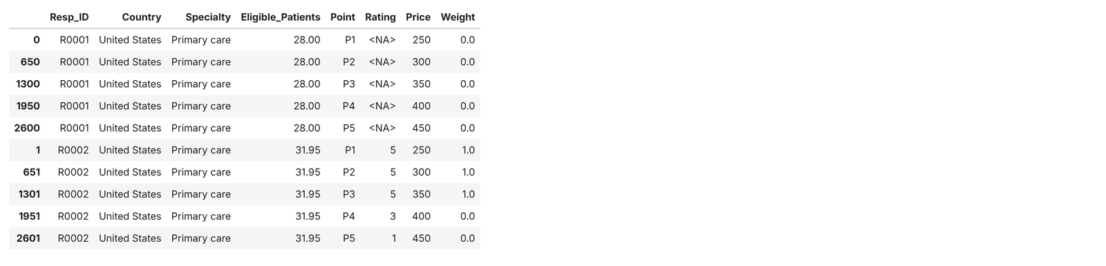
"Long" format means one row per respondent per price point instead of one row per respondent. It looks bigger, but it turns every later calculation into a simple group-by. Each row also carries the answer's weight (1.0, 0.5 or 0); screened-out physicians get 0 at every price, which keeps them in the base as non-prescribers.
Python Step 5 - Layer 1: the plain curve
MARKET = "United States"
labels = {5: "Definitely", 4: "Probably", 3: "Might or might not", 2: "Probably not", 1: "Definitely not"}

m = long[long["Country"] == MARKET]
counts = (m.assign(Answer=m["Rating"].map(labels).fillna("Screened out"))
            .pivot_table(index="Answer", columns="Price", values="Resp_ID", aggfunc="count", fill_value=0)
            .reindex(list(labels.values()) + ["Screened out"]))
shares = counts / counts.sum()

base = pd.DataFrame({"Demand": m.groupby("Price")["Weight"].mean()})
base["Revenue index"] = base.index * base["Demand"]
counts
base.style.format({"Demand": "{:.1%}", "Revenue index": "${:,.2f}"})
Because each row already carries its answer weight, demand at a price is just the mean weight across all respondents at that price. At $350: 48.5%, the same as Excel.
fig, ax = plt.subplots(1, 2, figsize=(10, 3.8))
ax[0].plot(base.index, base["Demand"], marker="o", color=COLORS["Primary care"], lw=2)
ax[0].set(title=f"{MARKET}: share who would prescribe", xlabel="Monthly price (USD)", ylim=(0, 1))
ax[0].yaxis.set_major_formatter(plt.matplotlib.ticker.PercentFormatter(1.0))
ax[1].plot(base.index, base["Revenue index"], marker="o", color=COLORS["Total"], lw=2)
best = base["Revenue index"].idxmax()
ax[1].annotate(f"best tested: ${best:,.0f}", (best, base.loc[best, "Revenue index"]),
               xytext=(0, 10), textcoords="offset points", ha="center")
ax[1].set(title="Revenue index (price x demand)", xlabel="Monthly price (USD)",
          ylim=(0, base["Revenue index"].max() * 1.2))
for a in ax:
    a.set_xticks(base.index)
    a.xaxis.set_major_formatter(plt.matplotlib.ticker.StrMethodFormatter("${x:,.0f}"))
plt.tight_layout()
plt.savefig("fig_l1_base_curve.png", dpi=200, bbox_inches="tight")
plt.show()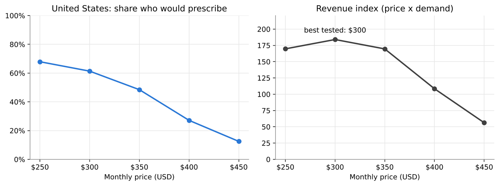
Python Step 6 - Layer 2: split by specialty
def demand_by(frame, weight=None):
    """Weighted share at each price. weight=None -> each physician counts once."""
    w = 1.0 if weight is None else frame[weight]
    num = (frame["Weight"] * w).groupby(frame["Price"]).sum()
    den = pd.Series(w, index=frame.index).groupby(frame["Price"]).sum()
    return num / den

seg = {"Total": demand_by(m)}
for s in SEGMENTS[1:]:
    seg[s] = demand_by(m[m["Specialty"] == s])
seg = pd.DataFrame(seg).T
seg.insert(0, "n", [m["Resp_ID"].nunique()] + [m.loc[m["Specialty"] == s, "Resp_ID"].nunique() for s in SEGMENTS[1:]])
seg["Kept at top price"] = seg[seg.columns[-1]] / seg[seg.columns[1]]
seg.style.format({c: "{:.1%}" for c in seg.columns if c != "n"})
demand_by is written once and reused for every layer: with no weight it treats each physician equally; given a weight column it computes a weighted share.
fig, ax = plt.subplots(figsize=(6.5, 4))
prices = ladders.loc[MARKET, PRICE_COLS].values.astype(float)
ends = []
for s in SEGMENTS:
    y = seg.loc[s, prices].values
    ax.plot(prices, y, marker="o", color=COLORS[s], lw=2.6 if s == "Total" else 1.8,
            ls="--" if s == "Total" else "-")
    ends.append((s, y[-1]))
label_ends(ax, ends, prices[-1])
ax.set(title=f"{MARKET}: demand by specialty", xlabel="Monthly price (USD)", ylim=(0, 1), xlim=(prices[0] - 15, prices[-1] + 90))
ax.yaxis.set_major_formatter(plt.matplotlib.ticker.PercentFormatter(1.0))
ax.set_xticks(prices)
ax.xaxis.set_major_formatter(plt.matplotlib.ticker.StrMethodFormatter("${x:,.0f}"))
plt.tight_layout()
plt.savefig("fig_l2_specialty.png", dpi=200, bbox_inches="tight")
plt.show()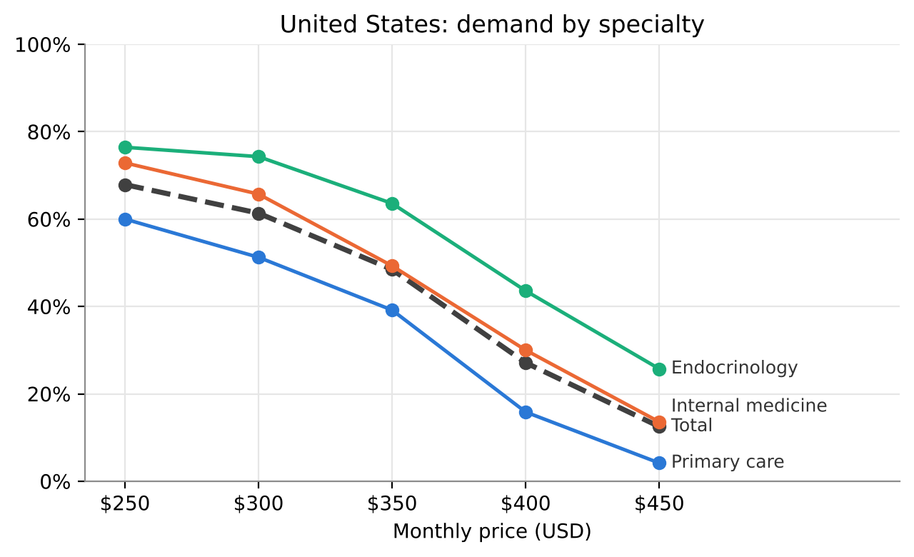
Python Step 7 - Layer 3: from physicians to patients
use_patients = weighting_basis == "Patient volume"
rows = []
for c in ladders.index:
    for s in SEGMENTS:
        sub = long[(long["Country"] == c) & ((long["Specialty"] == s) | (s == "Total"))]
        if sub.empty:
            continue                      # e.g. UK internal medicine is not a prescriber group
        d_phys = demand_by(sub)
        d_pat = demand_by(sub, "Eligible_Patients") if use_patients else d_phys
        rows.append({"Market": c, "Segment": s, "n": sub["Resp_ID"].nunique(),
                     "prices": d_pat.index.values, "obs": d_pat.values, "phys": d_phys.values})
cells = pd.DataFrame(rows)

view = cells[["Market", "Segment", "n"]].copy()
for k in range(5):
    view[f"Phys P{k+1}"] = cells["phys"].str[k]
    view[f"Pat P{k+1}"] = cells["obs"].str[k]
view["Base"] = np.where(view["n"] < min_base, "Small base - directional", "OK")
view.style.format({c: "{:.1%}" for c in view.columns if c.startswith(("Phys", "Pat"))}).hide(axis="index")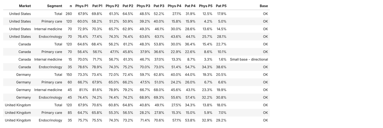
us = cells[(cells.Market == MARKET) & (cells.Segment == "Total")].iloc[0]
fig, ax = plt.subplots(figsize=(6.5, 4))
ax.plot(us.prices, us.phys, marker="o", color="#a6a6a6", ls="--", lw=1.8, label="Physician-level")
ax.plot(us.prices, us.obs, marker="o", color=COLORS["Primary care"], lw=2.2, label="Patient-weighted")
ax.set(title=f"{MARKET}: physician-level vs patient-weighted demand", xlabel="Monthly price (USD)", ylim=(0, 1))
ax.yaxis.set_major_formatter(plt.matplotlib.ticker.PercentFormatter(1.0))
ax.set_xticks(us.prices)
ax.xaxis.set_major_formatter(plt.matplotlib.ticker.StrMethodFormatter("${x:,.0f}"))
ax.legend(frameon=False)
plt.tight_layout()
plt.savefig("fig_l3_weighting.png", dpi=200, bbox_inches="tight")
plt.show()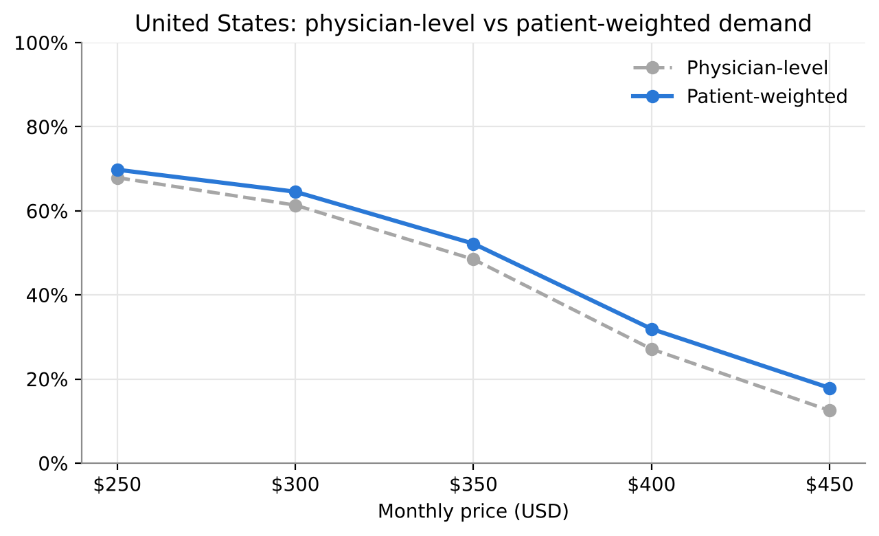
Python Step 8 - Layer 4: fit the logistic curve
def logistic3(p, K, a, b):
    return K / (1 + np.exp(-(a + b * p)))

def fit(prices, demand):
    p0 = [min(0.99, demand.max() + 0.05), 6.0, -6.0 / prices.mean()]
    params, _ = curve_fit(logistic3, prices, demand, p0=p0,
                          bounds=([0, -50, -10], [1, 50, 0]), maxfev=20000)
    return params

def peak(prices, K, a, b, cost=0.0, n=81):
    grid = np.linspace(prices[0], prices[-1], n)
    return grid[np.argmax((grid - cost) * logistic3(grid, K, a, b))]

out = []
for _, r in cells.iterrows():
    K, a, b = fit(r.prices, r.obs)
    ref = ladders.loc[r.Market, "Reference price"]
    rev_max = peak(r.prices, K, a, b)
    d_ref = logistic3(ref, K, a, b)
    out.append({"Market": r.Market, "Segment": r.Segment, "n": r.n, "K": K, "a": a, "b": b,
                "SSE": ((logistic3(r.prices, K, a, b) - r.obs) ** 2).sum(),
                "Rev-max price": rev_max, "% of ref": rev_max / ref,
                "Demand at rev-max": logistic3(rev_max, K, a, b),
                "Elasticity at ref": b * ref * (1 - d_ref / K)})
fits = pd.DataFrame(out)
fits.style.format({"K": "{:.3f}", "a": "{:.3f}", "b": "{:.5f}", "SSE": "{:.5f}", "Rev-max price": "${:,.2f}",
                   "% of ref": "{:.0%}", "Demand at rev-max": "{:.1%}", "Elasticity at ref": "{:.2f}"}).hide(axis="index")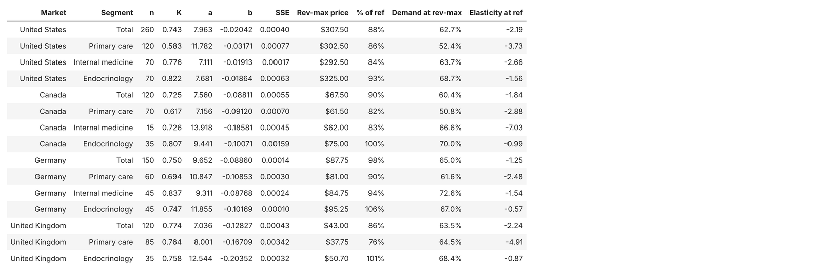
Why scipy.optimize.curve_fit and not scikit-learn's LogisticRegression? The data being fitted is five aggregated shares, one per price, not hundreds of individual yes/no records. LogisticRegression is built to classify individual records. curve_fit fits a curve of any shape you specify to a set of points by minimising squared error - exactly what Solver does in the Excel tab. It is the right tool on its own merits, and as a bonus the two tracks use the same method and reach the same parameters.
The bounds keep the fit sensible: K between 0 and 1 (it is a share), b at or below 0 (demand cannot rise with price). The peak function searches the same 81-point grid as Excel's Curve_Grid sheet, so it never reports a price outside the tested ladder.
fig, ax = plt.subplots(figsize=(7, 4.3))
prices = ladders.loc[MARKET, PRICE_COLS].values.astype(float)
grid = np.linspace(prices[0], prices[-1], 81)
ends = []
for s in SEGMENTS:
    f = fits[(fits.Market == MARKET) & (fits.Segment == s)].iloc[0]
    o = cells[(cells.Market == MARKET) & (cells.Segment == s)].iloc[0]
    y = logistic3(grid, f.K, f.a, f.b)
    ax.plot(grid, y, color=COLORS[s], lw=2.6 if s == "Total" else 1.8, ls="--" if s == "Total" else "-")
    ax.scatter(o.prices, o.obs, color=COLORS[s], s=28, zorder=3, edgecolor="white", linewidth=1.5)
    ends.append((s, y[-1]))
label_ends(ax, ends, grid[-1])
ax.set_xticks(prices)
ax.set(title=f"{MARKET}: fitted demand (lines) vs observed (dots), patient-weighted",
       xlabel="Monthly price (USD)", ylim=(0, 1), xlim=(prices[0] - 10, prices[-1] + 95))
ax.yaxis.set_major_formatter(plt.matplotlib.ticker.PercentFormatter(1.0))
ax.xaxis.set_major_formatter(plt.matplotlib.ticker.StrMethodFormatter("${x:,.0f}"))
plt.tight_layout()
plt.savefig("fig_l4_fitted.png", dpi=200, bbox_inches="tight")
plt.show()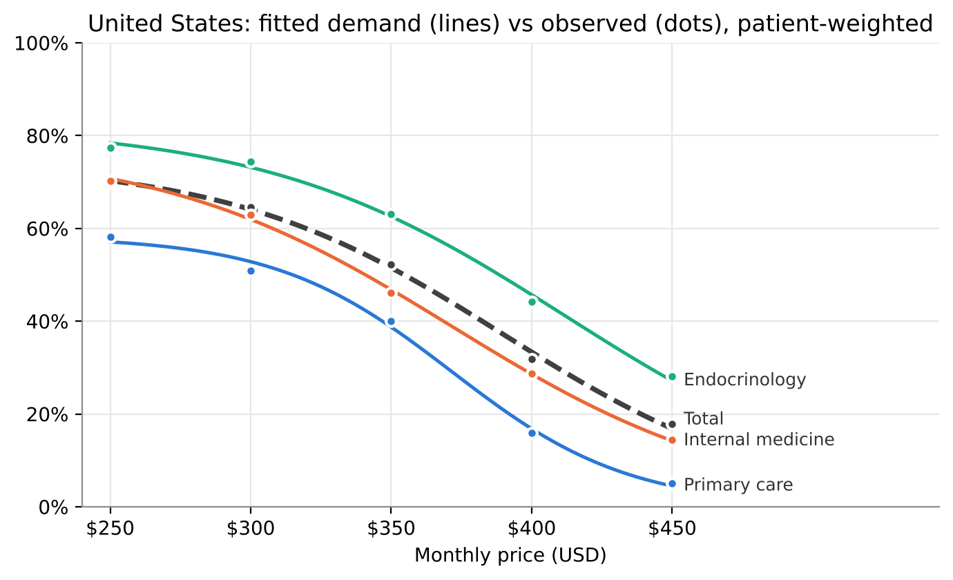
Python Step 9 - Layer 5: bootstrap interval
N_BOOT = 200
boot_w = np.random.default_rng(2026).poisson(1.0, size=(len(raw), N_BOOT))   # rows follow raw order
resp_index = {rid: i for i, rid in enumerate(raw["Resp_ID"])}

W5 = raw[PRICE_COLS].apply(lambda col: col.map(scale_weights)).fillna(0.0).values   # respondent x price weight
aw = raw["Eligible_Patients"].values if use_patients else np.ones(len(raw))

boot_rows, boot_peaks = [], {}
for c in ladders.index:
    mask = (raw["Country"] == c).values
    prices = ladders.loc[c, PRICE_COLS].values.astype(float)
    K_full = fits[(fits.Market == c) & (fits.Segment == "Total")].K.iloc[0]
    full, shortcut = [], []
    for j in range(N_BOOT):
        w = boot_w[:, j] * aw * mask
        d = (W5 * w[:, None]).sum(0) / w.sum()
        K, a, b = fit(prices, d)
        full.append(peak(prices, K, a, b))
        y = np.log(np.clip(d, 0.001, K_full * 0.995) / (K_full - np.clip(d, 0.001, K_full * 0.995)))
        b_s, a_s = np.polyfit(prices, y, 1)
        shortcut.append(peak(prices, K_full, a_s, b_s))
    full, shortcut = np.array(full), np.array(shortcut)
    boot_peaks[c] = full
    f = fits[(fits.Market == c) & (fits.Segment == "Total")].iloc[0]
    boot_rows.append({"Market": c, "Rev-max price": f["Rev-max price"],
                      "95% low": np.percentile(full, 2.5), "95% high": np.percentile(full, 97.5),
                      "Excel shortcut low": np.percentile(shortcut, 2.5),
                      "Excel shortcut high": np.percentile(shortcut, 97.5)})
boot = pd.DataFrame(boot_rows)
boot.style.format({c: "${:,.2f}" for c in boot.columns if c != "Market"}).hide(axis="index")
The bootstrap weights use the same random seed (2026) and the same Poisson recipe as the Excel Boot_Weights sheet, so both tracks resample identical "alternative samples". The table compares the two fitting approaches on those identical samples:
| Market | Full refit (Python) | Excel shortcut |
|---|---|---|
| United States | $297 - $322 | $292.50 - $330.00 |
| Canada | $63 - $72.50 | $62.00 - $73.00 |
| Germany | $84 - $90.75 | $82.50 - $93.75 |
| United Kingdom | $40 - $46 | $39.85 - $46.51 |
The shortcut columns reproduce the Excel numbers exactly. The full refit gives slightly narrower intervals, because letting the ceiling move absorbs some of the noise that the fixed-ceiling shortcut pushes into the slope. Either is fine for a launch decision; the full refit is the more precise of the two.
c = MARKET
lo, hi = np.percentile(boot_peaks[c], [2.5, 97.5])
fig, ax = plt.subplots(figsize=(6.5, 3.6))
ax.hist(boot_peaks[c], bins=np.arange(boot_peaks[c].min() - 1.25, boot_peaks[c].max() + 2.5, 2.5),
        color="#2a78d6", edgecolor="white", linewidth=1.5)
ax.axvspan(lo, hi, color="#2a78d6", alpha=0.08)
ax.axvline(fits[(fits.Market == c) & (fits.Segment == "Total")]["Rev-max price"].iloc[0], color="#404040", lw=2)
ax.set(title=f"{c}: revenue-maximising price across 200 bootstrap samples",
       xlabel="Revenue-maximising price (USD / month)", ylabel="Replicates")
ax.text(0.98, 0.95, f"95% interval: ${lo:,.0f} to ${hi:,.0f}", transform=ax.transAxes, ha="right", va="top",
        fontsize=9, color="#333333")
ax.xaxis.set_major_formatter(plt.matplotlib.ticker.StrMethodFormatter("${x:,.0f}"))
ax.grid(axis="x", visible=False)
plt.tight_layout()
plt.savefig("fig_l5_bootstrap.png", dpi=200, bbox_inches="tight")
plt.show()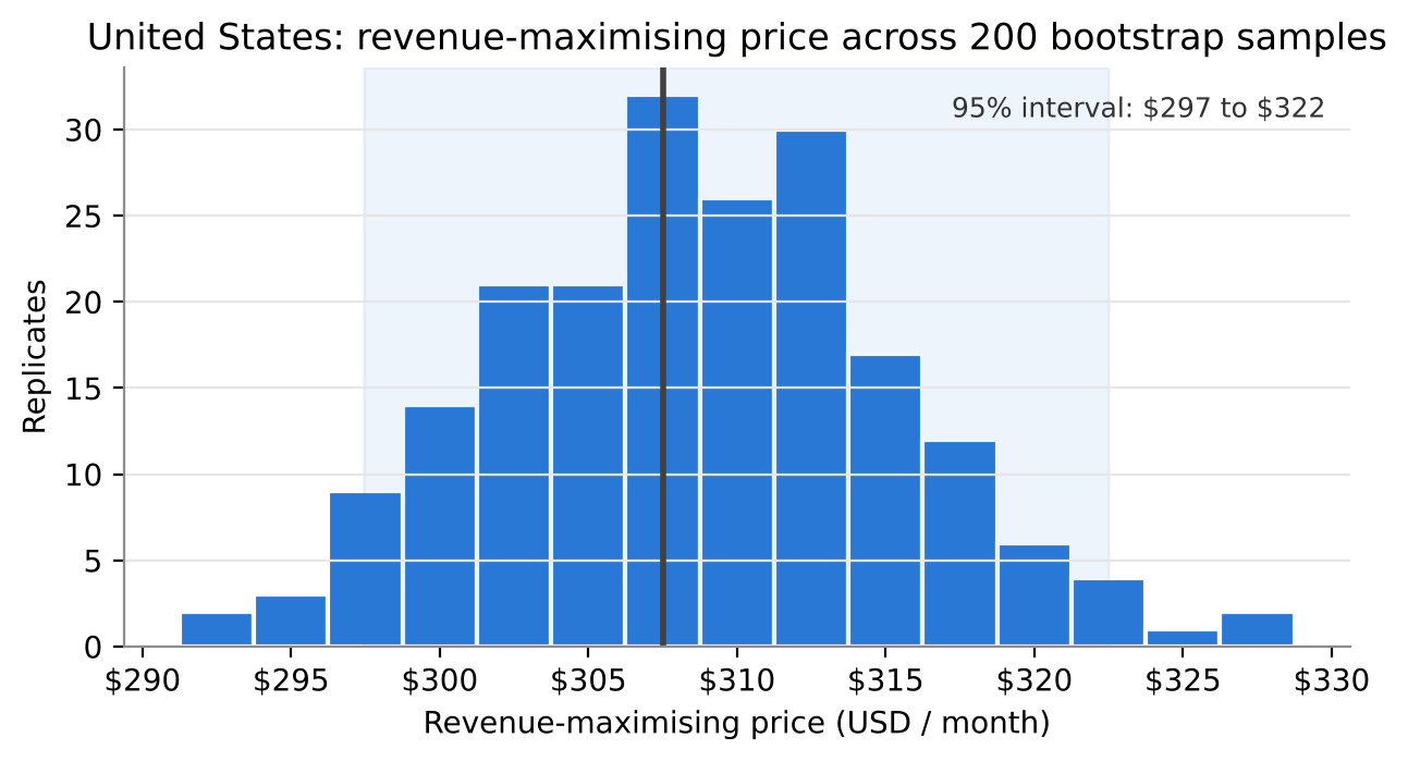
Python Step 10 - Layer 6: from revenue to margin
fits["Unit cost"] = fits["Market"].map(unit_cost)
fits["Margin-max price"] = [peak(ladders.loc[r.Market, PRICE_COLS].values.astype(float), r.K, r.a, r.b, r["Unit cost"])
                            for _, r in fits.iterrows()]

f = fits[(fits.Market == MARKET) & (fits.Segment == "Total")].iloc[0]
prices = ladders.loc[MARKET, PRICE_COLS].values.astype(float)
grid = np.linspace(prices[0], prices[-1], 81)
dem = logistic3(grid, f.K, f.a, f.b)
fig, ax = plt.subplots(figsize=(6.5, 4))
ax.plot(grid, grid * dem, color="#2a78d6", lw=2, label="Revenue per eligible patient")
ax.plot(grid, (grid - f["Unit cost"]) * dem, color="#1baf7a", lw=2, ls="--", label="Margin per eligible patient")
for val, col in [(f["Rev-max price"], "#2a78d6"), (f["Margin-max price"], "#1baf7a")]:
    ax.axvline(val, color=col, lw=1, alpha=0.6)
ax.set(title=f"{MARKET}: revenue vs margin (Total, patient-weighted)", xlabel="Monthly price (USD)",
       ylabel="USD per eligible patient-month", ylim=(0, None))
ax.xaxis.set_major_formatter(plt.matplotlib.ticker.StrMethodFormatter("${x:,.0f}"))
ax.legend(frameon=False, loc="lower left")
plt.tight_layout()
plt.savefig("fig_l6_margin.png", dpi=200, bbox_inches="tight")
plt.show()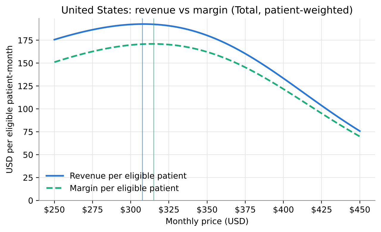
Python Step 11 - Bring it together
summary = (fits[fits.Segment == "Total"][["Market", "n", "Rev-max price", "% of ref", "Margin-max price", "Elasticity at ref"]]
           .merge(boot[["Market", "95% low", "95% high"]], on="Market"))
summary.insert(2, "Reference", summary["Market"].map(ladders["Reference price"]))
summary["Expected share at rev-max"] = fits[fits.Segment == "Total"]["Demand at rev-max"].values * calibration
summary.style.format({"Reference": "${:,.0f}", "Rev-max price": "${:,.2f}", "% of ref": "{:.0%}",
                      "Margin-max price": "${:,.2f}", "Elasticity at ref": "{:.2f}", "95% low": "${:,.0f}",
                      "95% high": "${:,.0f}", "Expected share at rev-max": "{:.1%}"}).hide(axis="index")
fig, axes = plt.subplots(1, 4, figsize=(15, 3.8), sharey=True)
for ax, c in zip(axes, ladders.index):
    prices = ladders.loc[c, PRICE_COLS].values.astype(float)
    grid = np.linspace(prices[0], prices[-1], 81)
    for s in SEGMENTS:
        f = fits[(fits.Market == c) & (fits.Segment == s)]
        if f.empty:
            continue
        f = f.iloc[0]
        ax.plot(grid, logistic3(grid, f.K, f.a, f.b), color=COLORS[s],
                lw=2.4 if s == "Total" else 1.5, ls="--" if s == "Total" else "-", label=s)
    ref = ladders.loc[c, "Reference price"]
    ax.axvline(ref, color="#8c8c8c", lw=1, ls=":")
    ax.text(ref, 0.96, " class price", fontsize=8, color="#595959")
    ax.set(title=c, xlabel="Monthly price (USD)", ylim=(0, 1))
    ax.xaxis.set_major_formatter(plt.matplotlib.ticker.StrMethodFormatter("${x:,.0f}"))
axes[0].yaxis.set_major_formatter(plt.matplotlib.ticker.PercentFormatter(1.0))
axes[0].set_ylabel("Would prescribe (patient-weighted)")
handles, labels_ = axes[0].get_legend_handles_labels()
fig.legend(handles, labels_, loc="lower center", ncol=4, frameon=False, bbox_to_anchor=(0.5, -0.06))
plt.tight_layout()
plt.savefig("fig_markets_small_multiples.png", dpi=200, bbox_inches="tight")
plt.show()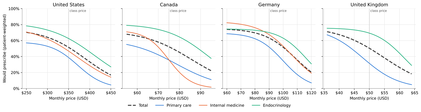
Four panels, one per market, instead of 15 lines on one chart. Each market keeps its own price axis, because each market gets its own price.
(End of tabs. Both tracks arrive at the same results.)
6. Reading the results
Headline. In three of the four markets, the revenue-maximising launch price for Product X is 10-15% below the class leader. In Germany it is close to parity.
| Market | Class price | Revenue-max price | % of class | 95% interval | Margin-max price | Elasticity at class price |
|---|---|---|---|---|---|---|
| United States | $350 | $307.50 | 88% | $297 - $322 | $315.00 | −2.19 |
| Canada | $75 | $67.50 | 90% | $63 - $72.50 | $69.00 | −1.84 |
| Germany | $90 | $87.75 | 98% | $84 - $90.75 | $88.50 | −1.25 |
| United Kingdom | $50 | $43.00 | 86% | $40 - $46 | $44.40 | −2.24 |
(Intervals from the full-refit bootstrap; the Excel shortcut gives slightly wider ranges, as shown in section 5.)
What the numbers say, market by market
United States. At parity ($350), about 52% of eligible patients would be on a physician's "would prescribe" list (patient-weighted, stated intent). At $307.50 that rises to about 63%. The extra uptake more than pays for the lower price. The 95% interval ($297-$322) does not reach $350, so parity is not supported by this data. An elasticity of −2.2 at the class price means a 1% price increase there would cost about 2.2% of demand.
Canada. Same story, slightly less pronounced: optimum about 10% below the class price, interval clear of parity.
Germany. The interval ($84-$91) includes the class price. Physicians here are the least price-sensitive of the four markets (elasticity −1.25, close to the −1 point where revenue is flat). Parity is defensible; a discount buys little.
United Kingdom. The most price-sensitive market overall, driven by GPs (elasticity −4.9, revenue-max 76% of the class price). Endocrinologists would accept parity, but GPs prescribe most type 2 diabetes treatment in the UK.
What the specialty split adds. In every market, endocrinologists tolerate the highest prices, and primary care is the most price-sensitive group (Canada's 15 internists aside). In the US, the endocrinology curve alone peaks at about $325; primary care at about $303, with far steeper losses above $350 (elasticity −3.7). US internists peak slightly lower still, at about $293: their demand falls steadily from a higher starting point rather than holding and then collapsing, as primary care's does. Since primary care writes most prescriptions, the market price has to work for primary care. Endocrinologists' tolerance is a reason the curve is not steeper, not a reason to price for them.
What the patient weighting adds. Weighting by eligible patients raised US demand by up to 5 points at the higher prices and moved the revenue-max price up by about $5. Physician-level results understate tolerance here, because the least price-sensitive physicians also manage the most eligible patients. Skipping this step would have pushed the recommendation slightly too low.
What the margin step adds. Little, for this product. Unit costs are small relative to price, so the margin peak sits $1-$8 above the revenue peak. Use the margin-max figure as the upper end of the recommended corridor rather than as a separate answer.
How to read the elasticity column. It is the fastest single test of "should we go higher or lower than the reference?": more negative than −1 means a lower price earns more; between −1 and 0 means a higher price would.
What these numbers are not.
They are stated intent, not behaviour. The 100/50 weighting is a standard discount for overstatement, not a calibrated one. The demand levels (52%, 63%) should not be read as market share forecasts. The shape of the curve and the position of its peak are more reliable than its height.
They measure prescriber willingness, not payer acceptance. Formulary decisions, rebates and net price are outside the scope of this method and this post.
They assume competitors stand still. If the class leader cuts its price in response, the curve moves.
7. From results to a pricing strategy
For the pricing committee.
Recommendation in one line. Launch below parity in the US, Canada and the UK, at parity in Germany, within these corridors:
| Market | Recommended corridor (USD / 30 days) | vs class leader | Anchor point |
|---|---|---|---|
| United States | $300 - $315 | 10-14% below | Revenue-max $307.50 / margin-max $315 |
| Canada | $66 - $69 | 8-12% below | Revenue-max $67.50 / margin-max $69 |
| Germany | $87 - $90 | 0-3% below | Revenue-max $87.75; interval includes parity |
| United Kingdom | $42 - $45 | 10-16% below | Revenue-max $43 / margin-max $44.40 |
Why not parity everywhere? Because in three markets the data says a parity price would forfeit roughly 8-13 points of eligible-patient uptake (US 63% → 52%, Canada 60% → 52%, UK 64% → 50%) and earn less revenue as a result. Product X has no clinical edge to justify parity; prescribers are telling us price is their tie-breaker.
Four strategic implications
Price for primary care, message to specialists. The market price has to work for the most price-sensitive, highest-volume group. Endocrinologists' higher tolerance is an asset for early adoption: use them for advocacy and peer influence, not as a reason to price higher.
Use the corridor, not the point. The bootstrap interval is $25-$38 wide in the US, depending on the fitting method. Any price inside the recommended corridor is consistent with the data. That gives room to align with internal price-architecture rules, round to sensible local-currency price points, and accommodate the next point.
Set the four prices together, not one by one. Many markets reference each other's prices when setting their own. A German price close to parity and a UK price 14% below are both supported by the data, but the gap between them will be visible to authorities that use international reference pricing. Before finalising, check the corridor in each market against referencing rules and launch sequence. [link to reference-pricing post]
Treat Germany's launch price as the anchor it becomes. With free pricing limited to the first months, the German launch price sets the starting point for what follows. The data supports opening at or near parity there.
What it is worth. At the recommended US price, patient-weighted stated demand is about 63% of eligible patients, versus about 52% at parity. Even after discounting stated intent heavily, a double-digit relative gain in uptake for a roughly 12% lower price is a favourable trade in a class where every prescription is contested.
Next steps before the price is final
Calibrate the scale weights against the company's own past launches (stated "definitely/probably" versus actual first-year uptake). Replace the 100/50 default in the Levers sheet with that ratio and re-run.
Test the recommended corridor with payers in each market. Gabor-Granger measures prescribers; payers decide access.
Re-run the analysis if a competitor changes its price before launch. The workbook recalculates in seconds.
8. Limitations and what comes next
Single product, single price. Real launches may involve several strengths or a product line. Gabor-Granger extends to multi-product studies (several ladders, one per product), at the cost of a longer survey.
No competitive response. Respondents react to Product X's price with the current market as backdrop. Methods that model competitor moves (such as choice-based conjoint) handle this better.
Stated, not revealed, preference. The weighting reduces overstatement; it does not remove it. Calibration against real launch data is the gold standard.
Small cells. Canada's internal medicine segment (n=15) is directional only. Plan quotas to avoid this in a real study.
Synthetic data. The dataset was built to behave realistically, so it is ideal for learning the method, but its specific numbers should not be used for any real pricing decision.
Coming next in the series: Van Westendorp's Price Sensitivity Meter - what to do when there is no reference price to anchor on. [link]
Downloads: Gabor_Granger_T2D_Pricing.xlsx (data + full Excel analysis) | Gabor_Granger_Analysis.ipynb (Python notebook) | gabor_granger_analysis.py (same code as a script). All data synthetic.
Price references used to set the ladders: class leader monthly prices from the manufacturer's US pricing page (Jan 2026), NHS dm+d indicative price (UK), German pharmacy price listings, and Canadian pharmacy cash prices, converted to USD.